Picker Style in React Native

Sometimes when designing a form in our app, we need to provide a multiple-choice option to the user.
In this article, we’ll learn about implementing Picker in a React-Native app and style it in our way.
To make the topic easier, we will examine an example with an explanation.
Picker Style in React Native
In React-Native, we use Picker. Picker is a UI component used to select a single item from multiple items, similar to the Dropdown menu.
When we place a Picker in our app, it styles in its default style. We can also change the style of a picker easily.
In our below code example, we will demonstrate how we can implement Picker in our React-Native app and style it in our way. The code snippet for our example will be as follows.
// importing necessary packages
import {Picker} from '@react-native-picker/picker';
import {StatusBar} from 'expo-status-bar';
import {useState} from 'react';
import {StyleSheet, Text, View} from 'react-native';

export default function App() {
  const [selectedValue, SetSelectedValue] = useState('java');

  return (  // Including the image
    <View style={styles.container}>
      <Picker
       selectedValue={selectedValue}
       style={
    { height: 50, width: 150 }}
       onValueChange={(itemValue, itemIndex) => SetSelectedValue(itemValue)}>
       <Picker.Item label='Java' value='java' />
       <Picker.Item label='Python' value='python' />
       <Picker.Item label='JavaScript' value='js' />
    </Picker>
    </View>
  );
}

const styles = StyleSheet.create({
  // Providing style.
  container: {
    flex: 1,
    backgroundColor: '#fff',
    alignItems: 'center',
    justifyContent: 'center',
  },
});
We already commanded the purpose of all necessary lines regarding the steps shared above in the example.
Through the line const [selectedValue, SetSelectedValue] = useState("java"); we the initial value of the picker to Java.
We created the Picker using the tag <Picker></Picker>, and below are the properties inside the tag.
| Properties/Code Lines | Definition |
|---|---|
selectedValue={selectedValue} |
Sets the initial value. |
style={{ height: 50, width: 150 }} |
Provides basic styles to the picker. |
onValueChange={(itemValue, itemIndex) => SetSelectedValue(itemValue)}> |
Provides an action when a user selects an item. |
<Picker.Item label="Java" value="java" /> |
Creates an item. |
<Picker.Item label="Python" value="python" /> |
Creates an item. |
<Picker.Item label="JavaScript" value="js" /> |
Creates an item. |
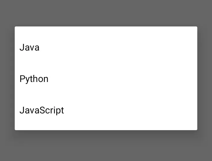
When you run the app, you’ll get the output below.
Output:
Note that the code shared above is created in React-Native, and we used the Expo-CLI to run the app. Also, you need the latest version of Node.js.
If you don’t have Expo-CLI in your environment, install it first.

Aminul Is an Expert Technical Writer and Full-Stack Developer. He has hands-on working experience on numerous Developer Platforms and SAAS startups. He is highly skilled in numerous Programming languages and Frameworks. He can write professional technical articles like Reviews, Programming, Documentation, SOP, User manual, Whitepaper, etc.
LinkedIn