How to Change Point Size in Graphs in R
-
Change Point Size in Graphs Using the
plot()Function in R -
Change Point Size in Graphs Using the
qplot()Function in R -
Change Point Size in Graphs Using
ggplot()in R - Conclusion
A scatterplot is a fundamental and widely used plot in R, providing a visual representation of the relationship between two variables.
This article aims to comprehensively discuss the basics of scatterplots, their interpretation, and customization options in R.
Change Point Size in Graphs Using the plot() Function in R
A scatterplot is a graphical representation of the relationship between two variables. It is widely used to determine if there’s a pattern, trend, or correlation between the variables.
In a scatterplot, each point represents an observation, displaying its values for both the x and y-axes. This visual representation allows for a quick assessment of the data distribution and helps in identifying any outliers or clusters of data points.
The size of points in a scatterplot, often referred to as “point size”, determines the dimensions of each data point plotted on the graph. Adjusting the point size is essential for highlighting specific data, improving visibility, and making your visualizations more informative.
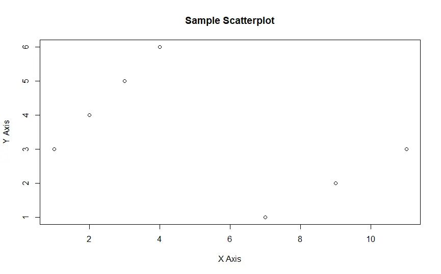
To create a basic scatterplot in R, we use the plot() function, a versatile tool for visualizing data. The following example demonstrates a simple scatterplot graph using this function:
v1 <- c(1, 2, 3, 4, 11, 9, 7)
v2 <- c(3, 4, 5, 6, 3, 2, 1)
plot(x = v1, y = v2, xlab = "X Axis", ylab = "Y Axis",
     main = "Sample Scatterplot")
Here, we define two vectors, v1 and v2, representing the values for the x and y-axes, respectively.
The plot() function plots these values, and we provide labels for the x and y axes using the xlab and ylab parameters, along with a title using the main parameter.
Output:
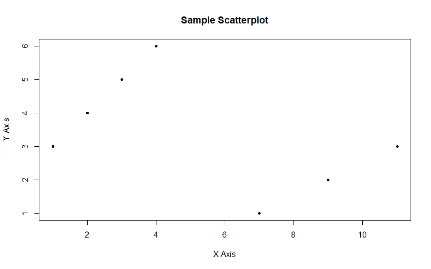
Change Point Shape Using the pch Parameter
Customizing the appearance of points in a scatterplot is crucial for conveying information effectively. This customization is achieved using the pch (point character) and cex (character expansion) parameters.
The pch parameter in the plot() function allows us to choose from a variety of point shapes. Each value of pch from 1 to 25 corresponds to a different shape, ranging from circles to squares to triangles and more.
plot(x = v1, y = v2, xlab = "X Axis", ylab = "Y Axis",
     main = "Sample Scatterplot", pch = 20)
In this example, we set pch to 20, which corresponds to a solid circle.
Output:
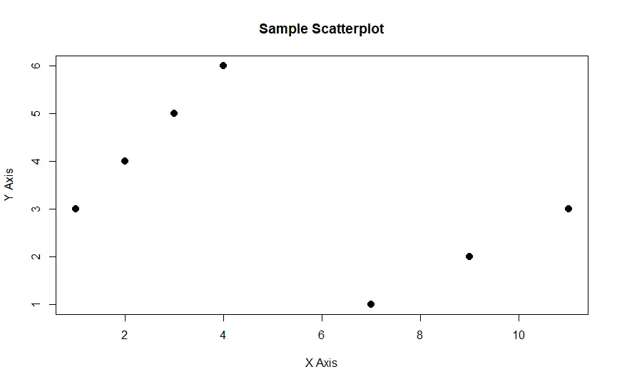
Change Point Size Using the cex Parameter
The cex parameter adjusts the size of the points in the scatterplot. A higher value for cex results in larger points, making them more visible and prominent.
plot(x = v1, y = v2, xlab = "X Axis", ylab = "Y Axis",
     main = "Sample Scatterplot", pch = 20, cex = 2)
In this example, we set cex to 2, enlarging the points.
Output:
Change Point Size in Graphs Using the qplot() Function in R
Apart from the plot() function, other plotting functions in R, like qplot() and ggplot(), offer options to customize point size.
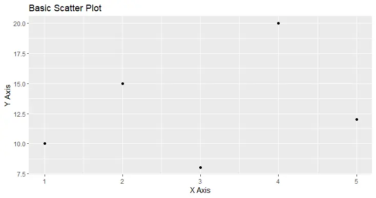
To begin, let’s create a basic scatter plot using qplot() with the default point size. We’ll utilize a sample dataset for demonstration.
library(ggplot2)

df <- data.frame(x = c(1, 2, 3, 4, 5),
                 y = c(10, 15, 8, 20, 12))

qplot(x = x, y = y, data = df,
      main = "Basic Scatter Plot",
      xlab = "X Axis", ylab = "Y Axis")
In this plot, the default point size is utilized.
Output:

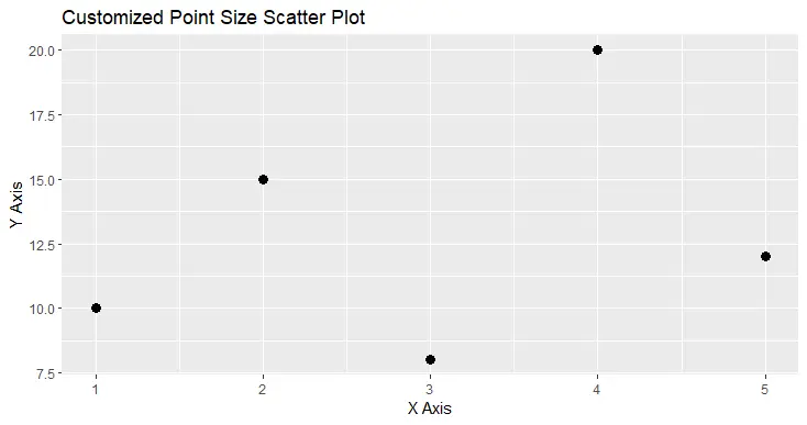
Change Point Size in Scatterplots
To customize the point size in a scatter plot using qplot(), you can use the size parameter. The size parameter allows you to set the point size.
qplot(x = x, y = y, data = df, size = I(5),
      main = "Customized Point Size Scatter Plot",
      xlab = "X Axis", ylab = "Y Axis")
In this example, we set size = I(5) to make the points larger.
Output:
Adjust Point Size Based on a Variable
You can adjust the point size based on a variable in your dataset, allowing you to emphasize specific data points based on their characteristics.
qplot(x = x, y = y, data = df, size = y,
      main = "Variable-based Point Size Scatter Plot",
      xlab = "X Axis", ylab = "Y Axis")
Here, the point size is adjusted based on the y variable.
Output:

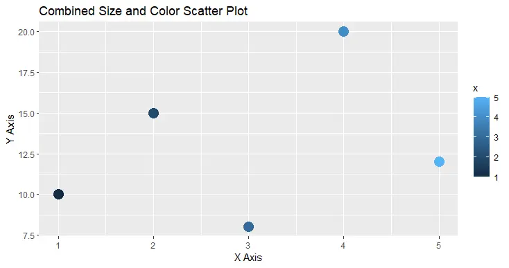
Combine Point Size and Color
Combining point size with color can provide a multi-dimensional view of the data. You can achieve this by using both the size and color parameters.
qplot(x = x, y = y, data = df, size = I(5), color = x,
      main = "Combined Size and Color Scatter Plot",
      xlab = "X Axis", ylab = "Y Axis")
In this example, both point size and color are mapped to different variables.
Output:
Change Point Size in Graphs Using ggplot() in R
We can use ggplot() to customize and change point size in graphs in R. To get started, let’s create a basic scatter plot using ggplot() with the default point size.
We’ll use a sample dataset for demonstration.
library(ggplot2)

df <- data.frame(x = c(1, 2, 3, 4, 5),
                 y = c(10, 15, 8, 20, 12))

ggplot(data = df, aes(x = x, y = y)) +
  geom_point() +
  labs(title = "Basic Scatter Plot",
       x = "X Axis", y = "Y Axis")
In this plot, the default point size is used.
Output:
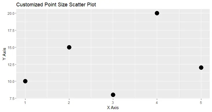
Change Point Size in Scatterplots
To customize the point size in a scatterplot, you can use the size aesthetic within the geom_point() layer. The size aesthetic allows you to control the point size.
ggplot(data = df, aes(x = x, y = y)) +
  geom_point(size = 3) +
  labs(title = "Customized Point Size Scatter Plot",
       x = "X Axis", y = "Y Axis")
In this example, we set size = 3 to make the points larger.
Output:
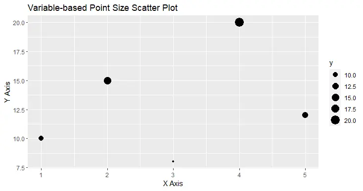
Adjust Point Size Based on a Variable
You can also adjust the point size based on a variable in your dataset. This is particularly useful when you want to emphasize specific data points based on their characteristics.
ggplot(data = df, aes(x = x, y = y, size = y)) +
  geom_point() +
  labs(title = "Variable-based Point Size Scatter Plot",
       x = "X Axis", y = "Y Axis")
In this example, the point size is adjusted based on the y variable.
Output:
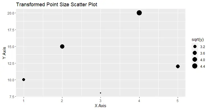
Transform Point Size
You can apply transformations to the point size, making it proportional to some variable or transformation of a variable. For instance, you can use the square root transformation for point size.
ggplot(data = df, aes(x = x, y = y, size = sqrt(y))) +
  geom_point() +
  labs(title = "Transformed Point Size Scatter Plot",
       x = "X Axis", y = "Y Axis")
In this example, we apply the square root transformation to the y variable for point size.
Output:
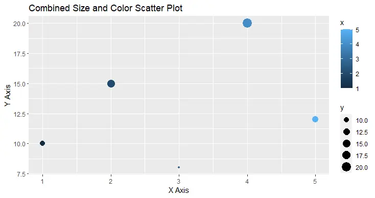
Combine Point Size and Color
You can combine point size with color to create plots that convey multiple dimensions of information simultaneously. For this, you use both the size and color aesthetics.
ggplot(data = df, aes(x = x, y = y, size = y, color = x)) +
  geom_point() +
  labs(title = "Combined Size and Color Scatter Plot",
       x = "X Axis", y = "Y Axis")
In this example, both point size and color are mapped to different variables.
Output:
Conclusion
Changing point size in graphs is essential for effective data visualization in R. Whether you are using the fundamental plot() function or the powerful ggplot2 package, understanding how to adjust point size will allow you to create informative and visually appealing graphs tailored to your data and analytical needs.
Experiment with different point sizes to enhance the presentation of your data and convey meaningful insights through your visualizations.

Manav is a IT Professional who has a lot of experience as a core developer in many live projects. He is an avid learner who enjoys learning new things and sharing his findings whenever possible.
LinkedIn