How to Plot Dates in Matplotlib
The time series plots convey how an attribute value changes over time using statistical methods like an autoregressive integrated moving average.
We can reliably predict or forecast the demand of a particular retail product based on historical time series data on previous sales of their product.
This article will demonstrate how to work with matplotlib.dates and some basic examples using some dates with a built-in Python module, and then we will see an example using data from a CSV file to plot dates in Matplotlib.
Plot Dates in Matplotlib Using matplotlib.dates
We will look over time series data and plot dates in Matplotlib. A ton of data contains date information, so knowing how to plot dates will be a huge help when creating some graphs.
First, we will go through some basic examples using some dates with the datetime module. So, we need to import some libraries.
from matplotlib import pyplot as plot

# A matplotlib date tool
import matplotlib.dates as mpl_dates

from datetime import datetime, timedelta
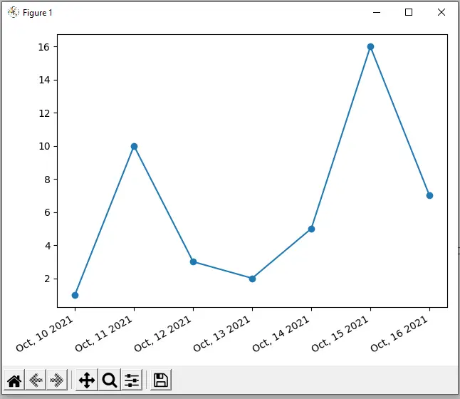
We have a list of seven dates for our sample data here, and we are using Python’s built-in datetime module to create these.
These are seven days back-to-back, and then below, we got a y1 variable for our y-axis.
# A list of dates for seven dates
dates = [
    datetime(2021, 10, 10),
    datetime(2021, 10, 11),
    datetime(2021, 10, 12),
    datetime(2021, 10, 13),
    datetime(2021, 10, 14),
    datetime(2021, 10, 15),
    datetime(2021, 10, 16),
]

# A data list
y1 = [1, 10, 3, 2, 5, 16, 7]
The plot_date() method helps plot dates, so we called this method and passed a dates parameter to be the x-axis and the y1 parameter to be the y-axis.
Instead of the default, this plot has markers connected by a line, but we can quickly fix that using the linestyle parameter. We want the line style of this plot to be solid.
plot.plot_date(dates, y1, linestyle="solid")
To get the current figure from Pyplot, we can use the gca() method, which gets the current figure. We can then run autofmt_xdate() on that figure.
We have different ways to format our plot to make it look good; we can use autofmt_xdate() is to format the date on our figure. This will rotate our dates to fit a bit nicer and change alignments.
plot.gcf().autofmt_xdate()
Let us see how we can change the format of our dates.
Suppose, instead of how they display with the year-month-day, we wanted them to start with the month, day, and year. To do this, we have to use some datetime formatting.
So to do this, we import matplotlib.dates as mpl_dates, and from that imported module, we use the DateFormatter class. Now in this class, we pass our format string.
The abbreviated name of the month is %b, the day is %d, and the year is %Y. We need to set this as the format for our x-axis.
Just like we grabbed the figure to run the autofmt_xdate() method, we need to grab the axis to run this method. It is a lot similar to getting the current figure, so to grab the current axis, we will call the gca() method to get the current axis.
Now, we can format the x-axis using xaxis.set_major_formatter() and pass the date_format that stores formatted dates.
date_format = mpl_dates.DateFormatter("%b, %d %Y")
# Get the access of current figure
plot.gca().xaxis.set_major_formatter(date_format)
The tight_layout() method adds padding to our plot.
plot.tight_layout()
Complete example code:
from matplotlib import pyplot as plot

# A matplotlib date tool
import matplotlib.dates as mpl_dates

from datetime import datetime, timedelta

# A list of dates for seven dates
dates = [
    datetime(2021, 10, 10),
    datetime(2021, 10, 11),
    datetime(2021, 10, 12),
    datetime(2021, 10, 13),
    datetime(2021, 10, 14),
    datetime(2021, 10, 15),
    datetime(2021, 10, 16),
]

# A data list
y1 = [1, 10, 3, 2, 5, 16, 7]

plot.plot_date(dates, y1, linestyle="solid")

date_format = mpl_dates.DateFormatter("%b, %d %Y")
# Get the access of current figure
plot.gcf().autofmt_xdate()
# Get the access of current figure
plot.gca().xaxis.set_major_formatter(date_format)
# Make responsive
plot.tight_layout()
plot.show()
Output:
Plot Dates in Matplotlib Using Data From a CSV File
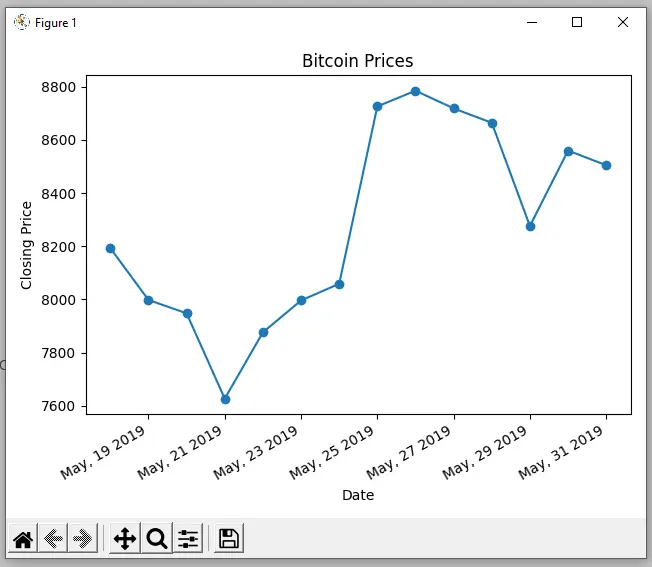
This section will provide an example using data from a CSV file. The data within the CSV file are Bitcoin prices over a couple of weeks.
First, we need to import Pandas.
import pandas as pd
We read data to load this as a Pandas dataframe and upload a CSV file, so we have the data.sv file in our directory. We can upload it using the read_csv() method, a CSV file reader.
data = pd.read_csv("data.csv")
We must convert the Date column to a datetime, so we need to use the to_datetime() method from Pandas. Then, we replace all the string values with those converted date times.
In the following line of code, we sort the data using the sort_values() method and pass the inplace=True, which will modify our data for the sorted column.
Whenever price_date is equal to data and then passes in that key of Date, it sets price_date equal to all of these dates in our data equivalent to that Date column.
Now, we will do the same with the price_close variable and set it to Close to grab all of the closing prices for those days, so we have the price date, and the price closed data loaded from the CSV file.
data["Date"] = pd.to_datetime(data["Date"])
data.sort_values("Date", inplace=True)

price_date = data["Date"]
price_close = data["Close"]
To plot this, we pass the data into the plot_date() method. We pass price_date as the x-values, and price_close as the y-values.
plot.plot_date(price_date, price_close, linestyle="solid")
Complete example code:
from matplotlib import pyplot as plot

# A matplotlib date tool
import matplotlib.dates as mpl_dates

from datetime import datetime, timedelta
import pandas as pd

data = pd.read_csv("data.csv")

data["Date"] = pd.to_datetime(data["Date"])
data.sort_values("Date", inplace=True)

price_date = data["Date"]
price_close = data["Close"]


plot.plot_date(price_date, price_close, linestyle="solid")

date_format = mpl_dates.DateFormatter("%b, %d %Y")
# Get the access of current figure
plot.gcf().autofmt_xdate()
# Get the access of current figure
plot.gca().xaxis.set_major_formatter(date_format)

plot.title("Bitcoin Prices")
plot.xlabel("Date")
plot.ylabel("Closing Price")

# Make responsive
plot.tight_layout()
plot.show()
Output:

Hello! I am Salman Bin Mehmood(Baum), a software developer and I help organizations, address complex problems. My expertise lies within back-end, data science and machine learning. I am a lifelong learner, currently working on metaverse, and enrolled in a course building an AI application with python. I love solving problems and developing bug-free software for people. I write content related to python and hot Technologies.
LinkedIn