How to Plot Candlestick in Matplotlib
In this demonstration, we will introduce the candlestick chart or plot and see how to create an OHLC (open, high, low, close) candlestick chart using the mplfinance module in Python Matplotlib.
Create Candlestick Plot With the mplfinance Library in Matplotlib
A Matplotlib finance API makes plotting share prices easy. It requires the pandas and mplfinance modules installed in our machine.
The mplfinance module can do all sorts of things like an OHLC chart, a candlestick chart or even a point and figure chart very easily, all in one line.
Let’s have an example, and the first thing to do is get some data. We have downloaded the Amazon share price from Yahoo finance from 2019 to 2020.
To download, go to yahoo finance, search for Amazon and then go to the historical data tab so you can download it here. We’re using amazon’s share price, but you can use any data share price you like.
If the mplfinance module is not installed on your machine, you must install it.
pip install mplfinance
Import the following required modules.
# %matplotlib inline
import pandas as pd
import mplfinance as mplf
This following line will display our plots or charts inline without using the show() method, but if we use a different IDLE like pycharm, we don’t need to write this line because it will produce an error.
%matplotlib inline
Let’s create a variable named file and make that the name of the CSV file that we downloaded. Make sure you’re in the right file path location, or you will have to put the path here and use the os Python package.
file = "AMZN.csv"
Then we will create a data frame and read the CSV file.
data = pd.read_csv(file)
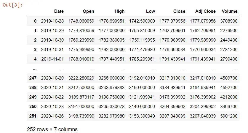
Below is called the data frame. It is 252 rows by 7 columns, and we have these columns here and see that it is automatically indexed.
data
If you write your code into a different IDLE, the above line will not work. You need to print it to have a look at your data.
Sometimes when we download data from yahoo, the columns have white space in front of the names. That can be annoying, so you have to change that.
We’ll convert the Date column to a datetime because the object is a string. We need to convert it into datetime using the pandas to_datetime() method.
We can see the summary of the Date column and its data type using the info() method.
data.Date = pd.to_datetime(data.Date)
data.info()
When we execute that, we will see now that we have a datetime data type rather than before we had an object.
<class 'pandas.core.frame.DataFrame'>
RangeIndex: 252 entries, 0 to 251
Data columns (total 7 columns):
 #   Column     Non-Null Count  Dtype
---  ------     --------------  -----
 0   Date       252 non-null    datetime64[ns]
 1   Open       252 non-null    float64
 2   High       252 non-null    float64
 3   Low        252 non-null    float64
 4   Close      252 non-null    float64
 5   Adj Close  252 non-null    float64
 6   Volume     252 non-null    int64
dtypes: datetime64[ns](1), float64(5), int64(1)
memory usage: 13.9 KB
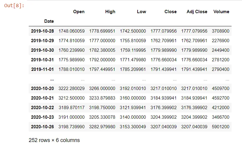
If we want to manipulate this data to display our plot, we need to access the Date column because we will display the share prices corresponding to the dates. We need to make the index the Date column of our data frame, and this index will automatically add the padding.
data = data.set_index("Date")
data
The Date column is our index now.
We will use finance API in the following example. We have our data and type mplf, which is our reference to the mplfinance module.
We call the plot() method from this module.
# %matplotlib inline # remove this line when use do not use jupyter notebook
import pandas as pd
import mplfinance as mplf
file = "AMZN.csv"
data = pd.read_csv(file)
data.Date = pd.to_datetime(data.Date)
data.info()
data = data.set_index("Date")
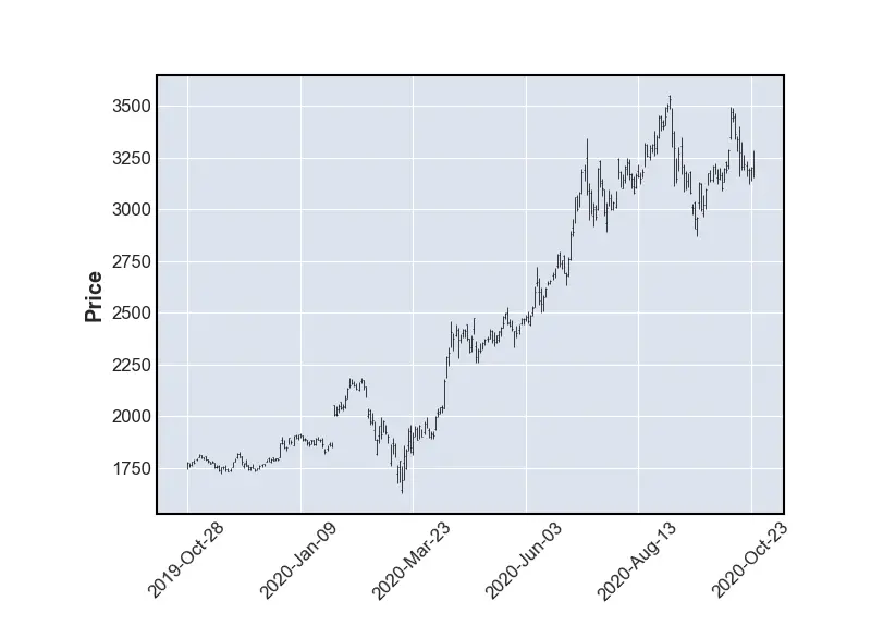
mplf.plot(data)
# use this when you are not using jupyter notebook
mplf.show()
Output:
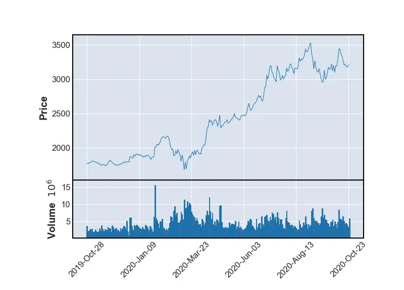
If we want to display the volume, we will make a line plot because that will be easier to see on this scale and have the volume True.
# %matplotlib inline # remove this line when we use jupyter notebook
import pandas as pd
import mplfinance as mplf

file = "AMZN.csv"
data = pd.read_csv(file)
data.Date = pd.to_datetime(data.Date)
data.info()
data = data.set_index("Date")
mplf.plot(data, type="line", volume=True)
# use this when you are not using jupyter notebook
mplf.show()
We’ve got a line plot different from the OHLC plot. We also have the volume, so we can see it is done something for us here.
It has labeled the axes and has rotated these labels.
Output:
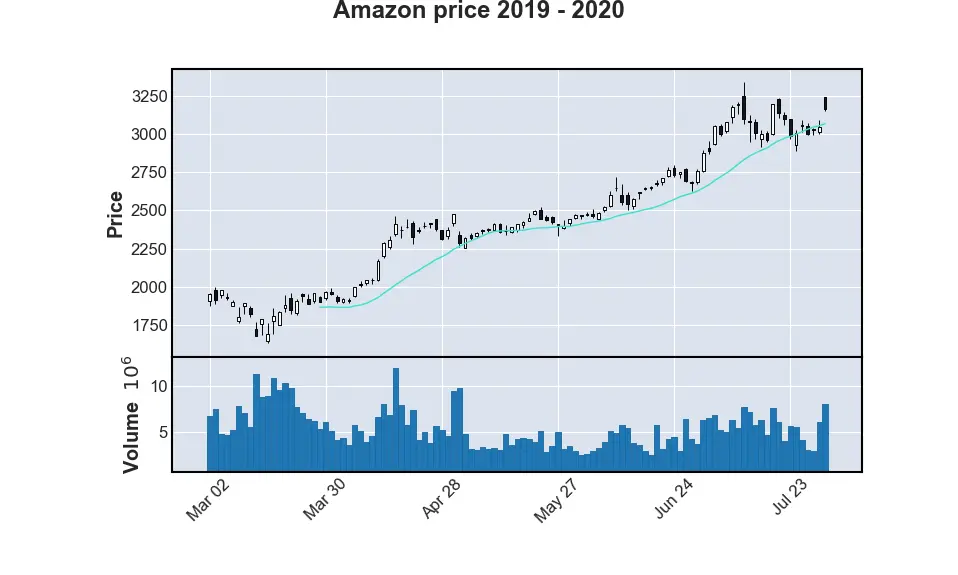
Let’s look for a few months using time series in pandas. We put data from May to July for moving average using the mav parameter, and then we specify the type as a candle called candlestick, and we will keep the volume.
# %matplotlib inline # remove this line when wuse do not use jupyter notebook
import pandas as pd
import mplfinance as mplf

file = "AMZN.csv"
data = pd.read_csv(file)
data.Date = pd.to_datetime(data.Date)
data.info()
data = data.set_index("Date")

mplf.plot(
    data.loc["2020-03":"2020-07"],
    figratio=(20, 12),
    title="Amazon price 2019 - 2020",
    type="candle",
    mav=(20),
    volume=True,
)
# use this when you are not using jupyter notebook
mplf.show()
We get a candlestick, an OHLC chart with the volume just for the moving average if we execute the code.
Output:
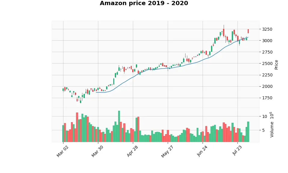
We can change the style of the look of the plots using the style parameter to set "yahoo" as a value for this method.
# %matplotlib inline # remove this line when wuse do not use jupyter notebook
import pandas as pd
import mplfinance as mplf

file = "AMZN.csv"
data = pd.read_csv(file)
data.Date = pd.to_datetime(data.Date)
data.info()
data = data.set_index("Date")

mplf.plot(
    data.loc["2020-03":"2020-07"],
    figratio=(20, 12),
    title="Amazon price 2019 - 2020",
    type="candle",
    mav=(20),
    volume=True,
    style="yahoo",
)
# use this when you are not using jupyter notebook
mplf.show()
Output:

Hello! I am Salman Bin Mehmood(Baum), a software developer and I help organizations, address complex problems. My expertise lies within back-end, data science and machine learning. I am a lifelong learner, currently working on metaverse, and enrolled in a course building an AI application with python. I love solving problems and developing bug-free software for people. I write content related to python and hot Technologies.
LinkedIn