Matplotlib Tutorial - Äxte Titel
In diesem Tutorial lernen wir den Achsentitel in der Matplotlib kennen.
Matplotlib Achsentitel
Syntax:
matplotlib.pyplot.title(label, fontdict=None, loc=None, **kwargs)
Sie setzt einen Titel der aktuellen Achsen.
Parameter
| Name | Datentyp | Beschreibung |
|---|---|---|
label |
str |
Kennungstext |
fontdict |
dict |
Beschriftungstext SchriftDictionary, wie Familie, Farbe, Gewicht und Größe |
loc |
str |
Die Position des Titels. Es hat drei Optionen, {{'center', 'left', 'right'} und die Standardoption ist center. |
# -*- coding: utf-8 -*-
import numpy as np
import matplotlib.pyplot as plt
x = np.linspace(0, 4 * np.pi, 1000)
y = np.sin(x)
plt.figure(figsize=(4, 3))
plt.plot(x, y, "r")
plt.xlabel(
"Time (s)",
size=16,
)
plt.ylabel("Value", size=16)
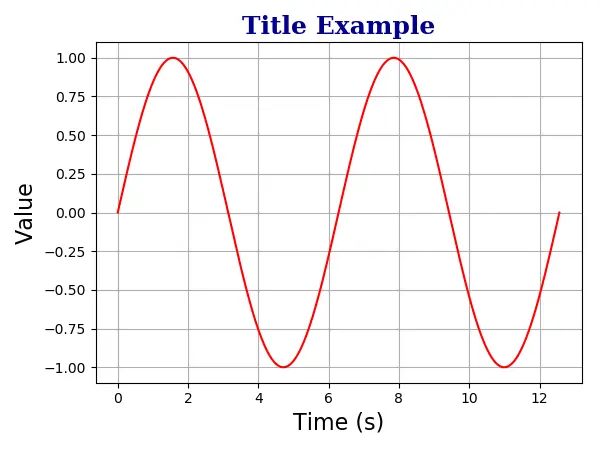
plt.title(
"Title Example",
fontdict={"family": "serif", "color": "darkblue", "weight": "bold", "size": 18},
)
plt.grid(True)
plt.show()
plt.title(
    "Title Example",
    fontdict={"family": "serif", "color": "darkblue", "weight": "bold", "size": 18},
)
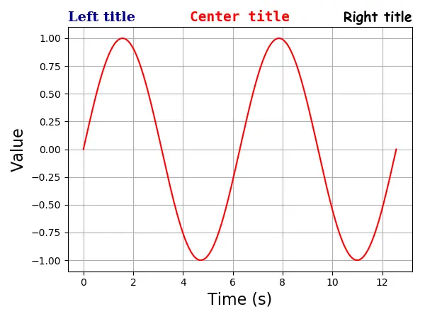
Matplotlib Axis Multiple Titles
Eine Achse kann maximal drei Titel haben, die in der Position left, center und right stehen. Die Position des spezifischen Titels wird mit dem Argument loc angegeben.
# -*- coding: utf-8 -*-
import numpy as np
import matplotlib.pyplot as plt

x = np.linspace(0, 4 * np.pi, 1000)
y = np.sin(x)

plt.figure(figsize=(8, 6))

plt.plot(x, y, "r")
plt.xlabel(
    "Time (s)",
    size=16,
)
plt.ylabel("Value", size=16)

plt.title(
    "Left title",
    fontdict={"family": "serif", "color": "darkblue", "weight": "bold", "size": 16},
    loc="left",
)

plt.title(
    "Center title",
    fontdict={"family": "monospace", "color": "red", "weight": "bold", "size": 16},
    loc="center",
)

plt.title(
    "Right title",
    fontdict={"family": "fantasy", "color": "black", "weight": "bold", "size": 16},
    loc="right",
)

plt.grid(True)

plt.show()
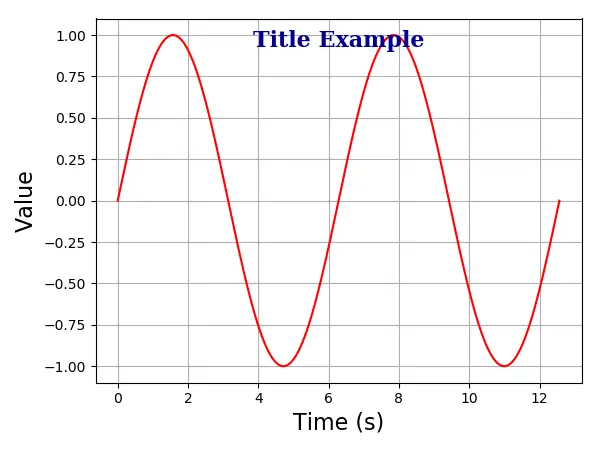
Matplotlib Axis Title inside Plot
Sie könnten den Titel auch mit der Option positon=(m, n) oder äquivalent x = m, y = n innerhalb der Handlung platzieren. Hier sind m und n Zahlen zwischen 0,0 und 1,0.
Die Position (0, 0) ist die linke untere Ecke des Diagramms, und die Position (1.0, 1.0) ist die rechte obere Ecke.
# -*- coding: utf-8 -*-
import numpy as np
import matplotlib.pyplot as plt

x = np.linspace(0, 4 * np.pi, 1000)
y = np.sin(x)

plt.figure(figsize=(6, 4.5))

plt.plot(x, y, "r")
plt.xlabel("Time (s)", size=16)
plt.ylabel("Value", size=16)

plt.title(
    "Title Example",
    position=(0.5, 0.9),
    fontdict={"family": "serif", "color": "darkblue", "weight": "bold", "size": 16},
)

plt.show()

Founder of DelftStack.com. Jinku has worked in the robotics and automotive industries for over 8 years. He sharpened his coding skills when he needed to do the automatic testing, data collection from remote servers and report creation from the endurance test. He is from an electrical/electronics engineering background but has expanded his interest to embedded electronics, embedded programming and front-/back-end programming.
LinkedIn Facebook