Pandas DataFrame DataFrame.plot.hist() 함수
Minahil Noor
2023년1월30일
Pandas
Pandas DataFrame
Pandas DataFrame Plot
-
pandas.DataFrame.plot.hist()구문 -
예제 코드:
DataFrame.plot.hist() -
예제 코드: 복잡한 히스토그램을 그리는
DataFrame.plot.hist() -
예제 코드: Bin 수를 변경하는
DataFrame.plot.hist()
Python Pandas DataFrame.plot.hist() 함수는DataFrame 열의 단일 히스토그램을 그립니다. 히스토그램은 그래픽 형식의 데이터를 나타냅니다. 범위의 막대를 만듭니다. 더 큰 막대는 더 많은 데이터가이 막대의 범위에 속함을 나타냅니다.
pandas.DataFrame.plot.hist()구문
DataFrame.sample(by=None, bins=10, **kwargs)
매개 변수
by |
문자열 또는 시퀀스입니다. 그룹화 할DataFrame의 열을 나타냅니다. |
bins |
정수입니다. 히스토그램 빈의 수를 나타냅니다. 빈은 범위와 같습니다 (예 : 0-5, 6-10 등). |
**kwargs |
히스토그램을 사용자 정의하기위한 추가 키워드 인수입니다. 여기에서 확인할 수 있습니다. |
반환
플로팅 된 히스토그램과AxesSubplot 데이터를 반환합니다.
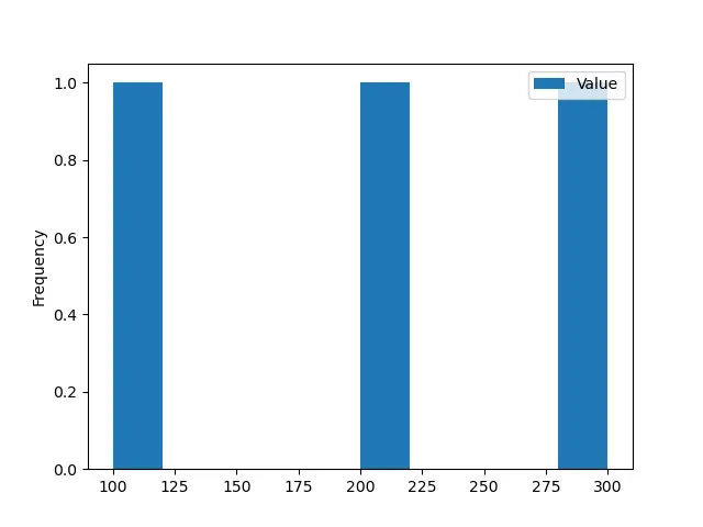
예제 코드: DataFrame.plot.hist()
먼저 간단한 DataFrame을 사용하여 히스토그램을 플로팅 해 보겠습니다.
import pandas as pd
dataframe = pd.DataFrame({'Value':[100, 200, 300]})
print(dataframe)
DataFrame은 다음과 같습니다.
 Value
0  100
1  200
2  300
이 함수의 모든 매개 변수는 선택 사항입니다. 매개 변수를 전달하지 않고이 함수를 실행하면 다음 출력이 생성됩니다.
import pandas as pd
from matplotlib import pyplot as plt

dataframe = pd.DataFrame({"Value": [100, 200, 300]})

histogram = dataframe.plot.hist()
print(histogram)
plt.show()
출력:
AxesSubplot(0.125,0.125;0.775x0.755)
예제 코드: 복잡한 히스토그램을 그리는DataFrame.plot.hist()
이제DataFrame을 복잡한 것으로 변환합니다.
import pandas as pd
import numpy as np

dataframe = pd.DataFrame(np.random.randint(0, 200, size=(200, 3)), columns=list("ABC"))

print(dataframe)
우리의DataFrame은
 A    B    C
0     15  163  163
1     29    7   54
2    195   40    6
3    183   92   57
4     72  167   40
..   ...  ...  ...
195   79   35    7
196  122   79  142
197  121   46  124
198  138  141  114
199  148   95  129

[200 rows x 3 columns]
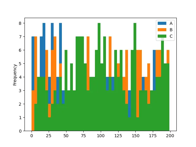
NumPy.random.randint() 함수를 사용하여 다음을 포함하는DataFrame을 만들었습니다. 임의의 정수. 이제DataFrame.plot.hist()함수를 사용하여이DataFrame의 히스토그램을 그릴 것입니다.
import pandas as pd
import numpy as np

from matplotlib import pyplot as plt

dataframe = pd.DataFrame(np.random.randint(0, 200, size=(200, 3)), columns=list("ABC"))

histogram = dataframe.plot.hist()
print(histogram)
plt.show()
출력:
AxesSubplot(0.125,0.125;0.775x0.755)
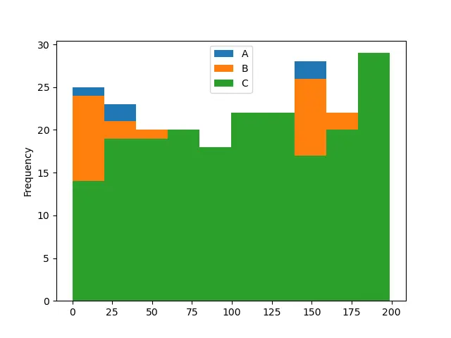
이 함수는 기본적으로 빈이 10 개인 히스토그램을 그렸습니다. DataFrame의 3 개 열의 빈도 분포를 보여줍니다. 각 열은 특정 색상으로 표시됩니다.
예제 코드: Bin 수를 변경하는DataFrame.plot.hist()
import pandas as pd
import numpy as np
from matplotlib import pyplot as plt

dataframe = pd.DataFrame(np.random.randint(0, 200, size=(200, 3)), columns=list("ABC"))

histogram = dataframe.plot.hist(bins=2)
print(histogram)
plt.show()
출력:
AxesSubplot(0.125,0.125;0.775x0.755)
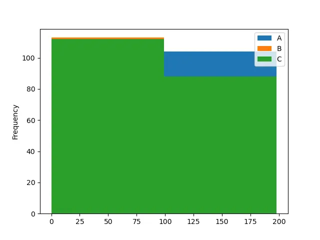
import pandas as pd
import numpy as np
from matplotlib import pyplot as plt

dataframe = pd.DataFrame(np.random.randint(0, 200, size=(200, 3)), columns=list("ABC"))

histogram = dataframe.plot.hist(bins=50)
print(histogram)
plt.show()
출력:
AxesSubplot(0.125,0.125;0.775x0.755)
첫 번째 예제 코드에서는 빈 수를 2로 변경하고 두 번째 예제 코드에서는 50입니다. 빈 수가 많을수록 히스토그램을 이해하기가 더 쉽습니다. 첫 번째 히스토그램은 열 A막대를 볼 수 없기 때문에 모호합니다.
튜토리얼이 마음에 드시나요? DelftStack을 구독하세요 YouTube에서 저희가 더 많은 고품질 비디오 가이드를 제작할 수 있도록 지원해주세요. 구독하다
관련 문장 - Pandas DataFrame
- Pandas concat 함수
- Pandas cut 기능
- Pandas DataFrame sort_index() 함수
- Pandas DataFrame.idxmax() 함수
- Pandas DataFrame.insert() 함수
- Pandas DataFrame.resample() 함수