Pandas DataFrame DataFrame.plot.hist() 函数
Minahil Noor
2023年1月30日
Pandas
Pandas DataFrame
Pandas DataFrame Plot
-
pandas.DataFrame.plot.hist()语法 -
示例代码:
DataFrame.plot.hist() -
示例代码:
DataFrame.plot.hist()绘制复杂的直方图 -
示例代码:
DataFrame.plot.hist()改变bin数量

Python Pandas DataFrame.plot.hist() 函数绘制了一个 DataFrame 的列的单一直方图。直方图以图形的形式表示数据。它可以创建范围的条形图。越高的条形图表明有更多的数据落入这个条形图的范围。
pandas.DataFrame.plot.hist() 语法
DataFrame.sample(by=None, bins=10, **kwargs)
参数
by |
它是一个字符串或序列。它代表 DataFrame 中要分组的列。 |
bins |
它是一个整数。它表示直方块的数量。一个直方块就像一个范围,例如,0-5,6-10 等。 |
**kwargs |
这些是自定义直方图的附加关键字参数。你可以在这里查看更多信息。 |
返回值
它返回一个绘制的直方图和 AxesSubplot 数据。
示例代码:DataFrame.plot.hist()
让我们先用一个简单的 DataFrame 绘制一个直方图。
import pandas as pd
dataframe = pd.DataFrame({'Value':[100, 200, 300]})
print(dataframe)
我们的 DataFrame 看起来像,
 Value
0  100
1  200
2  300
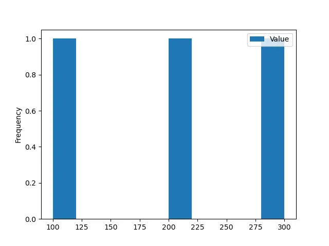
这个函数的所有参数都是可选的。如果我们在执行这个函数时不传递任何参数,那么它将产生以下输出。
import pandas as pd
from matplotlib import pyplot as plt

dataframe = pd.DataFrame({"Value": [100, 200, 300]})

histogram = dataframe.plot.hist()
print(histogram)
plt.show()
输出:
AxesSubplot(0.125,0.125;0.775x0.755)
示例代码:DataFrame.plot.hist() 绘制复杂的直方图
现在,我们将把我们的 DataFrame 转换为一个复杂的情况。
import pandas as pd
import numpy as np

dataframe = pd.DataFrame(np.random.randint(0, 200, size=(200, 3)), columns=list("ABC"))

print(dataframe)
我们的 DataFrame 变成:
 A    B    C
0     15  163  163
1     29    7   54
2    195   40    6
3    183   92   57
4     72  167   40
..   ...  ...  ...
195   79   35    7
196  122   79  142
197  121   46  124
198  138  141  114
199  148   95  129

[200 rows x 3 columns]
我们已经使用 NumPy.random.randint() 函数创建了一个包含随机整数的 DataFrame。现在,我们将使用 DataFrame.plot.hist() 函数绘制这个 DataFrame 的直方图。
import pandas as pd
import numpy as np

from matplotlib import pyplot as plt

dataframe = pd.DataFrame(np.random.randint(0, 200, size=(200, 3)), columns=list("ABC"))

histogram = dataframe.plot.hist()
print(histogram)
plt.show()
输出:
AxesSubplot(0.125,0.125;0.775x0.755)
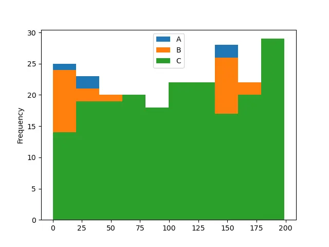
该函数绘制了一个直方图,默认有 10 个 bin。它显示了 DataFrame 中三列的频率分布。每一列用特定的颜色表示。
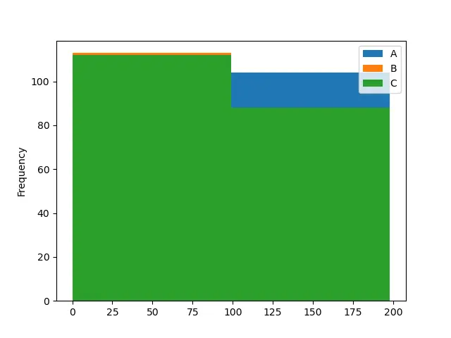
示例代码: DataFrame.plot.hist() 改变 bin 数量
import pandas as pd
import numpy as np
from matplotlib import pyplot as plt

dataframe = pd.DataFrame(np.random.randint(0, 200, size=(200, 3)), columns=list("ABC"))

histogram = dataframe.plot.hist(bins=2)
print(histogram)
plt.show()
输出:
AxesSubplot(0.125,0.125;0.775x0.755)
import pandas as pd
import numpy as np
from matplotlib import pyplot as plt

dataframe = pd.DataFrame(np.random.randint(0, 200, size=(200, 3)), columns=list("ABC"))

histogram = dataframe.plot.hist(bins=50)
print(histogram)
plt.show()
输出:
AxesSubplot(0.125,0.125;0.775x0.755)
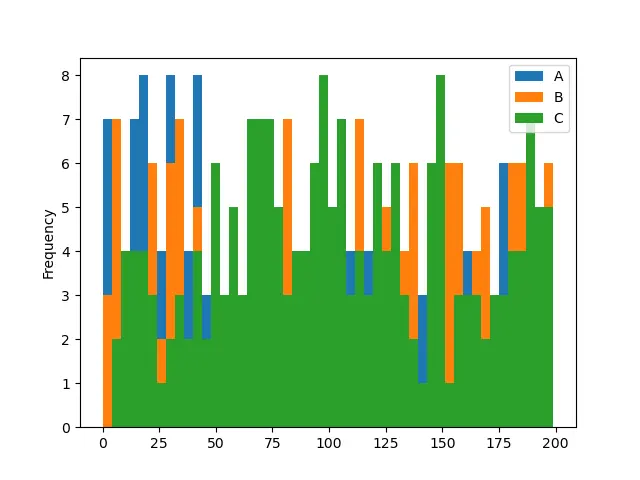
在第一个例子的代码中,我们将 bins 数改为 2,而在第二个例子的代码中,则是 50。请注意,bins 数越多,越容易理解直方图。第一个直方图是模糊的,因为我们无法看到 A 栏。
Enjoying our tutorials? Subscribe to DelftStack on YouTube to support us in creating more high-quality video guides. Subscribe
相关文章 - Pandas DataFrame
- Pandas concat 函数
- Pandas cut 函数
- Pandas DataFrame sort_index()函数
- Pandas DataFrame.idxmax()函数
- Pandas DataFrame.insert()函数
- Pandas DataFrame.resample()函数