Pandas DataFrame DataFrame.plot.hist() 関数
Minahil Noor
2023年1月30日
Pandas
Pandas DataFrame
Pandas DataFrame Plot
-
pandas.DataFrame.plot.hist()の構文 -
コード例:
DataFrame.plot.hist()) -
コード例:複素ヒストグラムを描画するための
DataFrame.plot.hist()の例題 -
コード例:
DataFrame.plot.hist()でビン数を変更する
Python Pandas DataFrame.plot.hist() 関数は、DataFrame の列の単一ヒストグラムを描画します。ヒストグラムはデータをグラフィカルな形式で表現します。これは範囲の棒グラフを作成します。高い棒は、より多くのデータがこの棒の範囲内にあることを示します。
pandas.DataFrame.plot.hist() の構文
DataFrame.sample(by=None, bins=10, **kwargs)
パラメータ
by |
これは文字列またはシーケンスです。これはグループ化する DataFrame のカラムを表します。 |
bins |
これは整数です。ヒストグラムのビンの数を表します。ビンは範囲のようなもので、例えば 0-5、6-10 などです。 |
**kwargs |
これらはヒストグラムをカスタマイズするための追加キーワード引数です。これらを確認することができますこちら。 |
戻り値
これはプロットされたヒストグラムと AxesSubplot データを返します。
コード例:DataFrame.plot.hist())
まず、単純な DataFrame を使ってヒストグラムをプロットしてみましょう。
import pandas as pd
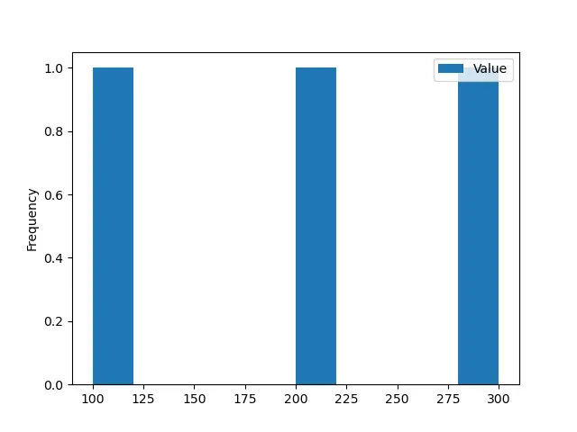
dataframe = pd.DataFrame({'Value':[100, 200, 300]})
print(dataframe)
この DataFrame は次のようになります。
 Value
0  100
1  200
2  300
この関数のすべてのパラメータはオプションです。パラメータを渡さずにこの関数を実行すると、以下のような出力が得られます。
import pandas as pd
from matplotlib import pyplot as plt

dataframe = pd.DataFrame({"Value": [100, 200, 300]})

histogram = dataframe.plot.hist()
print(histogram)
plt.show()
出力:
AxesSubplot(0.125,0.125;0.775x0.755)
コード例:複素ヒストグラムを描画するための DataFrame.plot.hist() の例題
ここで、DataFrame を複雑なものに変換します。
import pandas as pd
import numpy as np

dataframe = pd.DataFrame(np.random.randint(0, 200, size=(200, 3)), columns=list("ABC"))

print(dataframe)
私たちの DataFrame は次のようになります。
 A    B    C
0     15  163  163
1     29    7   54
2    195   40    6
3    183   92   57
4     72  167   40
..   ...  ...  ...
195   79   35    7
196  122   79  142
197  121   46  124
198  138  141  114
199  148   95  129

[200 rows x 3 columns]
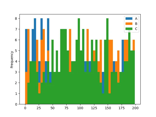
ここでは、NumPy.random.randint() 関数を用いて乱数整数を含む DataFrame を作成しました。ここで、関数 DataFrame.plot.hist() を用いて、この DataFrame のヒストグラムを描画します。
import pandas as pd
import numpy as np

from matplotlib import pyplot as plt

dataframe = pd.DataFrame(np.random.randint(0, 200, size=(200, 3)), columns=list("ABC"))

histogram = dataframe.plot.hist()
print(histogram)
plt.show()
出力:
AxesSubplot(0.125,0.125;0.775x0.755)
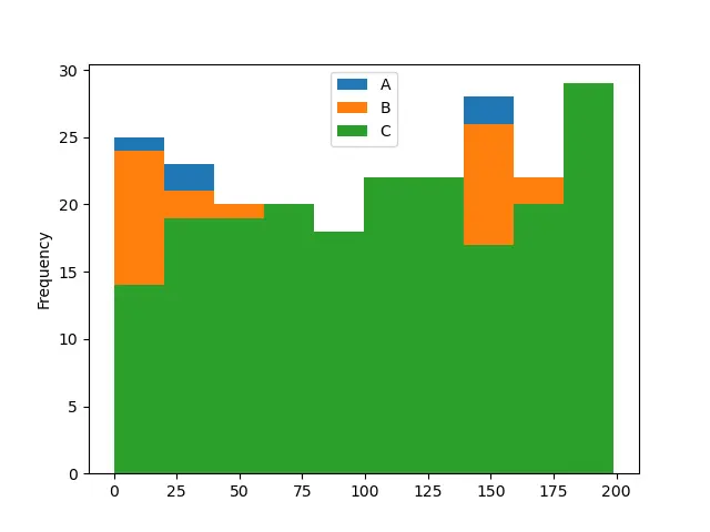
この関数はデフォルトで 10 ビンのヒストグラムを描画しています。これは DataFrame の 3つの列の度数分布を示します。各列は特定の色で表されます。
コード例:DataFrame.plot.hist() でビン数を変更する
import pandas as pd
import numpy as np
from matplotlib import pyplot as plt

dataframe = pd.DataFrame(np.random.randint(0, 200, size=(200, 3)), columns=list("ABC"))

histogram = dataframe.plot.hist(bins=2)
print(histogram)
plt.show()
出力:
AxesSubplot(0.125,0.125;0.775x0.755)
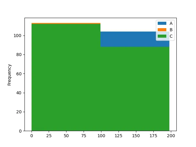
import pandas as pd
import numpy as np
from matplotlib import pyplot as plt

dataframe = pd.DataFrame(np.random.randint(0, 200, size=(200, 3)), columns=list("ABC"))

histogram = dataframe.plot.hist(bins=50)
print(histogram)
plt.show()
出力:
AxesSubplot(0.125,0.125;0.775x0.755)
最初の例のコードでは、ビンの数を 2 に変更し、2 番目の例のコードでは 50 に変更しています。ビンの数が多いほど、ヒストグラムを理解しやすいことに注意してください。最初のヒストグラムは、列 A のバーが見えないので、曖昧です。
チュートリアルを楽しんでいますか? <a href="https://www.youtube.com/@delftstack/?sub_confirmation=1" style="color: #a94442; font-weight: bold; text-decoration: underline;">DelftStackをチャンネル登録</a> して、高品質な動画ガイドをさらに制作するためのサポートをお願いします。 Subscribe
関連記事 - Pandas DataFrame
- Pandas cut 関数
- Pandas DataFrame sort_index() 関数
- Pandas DataFrame.idxmax() 関数
- Pandas DataFrame.insert() 関数
- Pandas DataFrame.resample() 関数
- Pandas DataFrame.reset_index() 関数