Pandas DataFrame DataFrame.plot.bar()関数
-
pandas.DataFrame.plot.bar()の構文 -
コード例:
DataFrame.plot.bar() -
コード例:複数のデータ列を持つ
DataFrame.plot.bar() -
コード例:サブプロットを作成するための
subplots = Trueを指定するDataFrame.plot.bar() -
コード例:単一のデータ列をプロットするための
DataFrame.plot.bar() -
コード例:指定された色を持つ
DataFrame.plot.bar()

Python Pandas DataFrame.plot.bar() 関数は棒グラフをプロットします指定された軸。グラフをカテゴリ別にプロットします。カテゴリは x 軸に与えられ、値は y 軸に与えられます。
pandas.DataFrame.plot.bar() の構文
DataFrame.sample(x=None, y=None, **kwds)
パラメーター
x |
これは、カテゴリがプロットされる軸です。指定されていない場合、DataFrame のインデックスが使用されます。 |
y |
これは、カテゴリーに対してプロットされた値を表します。指定されていない場合は、カテゴリに対して DataFrame のすべての数値列をプロットします。 |
**kwds |
これらは、プロットされたグラフをカスタマイズするための追加のキーワード引数です。これらはこちらで確認できます。 |
戻り値
N 次元の配列を返します。subplots = True の場合、列ごとに matplotlib.axes.Axes を含む N 次元の配列を返します。
コード例:DataFrame.plot.bar()
まず、簡単な DataFrame を使用してこの関数を理解しましょう。
import pandas as pd
dataframe = pd.DataFrame({'Value':[100, 200, 300]})
print(dataframe)
DataFrame は次のようになります
 Value
0  100
1  200
2  300
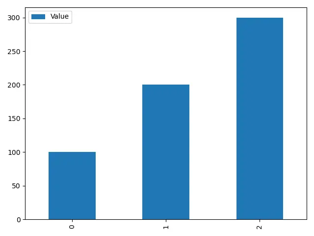
この関数のすべてのパラメーターはオプションです。パラメータを渡さずにこの関数を実行すると、インデックスが X 軸、数値データ列が Y 軸になります。
import pandas as pd
import matplotlib.pyplot as plt

dataframe = pd.DataFrame({"Value": [100, 200, 300]})
axis = dataframe.plot.bar(rot=0)
print(axis)
plt.show()
出力:
AxesSubplot(0.125,0.125;0.775x0.755)
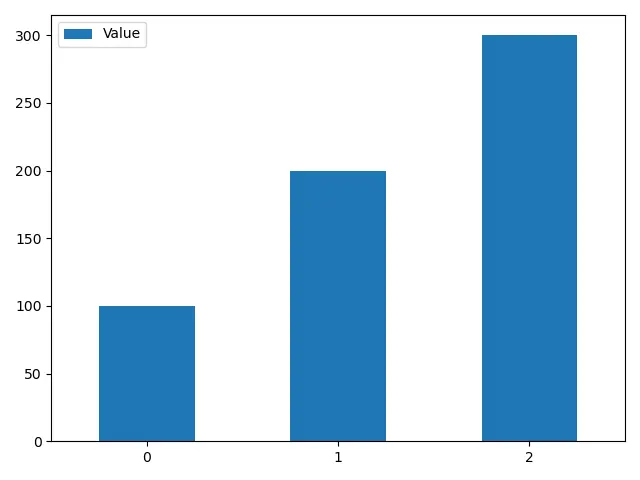
パラメータ rot は追加のキーワードパラメータです。X 軸上のカテゴリ名の回転を変更します。
rot を設定しない場合、プロットは以下のようになります。
コード例:複数のデータ列を持つ DataFrame.plot.bar()
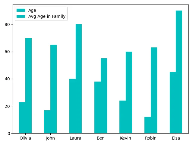
次に、DataFrame を複雑なものに変更します。
import pandas as pd

dataframe = pd.DataFrame(
    {
        "Age": [23, 17, 40, 38, 24, 12, 45],
        "Avg Age in Family": [70, 65, 80, 55, 60, 63, 90],
    },
    index=["Olivia", "John", "Laura", "Ben", "Kevin", "Robin", "Elsa"],
)
print(dataframe)
DataFrame は次のようになります
        Age  Avg Age in Family
Olivia   23                 70
John     17                 65
Laura    40                 80
Ben      38                 55
Kevin    24                 60
Robin    12                 63
Elsa     45                 90
DataFrame.plot.bar() 関数を使用してこの DataFrame をプロットします
import pandas as pd
import matplotlib.pyplot as plt

dataframe = pd.DataFrame(
    {
        "Age": [23, 17, 40, 38, 24, 12, 45],
        "Avg Age in Family": [70, 65, 80, 55, 60, 63, 90],
    },
    index=["Olivia", "John", "Laura", "Ben", "Kevin", "Robin", "Elsa"],
)
axis = dataframe.plot.bar(rot=0)
print(axis)
plt.show()
出力:
AxesSubplot(0.125,0.125;0.775x0.755)
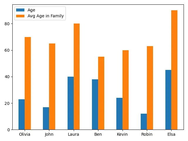
各カテゴリの数値データの 2つの棒を含む棒グラフを生成します。データを効率的に分析するのに役立ちます。
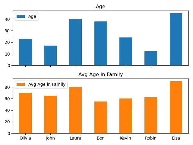
コード例:サブプロットを作成するための subplots = True を指定する DataFrame.plot.bar()
subplots = True の場合、関数は列ごとに matplotlib.axes.Axes を含む N 次元の 配列を返します。これを使用して、データ列を単一のプロットではなく、異なるサブプロットに分離できます。
import pandas as pd
import matplotlib.pyplot as plt

dataframe = pd.DataFrame(
    {
        "Age": [23, 17, 40, 38, 24, 12, 45],
        "Avg Age in Family": [70, 65, 80, 55, 60, 63, 90],
    },
    index=["Olivia", "John", "Laura", "Ben", "Kevin", "Robin", "Elsa"],
)
axes = dataframe.plot.bar(rot=0, subplots=True)
print(axes)
plt.show()
出力:
[<matplotlib.axes._subplots.AxesSubplot object at 0x0000029A89B06DC8>
 <matplotlib.axes._subplots.AxesSubplot object at 0x0000029A89B4B2C8>]
コード例:単一のデータ列をプロットするための DataFrame.plot.bar()
import pandas as pd
import matplotlib.pyplot as plt

dataframe = pd.DataFrame(
    {
        "Age": [23, 17, 40, 38, 24, 12, 45],
        "Avg Age in Family": [70, 65, 80, 55, 60, 63, 90],
    },
    index=["Olivia", "John", "Laura", "Ben", "Kevin", "Robin", "Elsa"],
)
axis = dataframe.plot.bar(y="Age", rot=0)
print(axis)
plt.show()
出力:
AxesSubplot(0.125,0.125;0.775x0.755)
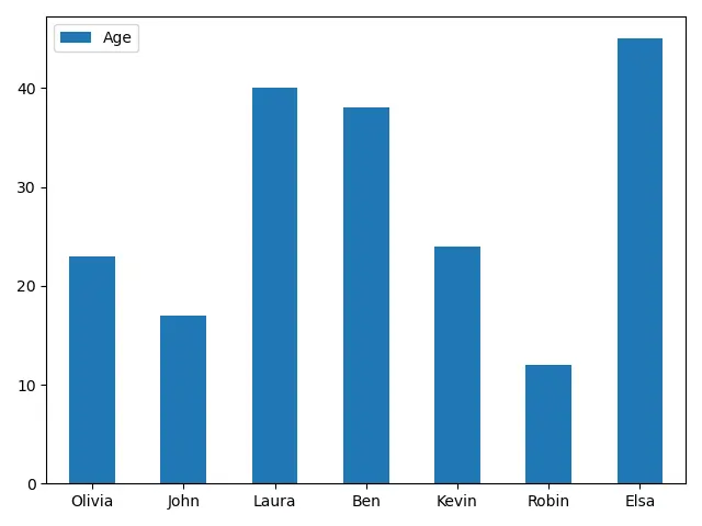
インデックスをカテゴリとしてプロットする代わりに、他の列に対してデータ列をプロットすることもできます。
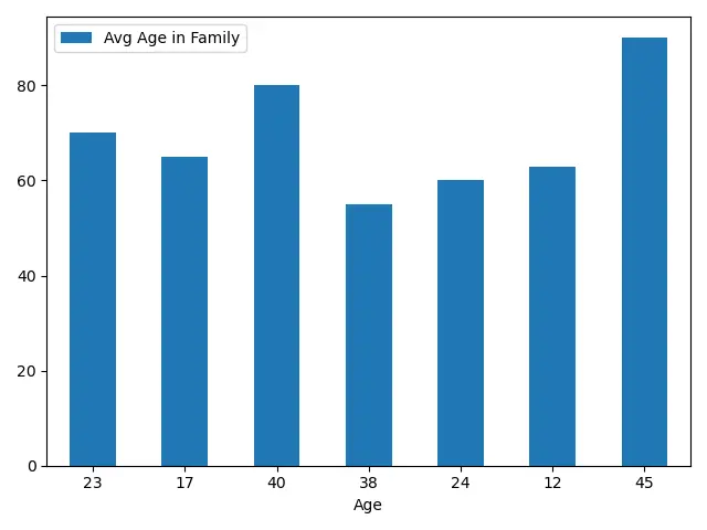
import pandas as pd
import matplotlib.pyplot as plt

dataframe = pd.DataFrame(
    {
        "Age": [23, 17, 40, 38, 24, 12, 45],
        "Avg Age in Family": [70, 65, 80, 55, 60, 63, 90],
    },
    index=["Olivia", "John", "Laura", "Ben", "Kevin", "Robin", "Elsa"],
)
axis = dataframe.plot.bar(x="Age", rot=0)
print(axis)
plt.show()
出力:
AxesSubplot(0.125,0.125;0.775x0.755)
コード例:指定された色を持つ DataFrame.plot.bar()
import pandas as pd
import matplotlib.pyplot as plt

dataframe = pd.DataFrame(
    {
        "Age": [23, 17, 40, 38, 24, 12, 45],
        "Avg Age in Family": [70, 65, 80, 55, 60, 63, 90],
    },
    index=["Olivia", "John", "Laura", "Ben", "Kevin", "Robin", "Elsa"],
)
axis = dataframe.plot.bar(rot=0, color="m")
plt.show()
DataFrame のすべての列の色 m を指定します。
import pandas as pd
import matplotlib.pyplot as plt

dataframe = pd.DataFrame(
    {
        "Age": [23, 17, 40, 38, 24, 12, 45],
        "Avg Age in Family": [70, 65, 80, 55, 60, 63, 90],
    },
    index=["Olivia", "John", "Laura", "Ben", "Kevin", "Robin", "Elsa"],
)
axis = dataframe.plot.bar(rot=0, color=["r", "b"])
print(axis)
plt.show()
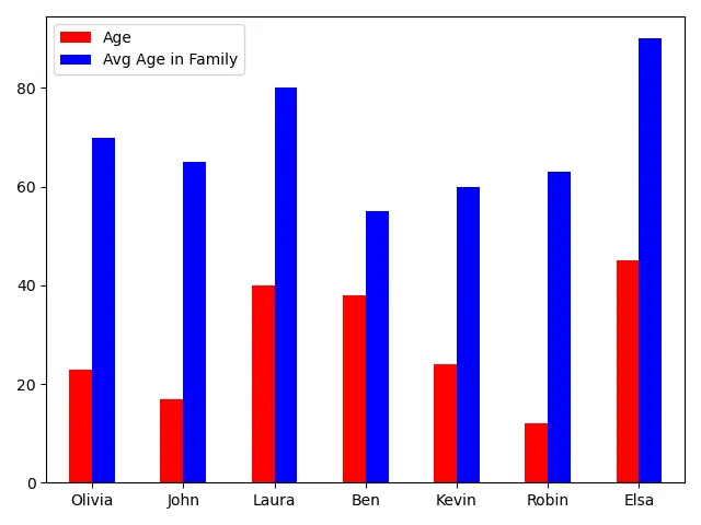
また、color パラメータにカラーリストを指定することで、DataFrame の異なる列に異なる色を指定することもできます。
関連記事 - Pandas DataFrame
- Pandas cut 関数
- Pandas DataFrame sort_index() 関数
- Pandas DataFrame.idxmax() 関数
- Pandas DataFrame.insert() 関数
- Pandas DataFrame.resample() 関数
- Pandas DataFrame.reset_index() 関数