Pandas DataFrame DataFrame.plot.bar() 함수
-
pandas.DataFrame.plot.bar()구문 -
예제 코드:
DataFrame.plot.bar() -
예제 코드: 여러 데이터 열이있는
DataFrame.plot.bar() -
예제 코드: 서브 플롯 생성을위한
subplots = True를 사용하는DataFrame.plot.bar() -
예제 코드: 단일 데이터 열을 그리는
DataFrame.plot.bar() -
예제 코드: 지정된 색상의
DataFrame.plot.bar()

Python Pandas DataFrame.plot.bar() 함수는 막대 그래프를 지정된 축. 범주별로 그래프를 표시합니다. 범주는 x 축에 제공되고 값은 y 축에 제공됩니다.
pandas.DataFrame.plot.bar()구문
DataFrame.sample(x=None, y=None, **kwds)
매개 변수
x |
카테고리가 표시되는 축입니다. 지정하지 않으면DataFrame의 인덱스가 사용됩니다. |
y |
카테고리에 대해 그려진 값을 나타냅니다. 지정하지 않으면 카테고리에 대해DataFrame의 모든 숫자 열을 플로팅합니다. |
**kwds |
플로팅 된 그래프를 사용자 정의하기위한 추가 키워드 인수입니다. 여기에서 확인할 수 있습니다. |
반환
N 차원 배열을 반환합니다. subplots=True이면 열당matplotlib.axes.Axes가있는 N 차원 배열을 반환합니다.
예제 코드: DataFrame.plot.bar()
먼저 간단한 DataFrame을 사용하여이 함수를 이해합시다.
import pandas as pd
dataframe = pd.DataFrame({'Value':[100, 200, 300]})
print(dataframe)
DataFrame은 다음과 같습니다.
 Value
0  100
1  200
2  300
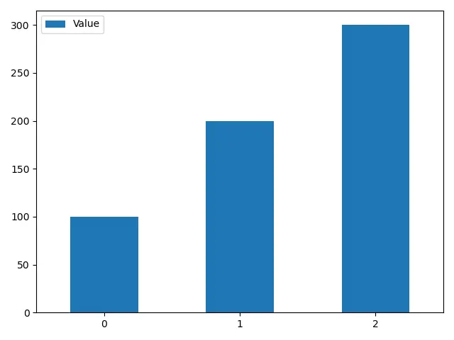
이 함수의 모든 매개 변수는 선택 사항입니다. 매개 변수를 전달하지 않고이 함수를 실행하면 인덱스를 x 축으로, 숫자 데이터 열을 y 축으로 취합니다.
import pandas as pd
import matplotlib.pyplot as plt

dataframe = pd.DataFrame({"Value": [100, 200, 300]})
axis = dataframe.plot.bar(rot=0)
print(axis)
plt.show()
출력:
AxesSubplot(0.125,0.125;0.775x0.755)
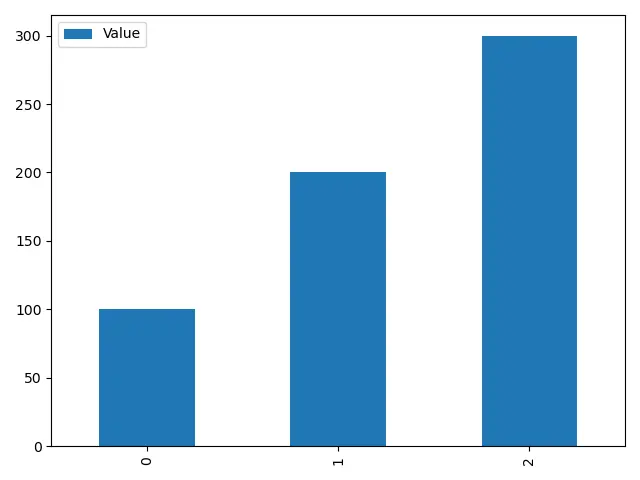
rot매개 변수는 추가 키워드 매개 변수입니다. x 축에서 범주 이름의 회전을 변경합니다.
rot을 설정하지 않으면 플롯은 아래와 같습니다.
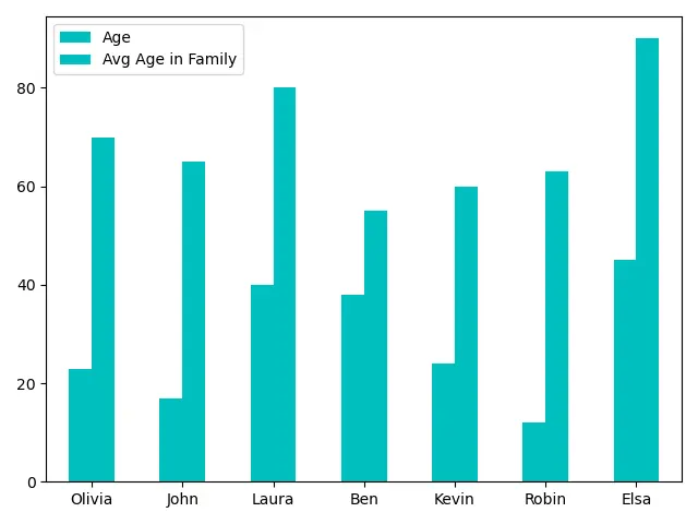
예제 코드: 여러 데이터 열이있는DataFrame.plot.bar()
이제DataFrame을 복잡한 것으로 변경합니다.
import pandas as pd

dataframe = pd.DataFrame(
    {
        "Age": [23, 17, 40, 38, 24, 12, 45],
        "Avg Age in Family": [70, 65, 80, 55, 60, 63, 90],
    },
    index=["Olivia", "John", "Laura", "Ben", "Kevin", "Robin", "Elsa"],
)
print(dataframe)
DataFrame은 다음과 같습니다.
        Age  Avg Age in Family
Olivia   23                 70
John     17                 65
Laura    40                 80
Ben      38                 55
Kevin    24                 60
Robin    12                 63
Elsa     45                 90
DataFrame.plot.bar()함수를 사용하여이DataFrame을 플로팅합니다.
import pandas as pd
import matplotlib.pyplot as plt

dataframe = pd.DataFrame(
    {
        "Age": [23, 17, 40, 38, 24, 12, 45],
        "Avg Age in Family": [70, 65, 80, 55, 60, 63, 90],
    },
    index=["Olivia", "John", "Laura", "Ben", "Kevin", "Robin", "Elsa"],
)
axis = dataframe.plot.bar(rot=0)
print(axis)
plt.show()
출력:
AxesSubplot(0.125,0.125;0.775x0.755)
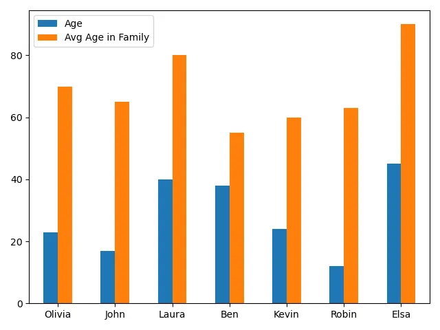
각 범주의 수치 데이터 막대 두 개를 포함하는 막대 그래프를 생성합니다. 데이터를 효율적으로 분석하는 데 도움이됩니다.
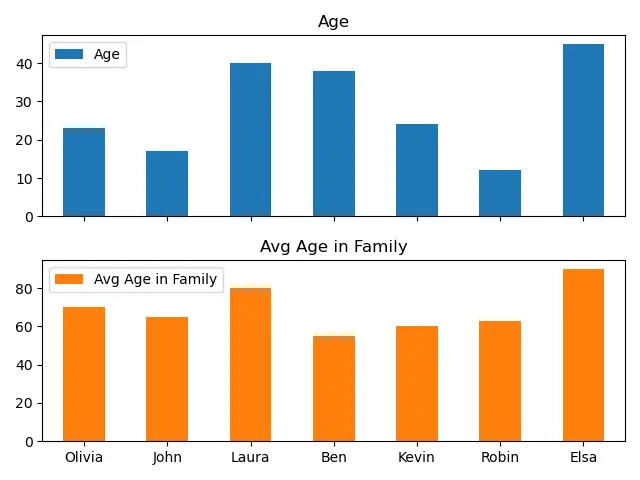
예제 코드: 서브 플롯 생성을위한subplots = True를 사용하는DataFrame.plot.bar()
subplots = True이면 함수는 열당matplotlib.axes.Axes가있는 N 차원 배열을 반환합니다. 이를 사용하여 데이터 열을 하나의 단일 플롯 대신 다른 서브 플롯으로 분리 할 수 있습니다.
import pandas as pd
import matplotlib.pyplot as plt

dataframe = pd.DataFrame(
    {
        "Age": [23, 17, 40, 38, 24, 12, 45],
        "Avg Age in Family": [70, 65, 80, 55, 60, 63, 90],
    },
    index=["Olivia", "John", "Laura", "Ben", "Kevin", "Robin", "Elsa"],
)
axes = dataframe.plot.bar(rot=0, subplots=True)
print(axes)
plt.show()
출력:
[<matplotlib.axes._subplots.AxesSubplot object at 0x0000029A89B06DC8>
 <matplotlib.axes._subplots.AxesSubplot object at 0x0000029A89B4B2C8>]
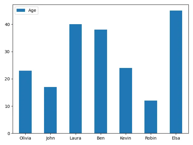
예제 코드: 단일 데이터 열을 그리는DataFrame.plot.bar()
import pandas as pd
import matplotlib.pyplot as plt

dataframe = pd.DataFrame(
    {
        "Age": [23, 17, 40, 38, 24, 12, 45],
        "Avg Age in Family": [70, 65, 80, 55, 60, 63, 90],
    },
    index=["Olivia", "John", "Laura", "Ben", "Kevin", "Robin", "Elsa"],
)
axis = dataframe.plot.bar(y="Age", rot=0)
print(axis)
plt.show()
출력:
AxesSubplot(0.125,0.125;0.775x0.755)
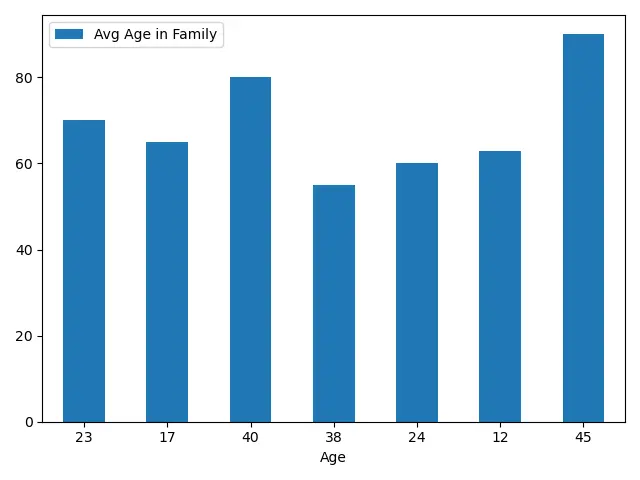
인덱스를 범주로 표시하는 대신 다른 열에 대해 데이터 열을 표시 할 수도 있습니다.
import pandas as pd
import matplotlib.pyplot as plt

dataframe = pd.DataFrame(
    {
        "Age": [23, 17, 40, 38, 24, 12, 45],
        "Avg Age in Family": [70, 65, 80, 55, 60, 63, 90],
    },
    index=["Olivia", "John", "Laura", "Ben", "Kevin", "Robin", "Elsa"],
)
axis = dataframe.plot.bar(x="Age", rot=0)
print(axis)
plt.show()
출력:
AxesSubplot(0.125,0.125;0.775x0.755)
예제 코드: 지정된 색상의DataFrame.plot.bar()
import pandas as pd
import matplotlib.pyplot as plt

dataframe = pd.DataFrame(
    {
        "Age": [23, 17, 40, 38, 24, 12, 45],
        "Avg Age in Family": [70, 65, 80, 55, 60, 63, 90],
    },
    index=["Olivia", "John", "Laura", "Ben", "Kevin", "Robin", "Elsa"],
)
axis = dataframe.plot.bar(rot=0, color="m")
plt.show()
DataFrame의 모든 열에 대해 m색상을 지정합니다.
import pandas as pd
import matplotlib.pyplot as plt

dataframe = pd.DataFrame(
    {
        "Age": [23, 17, 40, 38, 24, 12, 45],
        "Avg Age in Family": [70, 65, 80, 55, 60, 63, 90],
    },
    index=["Olivia", "John", "Laura", "Ben", "Kevin", "Robin", "Elsa"],
)
axis = dataframe.plot.bar(rot=0, color=["r", "b"])
print(axis)
plt.show()
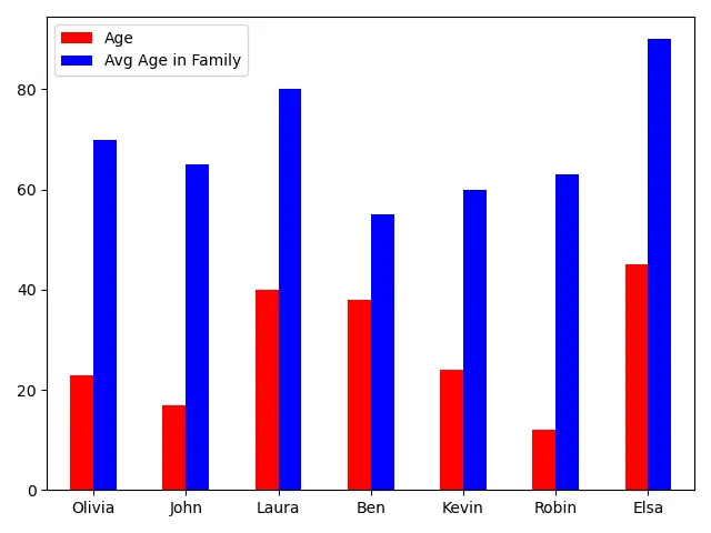
color 매개 변수에 색상 목록을 제공하여DataFrame의 다른 열에 대해 다른 색상을 지정할 수도 있습니다.
관련 문장 - Pandas DataFrame
- Pandas concat 함수
- Pandas cut 기능
- Pandas DataFrame sort_index() 함수
- Pandas DataFrame.idxmax() 함수
- Pandas DataFrame.insert() 함수
- Pandas DataFrame.resample() 함수