Pandas DataFrame DataFrame.plot.bar() 函式
Minahil Noor
2023年1月30日
Pandas
Pandas DataFrame
Pandas DataFrame Plot
-
pandas.DataFrame.plot.bar()語法 -
示例程式碼:
DataFrame.plot.bar() -
示例程式碼:
DataFrame.plot.bar()與多資料列的關係 -
示例程式碼:
DataFrame.plot.bar()與subplots=True建立子圖 -
示例程式碼:
DataFrame.plot.bar()來繪製單個資料列 -
示例程式碼:
DataFrame.plot.bar()與指定的顏色

Python Pandas DataFrame.plot.bar() 函式沿著指定的軸線繪製一個條形圖。它將圖形按類別繪製。分類在 X 軸上給出,數值在 Y 軸上給出。
pandas.DataFrame.plot.bar() 語法
DataFrame.sample(x=None, y=None, **kwds)
引數
x |
這是繪製類別的軸。如果沒有指定,則使用 DataFrame 的索引 |
y |
它代表的是針對類別繪製的數值。如果沒有指定,那麼它就會將 DataFrame 的所有數字列與類別進行對比 |
**kwds |
這些是額外的關鍵字引數,用於自定義繪製的圖形。你可以參考這裡 |
返回值
它返回一個 N 維的陣列,如果 subplots=True,則返回 N 維的陣列,每列有 matplotlib.axes.Axes。如果 subplots=True,則返回 N 維陣列,每列有是 matplotlib.axes.Axes。
示例程式碼:DataFrame.plot.bar()
我們先用一個簡單的 DataFrame 來理解這個函式。
import pandas as pd
dataframe = pd.DataFrame({'Value':[100, 200, 300]})
print(dataframe)
我們的 DataFrame 為,
 Value
0  100
1  200
2  300
這個函式的所有引數都是可選的。如果我們在執行這個函式時沒有傳遞任何引數,那麼它將索引作為 X 軸,數字資料列作為 Y 軸。
import pandas as pd
import matplotlib.pyplot as plt

dataframe = pd.DataFrame({"Value": [100, 200, 300]})
axis = dataframe.plot.bar(rot=0)
print(axis)
plt.show()
輸出:
AxesSubplot(0.125,0.125;0.775x0.755)
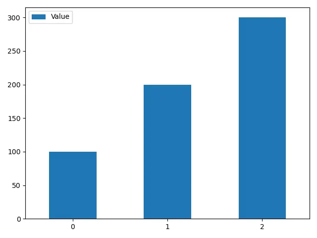
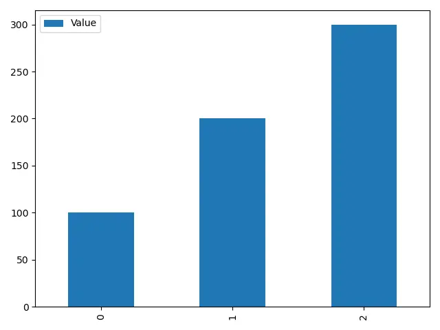
引數 rot 是一個附加的關鍵字引數。它改變了 X 軸上類別名稱的旋轉。
如果我們不設定 rot,圖中會出現下面的情況。
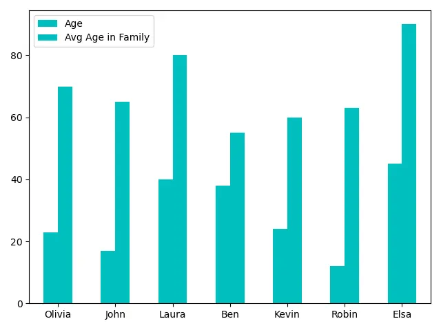
示例程式碼:DataFrame.plot.bar() 與多資料列的關係
現在,我們將把我們的 DataFrame 改成一個複雜的資料。
import pandas as pd

dataframe = pd.DataFrame(
    {
        "Age": [23, 17, 40, 38, 24, 12, 45],
        "Avg Age in Family": [70, 65, 80, 55, 60, 63, 90],
    },
    index=["Olivia", "John", "Laura", "Ben", "Kevin", "Robin", "Elsa"],
)
print(dataframe)
我們的 DataFrame 為,
        Age  Avg Age in Family
Olivia   23                 70
John     17                 65
Laura    40                 80
Ben      38                 55
Kevin    24                 60
Robin    12                 63
Elsa     45                 90
使用 DataFrame.plot.bar() 函式繪製這個 DataFrame。
import pandas as pd
import matplotlib.pyplot as plt

dataframe = pd.DataFrame(
    {
        "Age": [23, 17, 40, 38, 24, 12, 45],
        "Avg Age in Family": [70, 65, 80, 55, 60, 63, 90],
    },
    index=["Olivia", "John", "Laura", "Ben", "Kevin", "Robin", "Elsa"],
)
axis = dataframe.plot.bar(rot=0)
print(axis)
plt.show()
輸出:
AxesSubplot(0.125,0.125;0.775x0.755)
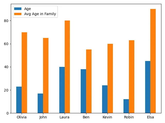
它能生成一個包含每個類別的兩個條形數字資料的條形圖。它有助於有效地分析資料。
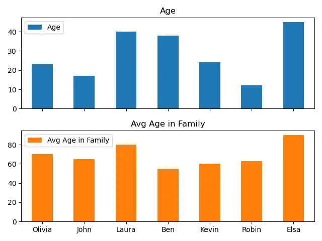
示例程式碼:DataFrame.plot.bar() 與 subplots=True 建立子圖
如果 subplots=True,那麼函式返回一個 N 維的陣列,每列有 matplotlib.axes.Axes。使用這個函式,我們可以將資料列分成不同的子圖,而不是一個單一的圖。
import pandas as pd
import matplotlib.pyplot as plt

dataframe = pd.DataFrame(
    {
        "Age": [23, 17, 40, 38, 24, 12, 45],
        "Avg Age in Family": [70, 65, 80, 55, 60, 63, 90],
    },
    index=["Olivia", "John", "Laura", "Ben", "Kevin", "Robin", "Elsa"],
)
axes = dataframe.plot.bar(rot=0, subplots=True)
print(axes)
plt.show()
輸出:
[<matplotlib.axes._subplots.AxesSubplot object at 0x0000029A89B06DC8>
 <matplotlib.axes._subplots.AxesSubplot object at 0x0000029A89B4B2C8>]
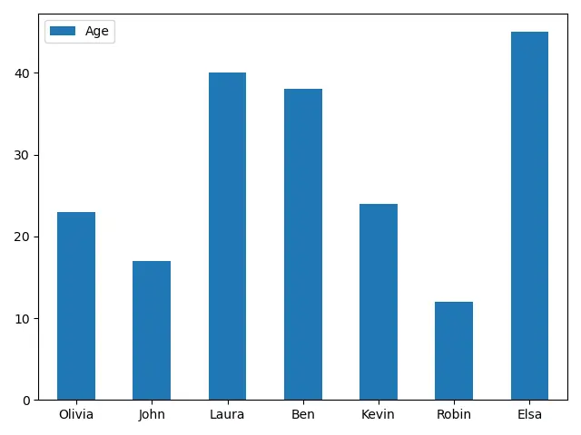
示例程式碼:DataFrame.plot.bar() 來繪製單個資料列
import pandas as pd
import matplotlib.pyplot as plt

dataframe = pd.DataFrame(
    {
        "Age": [23, 17, 40, 38, 24, 12, 45],
        "Avg Age in Family": [70, 65, 80, 55, 60, 63, 90],
    },
    index=["Olivia", "John", "Laura", "Ben", "Kevin", "Robin", "Elsa"],
)
axis = dataframe.plot.bar(y="Age", rot=0)
print(axis)
plt.show()
輸出:
AxesSubplot(0.125,0.125;0.775x0.755)
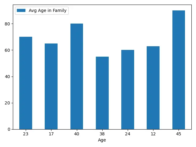
我們還可以將任何資料列與其他列進行對比,而不是將索引作為類別進行繪製。
import pandas as pd
import matplotlib.pyplot as plt

dataframe = pd.DataFrame(
    {
        "Age": [23, 17, 40, 38, 24, 12, 45],
        "Avg Age in Family": [70, 65, 80, 55, 60, 63, 90],
    },
    index=["Olivia", "John", "Laura", "Ben", "Kevin", "Robin", "Elsa"],
)
axis = dataframe.plot.bar(x="Age", rot=0)
print(axis)
plt.show()
輸出:
AxesSubplot(0.125,0.125;0.775x0.755)
示例程式碼:DataFrame.plot.bar() 與指定的顏色
import pandas as pd
import matplotlib.pyplot as plt

dataframe = pd.DataFrame(
    {
        "Age": [23, 17, 40, 38, 24, 12, 45],
        "Avg Age in Family": [70, 65, 80, 55, 60, 63, 90],
    },
    index=["Olivia", "John", "Laura", "Ben", "Kevin", "Robin", "Elsa"],
)
axis = dataframe.plot.bar(rot=0, color="m")
plt.show()
它為 DataFrame 中的所有列指定顏色為 m。
import pandas as pd
import matplotlib.pyplot as plt

dataframe = pd.DataFrame(
    {
        "Age": [23, 17, 40, 38, 24, 12, 45],
        "Avg Age in Family": [70, 65, 80, 55, 60, 63, 90],
    },
    index=["Olivia", "John", "Laura", "Ben", "Kevin", "Robin", "Elsa"],
)
axis = dataframe.plot.bar(rot=0, color=["r", "b"])
print(axis)
plt.show()
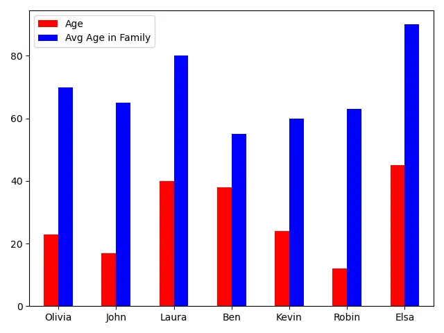
我們還可以通過給 color 引數提供一個顏色列表,為 DataFrame 中的不同列指定不同的顏色。
Enjoying our tutorials? Subscribe to DelftStack on YouTube to support us in creating more high-quality video guides. Subscribe
相關文章 - Pandas DataFrame
- Pandas concat 函式
- Pandas cut 函式
- Pandas DataFrame sort_index()函式
- Pandas DataFrame.idxmax()函式
- Pandas DataFrame.insert()函式
- Pandas DataFrame.resample()函式