HOWTO · R
How to Rotate Axis Labels in R
Learn how to rotate tick labels in Base R and ggplot2, and how to align them after rotation.
On this page
In R, axis labels can mean either tick labels (the text next to tick marks) or axis titles such as xlab and ylab. Base R uses the las graphical parameter for tick-label orientation, while ggplot2 uses element_text() in a theme. This distinction matters: rotating tick labels does not rotate an axis title.
Rotate Tick Labels in Base R
The las parameter controls the orientation of tick labels in Base R. Its four values are:
las = 0: labels are parallel to the axis (the default).las = 1: labels are horizontal.las = 2: labels are perpendicular to the axis.las = 3: labels are vertical.
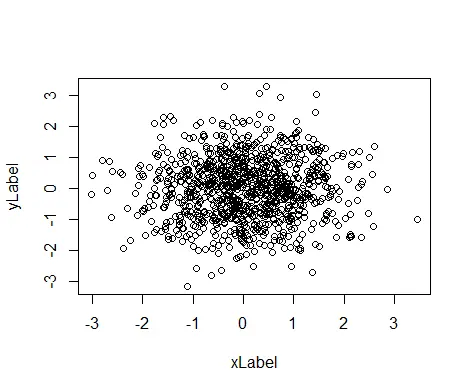
The setting can be supplied to plot() or another high-level graphics function. The following plot is the common starting point for the examples:
Example Code:
# Create example data
set.seed(99999)

xLabel <- rnorm(1000)
yLabel <- rnorm(1000)

# The Default Plot
plot(xLabel, yLabel)
Output:
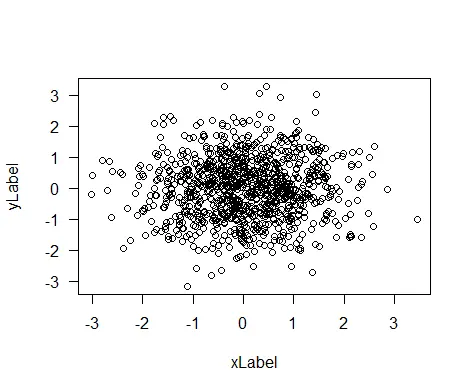
Use las = 1 for horizontal tick labels:
Example Code:
# Create example Data
set.seed(99999)

xLabel <- rnorm(1000)
yLabel <- rnorm(1000)

# The Horizontal Axis Plot
plot(xLabel, yLabel, las=1)
The code above creates a plot with horizontal tick labels.
Output:
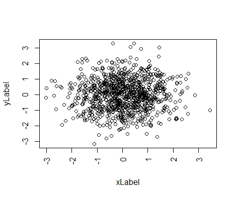
Use las = 3 for vertical tick labels. This is useful when horizontal labels overlap:
Example Code:
# Create example Data
set.seed(99999)

xLabel <- rnorm(1000)
yLabel <- rnorm(1000)

# The Vertical Axis Plot
plot(xLabel, yLabel, las=3)
The code above creates a plot with vertical tick labels.
Output:
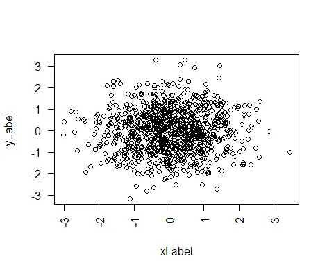
Use las = 2 when you want labels perpendicular to their axis:
Example Code:
# Create example Data
set.seed(99999)

xLabel <- rnorm(1000)
yLabel <- rnorm(1000)

# The Perpendicular Axis Plot
plot(xLabel, yLabel, las=2)
The code above creates a plot with tick labels perpendicular to their axes.
Output:
These values affect tick labels on the plot. They do not change an axis title. To set or change a title, use a separate argument such as xlab = "Horizontal value" or ylab = "Vertical value":
plot(xLabel, yLabel, las = 3,
     xlab = "Horizontal value", ylab = "Vertical value")
The las parameter is limited to these four documented orientations. If you need an arbitrary angle, use a custom text-drawing approach or use the ggplot2 approach below; axis() with las does not provide arbitrary angles.
Rotate Tick Labels in ggplot2
In ggplot2, style x-axis tick labels with axis.text.x and y-axis tick labels with axis.text.y. Pass an element_text() object to set angle, hjust (horizontal justification), and vjust (vertical justification).
plot + theme(axis.text.x = element_text(angle = 45, vjust = 1, hjust = 1))
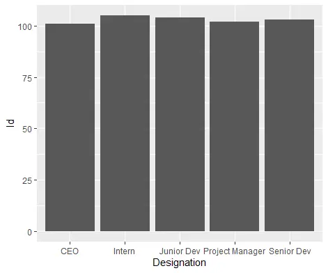
For example, this data produces long x-axis labels that benefit from rotation:
Example Code:
# Create example Data
Delftstack <- data.frame(Designation=c('CEO', 'Project Manager', 'Senior Dev', 'Junior Dev', 'Intern'),
                         Id=c(101, 102, 103, 104, 105))

library(ggplot2)

ggplot(Delftstack, aes(x = Designation, y = Id)) +
  geom_col()
The code above creates a default plot from the given data.
Output:
Rotate Tick Labels to 90 Degrees in ggplot2
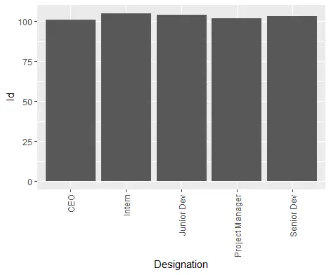
Rotate the x-axis tick labels to 90 degrees and align them with the tick marks:
Example Code:
# Create example Data
Delftstack <- data.frame(Designation=c('CEO', 'Project Manager', 'Senior Dev', 'Junior Dev', 'Intern'),
                         Id=c(101, 102, 103, 104, 105))

ggplot(Delftstack, aes(x = Designation, y = Id)) +
  geom_col() +
  theme(axis.text.x = element_text(angle = 90, vjust = 0.5, hjust = 1))
The code above creates a ggplot2 chart with 90-degree x-axis tick labels.
Output:
Rotate Tick Labels to 45 Degrees in ggplot2
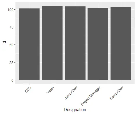
For a less severe rotation, use 45 degrees and adjust the justification:
Example Code:
# Create example Data
Delftstack <- data.frame(Designation=c('CEO', 'Project Manager', 'Senior Dev', 'Junior Dev', 'Intern'),
                         Id=c(101, 102, 103, 104, 105))

ggplot(Delftstack, aes(x = Designation, y = Id)) +
  geom_col() +
  theme(axis.text.x = element_text(angle = 45, vjust = 1, hjust = 1))
The code above creates a ggplot2 chart with 45-degree x-axis tick labels.
Output:
To rotate y-axis tick labels, change the theme target to axis.text.y. To rotate an axis title instead, use axis.title.x or axis.title.y, for example theme(axis.title.x = element_text(angle = 15)). This targets the title rather than the tick-label text.
Choosing an angle and alignment
Start with 90 degrees when category names are long or overlap. Try 45 degrees when the labels fit diagonally, then adjust hjust and vjust if the text appears too far from the axis. The best values can depend on the plot dimensions, font, and graphics device, so inspect the final output at its intended size. Rotation changes the text orientation; it does not automatically create more space in a cramped plotting area.
The Base R examples use only the standard graphics package. The ggplot2 examples require the ggplot2 package and a plot-rendering device. If a package is unavailable, install it according to your project’s environment policy rather than changing the example to a different plotting system.