在 R 中旋轉軸標籤
Base R 和 ggplot 在 R 中旋轉軸標籤的方式不同。本教程演示如何在 R 中旋轉軸標籤。
在基礎 R 中旋轉軸標籤
在 base R 中,我們可以水平、垂直或垂直於軸旋轉軸標籤。讓我們首先展示我們將為其旋轉標籤的圖,然後,下面將演示每種方法。
示例程式碼:
# Create example Data
set.seed(99999)
xLabel <- rnorm(1000)
yLabel <- rnorm(1000)
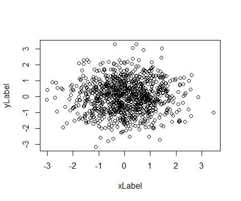
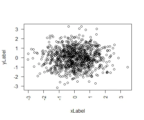
# The Default Plot
plot(xLabel, yLabel)
輸出:
水平旋轉軸標籤
我們可以通過在圖中傳遞 las=1 水平旋轉軸標籤。
示例程式碼:
# Create example Data
set.seed(99999)

xLabel <- rnorm(1000)
yLabel <- rnorm(1000)

# The Horizontal Axis Plot
plot(xLabel, yLabel, las=1)
上面的程式碼建立了一個帶有水平軸標籤的圖。
輸出:

垂直旋轉軸標籤
我們可以通過在圖中傳遞 las=3 來垂直旋轉軸標籤。
示例程式碼:
# Create example Data
set.seed(99999)

xLabel <- rnorm(1000)
yLabel <- rnorm(1000)

# The Vertical Axis Plot
plot(xLabel, yLabel, las=3)
上面的程式碼建立了一個帶有垂直軸標籤的圖。
輸出:

旋轉軸標籤垂直於軸
我們可以通過在圖中傳遞 las=2 來垂直於軸旋轉軸標籤。
示例程式碼:
# Create example Data
set.seed(99999)

xLabel <- rnorm(1000)
yLabel <- rnorm(1000)

# The Perpendicular Axis Plot
plot(xLabel, yLabel, las=2)
上面的程式碼建立了一個垂直於軸標籤的圖。
輸出:
las 值可以在 Base R 中的任何型別的繪圖中更改。
在 ggplot 中旋轉軸標籤
使用以下語法,我們可以旋轉 ggplot2 中的軸標籤。
plot + theme(axis.text.x = element_text(angle = 45, vjust = 1, hjust=1))
標籤將旋轉 45 度角,vjust 和 hjust 將控制標籤文字的垂直和水平對齊方式。讓我們建立一個繪圖,我們可以在 ggplot2 中旋轉軸標籤。
示例程式碼:
# Create example Data
Delftstack <- data.frame(Designation=c('CEO', 'Project Manager', 'Senior Dev', 'Junior Dev', 'Intern'),
Id=c(101, 102, 103, 104, 105))
#view the data
Delftstack
#plot the data using gglpot
library(ggplot2)
#create bar plot
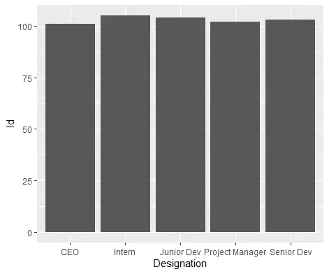
ggplot(data=Delftstack, aes(x=Designation, y=Id)) +
geom_bar(stat="identity")
上面的程式碼將從給定的資料建立一個預設圖。
輸出:
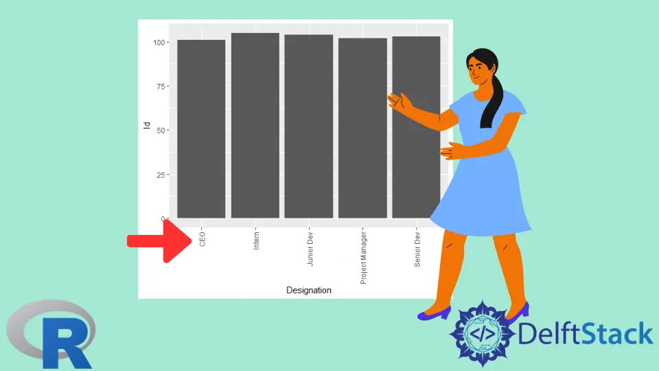
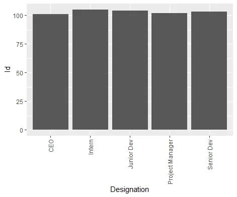
在 ggplot 中將軸標籤旋轉 90 度
我們可以在 ggplot2 中將值 90 賦予將軸標籤旋轉 90 度的角度。
示例程式碼:
# Create example Data
Delftstack <- data.frame(Designation=c('CEO', 'Project Manager', 'Senior Dev', 'Junior Dev', 'Intern'),
                         Id=c(101, 102, 103, 104, 105))

#plot the data using gglpot2
library(ggplot2)

#create bar plot
ggplot(data=Delftstack, aes(x=Designation, y=Id)) +
  geom_bar(stat="identity") +
  theme(axis.text.x = element_text(angle=90, vjust=.5, hjust=1))
上面的程式碼將建立一個軸旋轉 90 度的 gglpot2。
輸出:
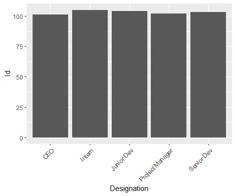
在 ggplot 中將軸標籤旋轉 45 度
我們可以在 ggplot2 中將值 45 賦予將軸標籤旋轉 45 度的角度。
示例程式碼:
# Create example Data
Delftstack <- data.frame(Designation=c('CEO', 'Project Manager', 'Senior Dev', 'Junior Dev', 'Intern'),
                         Id=c(101, 102, 103, 104, 105))

#plot the data using gglpot2
library(ggplot2)

#create bar plot
ggplot(data=Delftstack, aes(x=Designation, y=Id)) +
  geom_bar(stat="identity") +
  theme(axis.text.x = element_text(angle=45, vjust=1, hjust=1))
上面的程式碼將建立一個軸旋轉 45 度的 gglpot。
輸出:

Sheeraz is a Doctorate fellow in Computer Science at Northwestern Polytechnical University, Xian, China. He has 7 years of Software Development experience in AI, Web, Database, and Desktop technologies. He writes tutorials in Java, PHP, Python, GoLang, R, etc., to help beginners learn the field of Computer Science.
LinkedIn Facebook