How to Plot Decision Boundary Python
- Install Prerequisite Libraries
- Decision Boundary
-
Use Matplotlib’s
pyplotto Plot a Decision Boundary Separating 2 Classes - Generate Decision Boundary
A visual summary of your results with pictures, graphs, and plots gives the human mind a more leisurely time processing, understanding, and recognizing patterns in any given data.
This article will go through a step-by-step procedure to plot a decision boundary using Matplotlib’s pyplot.
For this, we will use the built-in pre-processed data (without missing data or outliers) dataset package provided by the Sklearn library to plot the decision boundary on data. Then we will use Matplotlib’s library to plot the decision boundary.
Install Prerequisite Libraries
To use the plotting feature of Matplotlib’s pyplot, we first need to install Matplotlib’s library. We can achieve this by executing the following command:
pip install matplotlib
It is also essential to ensure we work with the correct Python version. For this article, we are using version 3.10.4.
We can check the currently installed python version by executing the following command:
python --version
Decision Boundary
Classification machine learning algorithms learn to assign labels to input examples (observations). The goal of classification is to separate the feature space so that labels are assigned to points in the feature space as correctly as possible.
This method is called a decision surface or boundary, and it works as a demonstrative tool to visualize the results of the classification predictive model. We can create a linear decision boundary for a minimum of two input features.
However, if there are more than two input features, we can create multi-linear decision boundaries. This article will focus on plotting the decision boundary of two input features.
Use Matplotlib’s pyplot to Plot a Decision Boundary Separating 2 Classes
Import the Required Libraries
import numpy as np
import pandas as pd
import matplotlib.pyplot as plt
from matplotlib.colors import ListedColormap
from sklearn import datasets
from sklearn.linear_model import LogisticRegression
from sklearn.preprocessing import StandardScaler
from sklearn.metrics import accuracy_score, confusion_matrix
from sklearn.model_selection import train_test_split
Generate the Dataset
We will generate a custom dataset using the Sklearn library make_blobs() function within the datasets class. As mentioned above, the generated dataset we will use is a built-in pre-processed data (without missing data or outliers) dataset package provided by the Sklearn library.
Our custom-generated dataset variables are as follows.
    samples     features    standard deviation
    1000        2           3
XFeature, yFeature = datasets.make_blobs(
    n_samples=1000, centers=2, n_features=2, random_state=1, cluster_std=3
)
Once the data generation is complete, we can create a scatter plot of the data to see the data variability in a much-improved light.
for c_value in range(2):
    row = np.where(yFeature == c_value)
    plt.scatter(XFeature[row, 0], XFeature[row, 1])
plt.show()
In the next step, we will build the classification model to predict unseen data. We can use logistic regression for our custom dataset as it has only two features.
Logistic Regression Model
We will use a logistic regression model function provided Logistic Regression class in the sklearn library and train it on our sample data.
regressor = LogisticRegression()
regressor.fit(XFeature, yFeature)
y_pred = regressor.predict(XFeature)
Now we will evaluate the accuracy by the accuracy_score class from the sklearn library.
accuracy = accuracy_score(y, y_pred)
print("Model Accuracy: %.3f" % accuracy)
Generate Decision Boundary
Matplotlib provides a valuable function called contour(), which can help to add colors while plotting between different points. To achieve this, we first need to initialize the grid of points Xfeature or YFeature in the feature space.
Following that, we need to find each feature’s maximum value and minimum value and then increase this by one to ensure that the whole space is covered.
min1, max1 = XFeature[:, 0].min() - 1, XFeature[:, 0].max() + 1
min2, max2 = XFeature[:, 1].min() - 1, XFeature[:, 1].max() + 1
The numpy library provides an arrange() function to scale the coordinates with 0.1 resolution.
x1_scale = np.arange(min1, max1, 0.1)
x2_scale = np.arange(min2, max2, 0.1)
In the next step, the numpy library provides a meshgrid() function to convert scaled coordinates into a grid.
x_grid, y_grid = np.meshgrid(x1_scale, x2_scale)
Following that, we will reduce the 2-D array grid to a 1-D array using the flatten() function provided by the numpy library.
x_g, y_g = x_grid.flatten(), y_grid.flatten()
x_g, y_g = x_g.reshape((len(x_g), 1)), y_g.reshape((len(y_g), 1))
Finally, we will be stacking the 1-D array side-by-side as columns in an input dataset but at a much higher resolution.
grid = np.hstack((x_g, y_g))
After that, we can fit this into the regression model we created above to predict values.
y_pred_2 = regressor.predict(grid)  # predict the probability
# keep just the probabilities for class 0
p_pred = regressor.predict_proba(grid)
p_pred = p_pred[:, 0]  # reshaping the results
p_pred.shape
pp_grid = p_pred.reshape(x_grid.shape)
Now, we will plot those predicted grids as a contour plot using the contourf() using different colors.
surface = plt.contourf(x_grid, y_grid, pp_grid, cmap="Pastel1")
plt.colorbar(surface)  # create scatter plot for samples from each class
for class_value in range(2):
    row_ix = np.where(y == class_value)
    plt.scatter(X[row_ix, 0], X[row_ix, 1], cmap="Pastel1")
plt.show()
And thus, we end up with the following script to plot a decision boundary that separates two classes.
Full Code:
import numpy as np
import pandas as pd
import matplotlib.pyplot as plt
from matplotlib.colors import ListedColormap
from sklearn import datasets
from sklearn.linear_model import LogisticRegression
from sklearn.preprocessing import StandardScaler
from sklearn.metrics import accuracy_score, confusion_matrix
from sklearn.model_selection import train_test_split

XFeature, yFeature = datasets.make_blobs(
    n_samples=1000, centers=2, n_features=2, random_state=1, cluster_std=3
)

for c_val in range(2):
    row = np.where(yFeature == c_val)
    plt.scatter(XFeature[row, 0], XFeature[row, 1])
plt.show()

reg = LogisticRegression()
reg.fit(XFeature, yFeature)
y_pred = reg.predict(XFeature)

acc = accuracy_score(yFeature, y_pred)
print("Accuracy: %.3f" % acc)

min1, max1 = XFeature[:, 0].min() - 1, XFeature[:, 0].max() + 1
min2, max2 = XFeature[:, 1].min() - 1, XFeature[:, 1].max() + 1

x1_scale = np.arange(min1, max1, 0.1)
x2_scale = np.arange(min2, max2, 0.1)

x_grid, y_grid = np.meshgrid(x1_scale, x2_scale)

x_g, y_g = x_grid.flatten(), y_grid.flatten()
x_g, y_g = x_g.reshape((len(x_g), 1)), y_g.reshape((len(y_g), 1))

grid = np.hstack((x_g, y_g))

y_pred_2 = reg.predict(grid)
p_pred = reg.predict_proba(grid)
p_pred = p_pred[:, 0]
pp_grid = p_pred.reshape(x_grid.shape)

surface = plt.contourf(x_grid, y_grid, pp_grid, cmap="Pastel1")
plt.colorbar(surface)
for class_value in range(2):
    row_ix = np.where(yFeature == class_value)
    plt.scatter(XFeature[row_ix, 0], XFeature[row_ix, 1], cmap="Pastel1")
plt.show()
Output:
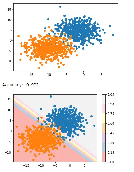
This is how we can apply decision boundary separating two classes using Matplotlib’s pyplot.

I am Fariba Laiq from Pakistan. An android app developer, technical content writer, and coding instructor. Writing has always been one of my passions. I love to learn, implement and convey my knowledge to others.
LinkedIn