How to Plot CSV in Python

CSV stands for Comma Separated Values, a popular format to store structured data. The CSV file contains the data in the form of a table with rows and columns.
We often need to visualize the data stored in the CSV file. For this purpose, Python provides different kinds of plots for data visualization.
Use matplotlib.pyplot to Visualize the CSV Data in Python
Matplotlib is an open-source and popular data visualization library in Python. It has a sub-module called pyplot, used to plot graphs in Python.
To use matplotlib, we must install it first using the following command.
#Python 3.x
pip install matplotlib
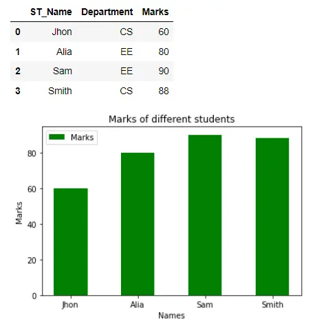
Use Bar Plot to Visualize CSV Data
A bar plot is a graph that contains rectangular bars that display the numeric values for categorical feature levels as bars. We will use the bar() method of the pyplot module to plot a bar graph.
In the following code, we have read the data from the CSV file using the read_csv() method available in the pandas module. The names and grades were retrieved from the data and transformed into lists.
The x represents the independent variable students’ names on the x-axis. The list y represents the students’ marks, which will appear on the y-axis.
We used the bar() method and passed the arguments. The width of the bar is 0.5, and the legend is Marks.
Finally, we have invoked the show() method, which will display the bar graph in the output.
Example Code:
# Python 3.x
import matplotlib.pyplot as plt
import pandas as pd

data = pd.read_csv("Student.csv")
display(data)
st_name = data["ST_Name"]
marks = data["Marks"]
x = list(st_name)
y = list(marks)
plt.bar(x, y, color="g", width=0.5, label="Marks")
plt.xlabel("Names")
plt.ylabel("Marks")
plt.title("Marks of different students")
plt.legend()
plt.show()
Output:
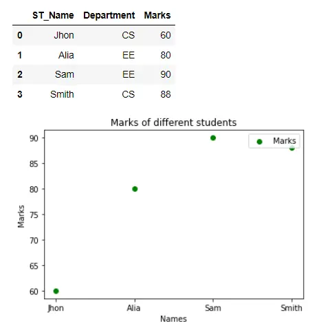
Use Scatter Plot to Visualize CSV Data
A scatter graph uses dots to visualize the data as a numerical pair (x,y) where x and y represent one value. If we visualize the relation between the data of students’ name and their marks using a scatter graph, we only have to call the scatter() method by providing x and y as the required arguments.
Example Code:
# Python 3.x
import matplotlib.pyplot as plt
import pandas as pd

data = pd.read_csv("Student.csv")
display(data)
st_name = data["ST_Name"]
marks = data["Marks"]
x = list(st_name)
y = list(marks)
plt.scatter(x, y, color="g", label="Marks")
plt.xlabel("Names")
plt.ylabel("Marks")
plt.title("Marks of different students")
plt.legend()
plt.show()
Output:
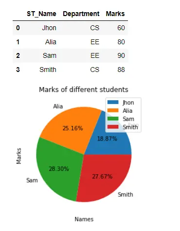
Use Pie Plot to Visualize CSV Data
A pie plot is a circular chart divided into many sectors. The area of an arc/sector represents its quantity.
We used a pie plot to visualize the students’ grades in the following code. We have called the pie() method and passed the list of marks and student names as labels on the graph.
We have also displayed the percentage of each portion using the autopct. The student who scored the highest occupies the larger area of the pie chart and vice versa.
Example Code:
# Python 3.x
import matplotlib.pyplot as plt
import pandas as pd

data = pd.read_csv("Student.csv")
display(data)
st_name = data["ST_Name"]
marks = data["Marks"]
x = list(st_name)
y = list(marks)
plt.pie(y, labels=st_name, autopct="%.2f%%")
plt.xlabel("Names")
plt.ylabel("Marks")
plt.title("Marks of different students")
plt.legend()
plt.show()
Output:
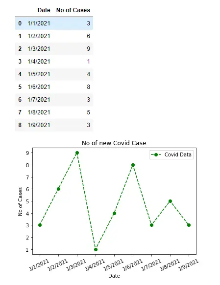
Use Line Plot to Visualize CSV Data
A line plot is a graph that displays information that changes over time in the form of data points. We will use the plot() method to plot a line graph.
In the following code, we have visualized a sample of COVID data by dates along the x-axis and the number of cases along the y-axis using a line graph. We have called the plot() method and passed the necessary arguments.
The linestyle represents the style of the line, which is dashed in our case but solid by default. The Markers indicate the dots representing the line’s points.
Example Code:
# Python 3.x
import matplotlib.pyplot as plt
import pandas as pd

data = pd.read_csv("covid_cases.csv")
display(data)
date = data["Date"]
cases = data["No of Cases"]
x = list(date)
y = list(cases)
plt.plot(x, y, color="g", linestyle="dashed", marker="o", label="Covid Data")
plt.xlabel("Date")
plt.xticks(rotation=25)
plt.ylabel("No of Cases")
plt.title("No of new Covid Case")
plt.legend()
plt.show()
Output:

I am Fariba Laiq from Pakistan. An android app developer, technical content writer, and coding instructor. Writing has always been one of my passions. I love to learn, implement and convey my knowledge to others.
LinkedIn