How to Plot a Table in Matplotlib

We can plot a table in Matplotlib using the matplotlib.pyplot.table method.
matplotlib.pyplot.table() Method
Syntax
matplotlib.pyplot.table(
    cellText=None,
    cellColours=None,
    cellLoc="right",
    colWidths=None,
    rowLabels=None,
    rowColours=None,
    rowLoc="left",
    colLabels=None,
    colColours=None,
    colLoc="center",
    loc="bottom",
    bbox=None,
    edges="closed",
    **kwargs
)
Examples: Plot a Table in Matplotlib Using the matplotlib.pyplot.table() Method
import matplotlib.pyplot as plt

fig, ax = plt.subplots(1, 1)
data = [[1, 2, 3], [5, 6, 7], [8, 9, 10]]
column_labels = ["Column 1", "Column 2", "Column 3"]
ax.axis("tight")
ax.axis("off")
ax.table(cellText=data, colLabels=column_labels, loc="center")

plt.show()
Output:
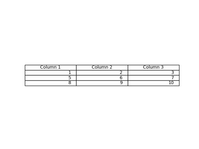
This method generates a table from the data passed as the cellText parameter in the table() method. The column names can be specified with the colLabels parameter, and the loc="center" places the table at the center of the respective axes.
We can also pass a Pandas DataFrame and NumPy array as a cellText parameter to generate a table.
import pandas as pd
import matplotlib.pyplot as plt

fig, ax = plt.subplots(1, 1)
data = [[1, 2, 3], [5, 6, 7], [8, 9, 10]]
column_labels = ["Column 1", "Column 2", "Column 3"]
df = pd.DataFrame(data, columns=column_labels)
ax.axis("tight")
ax.axis("off")
ax.table(
    cellText=df.values, colLabels=df.columns, rowLabels=["A", "B", "C"], loc="center"
)

plt.show()
Output:
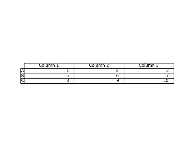
This process generates the table from the DataFrame df. We pass the values of df as cellText parameter and the column names of df as colLabels. The rowLabels value acts as a label for the rows of the table.
To distinguish the row labels and column labels in the table, style those particular fields differently.
import pandas as pd
import matplotlib.pyplot as plt

fig, ax = plt.subplots(1, 1)
data = [[1, 2, 3], [5, 6, 7], [8, 9, 10]]
column_labels = ["Column 1", "Column 2", "Column 3"]
df = pd.DataFrame(data, columns=column_labels)
ax.axis("tight")
ax.axis("off")
ax.table(
    cellText=df.values,
    colLabels=df.columns,
    rowLabels=["A", "B", "C"],
    rowColours=["yellow"] * 3,
    colColours=["yellow"] * 3,
    loc="center",
)

plt.show()
Output:
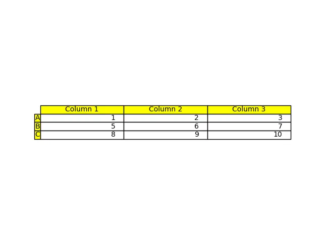
Here, we style the row labels and the column labels with yellow color to distinguish these fields from the rest of the table; this is done by using the parameters, rowColours, and colColours.

Suraj Joshi is a backend software engineer at Matrice.ai.
LinkedIn