Comment tracer une table dans Matplotlib

Nous pouvons tracer un tableau dans Matplotlib en utilisant la méthode matplotlib.pyplot.table.
Méthode matplotlib.pyplot.table()
Syntaxe
matplotlib.pyplot.table(
    cellText=None,
    cellColours=None,
    cellLoc="right",
    colWidths=None,
    rowLabels=None,
    rowColours=None,
    rowLoc="left",
    colLabels=None,
    colColours=None,
    colLoc="center",
    loc="bottom",
    bbox=None,
    edges="closed",
    **kwargs
)
Exemples : Tracer un tableau dans Matplotlib en utilisant la méthode matplotlib.pyplot.table()
import matplotlib.pyplot as plt

fig, ax = plt.subplots(1, 1)
data = [[1, 2, 3], [5, 6, 7], [8, 9, 10]]
column_labels = ["Column 1", "Column 2", "Column 3"]
ax.axis("tight")
ax.axis("off")
ax.table(cellText=data, colLabels=column_labels, loc="center")

plt.show()
Production:
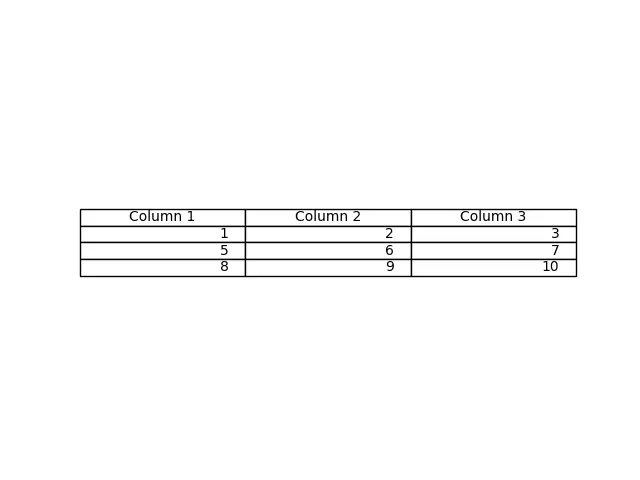
Cette méthode génère un tableau à partir des données passées comme paramètre cellText dans la méthode table(). Les noms des colonnes peuvent être spécifiés avec le paramètre colLabels, et le paramètre loc="center" place la table au centre des axes respectifs.
Nous pouvons également passer un tableau Pandas DataFrame et NumPy comme paramètre cellText pour générer un tableau.
import pandas as pd
import matplotlib.pyplot as plt

fig, ax = plt.subplots(1, 1)
data = [[1, 2, 3], [5, 6, 7], [8, 9, 10]]
column_labels = ["Column 1", "Column 2", "Column 3"]
df = pd.DataFrame(data, columns=column_labels)
ax.axis("tight")
ax.axis("off")
ax.table(
    cellText=df.values, colLabels=df.columns, rowLabels=["A", "B", "C"], loc="center"
)

plt.show()
Production:
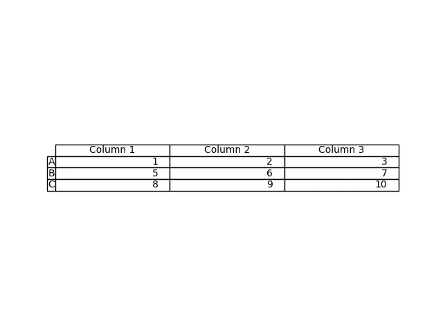
Ce processus génère le tableau à partir du DataFrame df. Nous passons les valeurs de df comme paramètre “cellText” et les noms de colonnes de df comme colLabels. La valeur de rowLabels agit comme un label pour les lignes de la table.
Pour distinguer les étiquettes des lignes et des colonnes de la table, il faut donner un style différent à ces champs particuliers.
import pandas as pd
import matplotlib.pyplot as plt

fig, ax = plt.subplots(1, 1)
data = [[1, 2, 3], [5, 6, 7], [8, 9, 10]]
column_labels = ["Column 1", "Column 2", "Column 3"]
df = pd.DataFrame(data, columns=column_labels)
ax.axis("tight")
ax.axis("off")
ax.table(
    cellText=df.values,
    colLabels=df.columns,
    rowLabels=["A", "B", "C"],
    rowColours=["yellow"] * 3,
    colColours=["yellow"] * 3,
    loc="center",
)

plt.show()
Production:
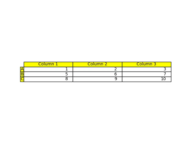
Ici, nous donnons une couleur jaune aux étiquettes des lignes et des colonnes afin de distinguer ces champs du reste du tableau ; cela se fait en utilisant les paramètres rowColours et colColours.

Suraj Joshi is a backend software engineer at Matrice.ai.
LinkedIn