Matplotlib で表をプロットする方法
Suraj Joshi
2020年11月8日
Matplotlib
Matplotlib では、matplotlib.pyplot.table メソッドを使って表をプロットすることができます。
matplotlib.pyplot.table() メソッド
構文
matplotlib.pyplot.table(
    cellText=None,
    cellColours=None,
    cellLoc="right",
    colWidths=None,
    rowLabels=None,
    rowColours=None,
    rowLoc="left",
    colLabels=None,
    colColours=None,
    colLoc="center",
    loc="bottom",
    bbox=None,
    edges="closed",
    **kwargs
)
例:Matplotlib.pyplot.table() メソッドを用いた Matplotlib での表のプロット
import matplotlib.pyplot as plt

fig, ax = plt.subplots(1, 1)
data = [[1, 2, 3], [5, 6, 7], [8, 9, 10]]
column_labels = ["Column 1", "Column 2", "Column 3"]
ax.axis("tight")
ax.axis("off")
ax.table(cellText=data, colLabels=column_labels, loc="center")

plt.show()
出力:
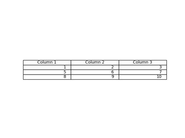
このメソッドは table() メソッドで cellText パラメータとして渡されたデータからテーブルを生成します。カラム名は colLabels パラメータで指定し、loc="center" でテーブルを各軸の中心に配置します。
また、cellText パラメータに Pandas DataFrame と NumPy Arrays を渡してテーブルを生成することもできます。
import pandas as pd
import matplotlib.pyplot as plt

fig, ax = plt.subplots(1, 1)
data = [[1, 2, 3], [5, 6, 7], [8, 9, 10]]
column_labels = ["Column 1", "Column 2", "Column 3"]
df = pd.DataFrame(data, columns=column_labels)
ax.axis("tight")
ax.axis("off")
ax.table(
    cellText=df.values, colLabels=df.columns, rowLabels=["A", "B", "C"], loc="center"
)

plt.show()
出力:
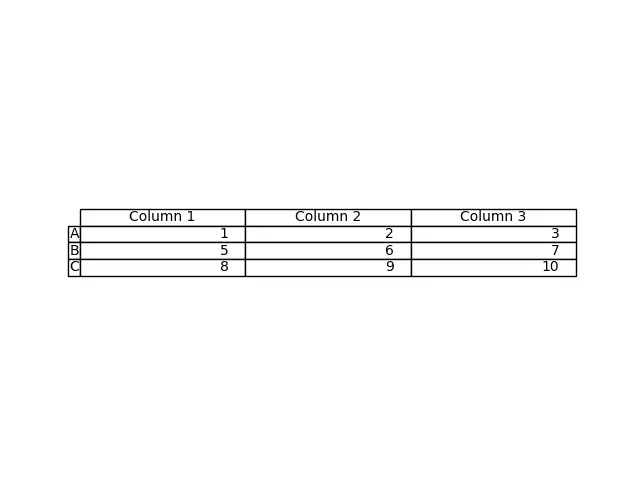
この処理は DataFrame df からテーブルを生成します。パラメータ df の値を cellText に、df のカラム名を colLabels に渡します。rowLabels の値はテーブルの行のラベルとして振る舞う。
テーブル内の行ラベルと列ラベルを区別するには、特定のフィールドを異なるスタイルにする必要があります。
import pandas as pd
import matplotlib.pyplot as plt

fig, ax = plt.subplots(1, 1)
data = [[1, 2, 3], [5, 6, 7], [8, 9, 10]]
column_labels = ["Column 1", "Column 2", "Column 3"]
df = pd.DataFrame(data, columns=column_labels)
ax.axis("tight")
ax.axis("off")
ax.table(
    cellText=df.values,
    colLabels=df.columns,
    rowLabels=["A", "B", "C"],
    rowColours=["yellow"] * 3,
    colColours=["yellow"] * 3,
    loc="center",
)

plt.show()
出力:
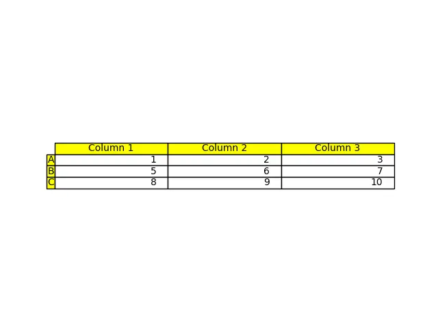
ここでは、行ラベルと列ラベルを黄色でスタイル設定して、これらのフィールドをテーブルの他の部分と区別します。これは、パラメータ rowColours と colColours を使用して行われます。
チュートリアルを楽しんでいますか? <a href="https://www.youtube.com/@delftstack/?sub_confirmation=1" style="color: #a94442; font-weight: bold; text-decoration: underline;">DelftStackをチャンネル登録</a> して、高品質な動画ガイドをさらに制作するためのサポートをお願いします。 Subscribe
著者: Suraj Joshi

Suraj Joshi is a backend software engineer at Matrice.ai.
LinkedIn