Matplotlib에서 테이블을 그리는 방법
Suraj Joshi
2020년11월22일
Matplotlib
matplotlib.pyplot.table 메서드를 사용하여 Matplotlib에서 테이블을 그릴 수 있습니다.
matplotlib.pyplot.table()메서드
통사론
matplotlib.pyplot.table(
    cellText=None,
    cellColours=None,
    cellLoc="right",
    colWidths=None,
    rowLabels=None,
    rowColours=None,
    rowLoc="left",
    colLabels=None,
    colColours=None,
    colLoc="center",
    loc="bottom",
    bbox=None,
    edges="closed",
    **kwargs
)
예: matplotlib.pyplot.table()메서드를 사용하여 Matplotlib에서 테이블 플로팅
import matplotlib.pyplot as plt

fig, ax = plt.subplots(1, 1)
data = [[1, 2, 3], [5, 6, 7], [8, 9, 10]]
column_labels = ["Column 1", "Column 2", "Column 3"]
ax.axis("tight")
ax.axis("off")
ax.table(cellText=data, colLabels=column_labels, loc="center")

plt.show()
출력:
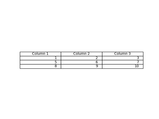
이 메서드는table()메서드에서cellText 매개 변수로 전달 된 데이터에서 테이블을 생성합니다. 열 이름은colLabels 매개 변수로 지정할 수 있으며loc = "center"는 테이블을 각 축의 중앙에 배치합니다.
Pandas DataFrame 및 NumPy 배열을cellText 매개 변수로 전달하여 테이블을 생성 할 수도 있습니다.
import pandas as pd
import matplotlib.pyplot as plt

fig, ax = plt.subplots(1, 1)
data = [[1, 2, 3], [5, 6, 7], [8, 9, 10]]
column_labels = ["Column 1", "Column 2", "Column 3"]
df = pd.DataFrame(data, columns=column_labels)
ax.axis("tight")
ax.axis("off")
ax.table(
    cellText=df.values, colLabels=df.columns, rowLabels=["A", "B", "C"], loc="center"
)

plt.show()
출력:
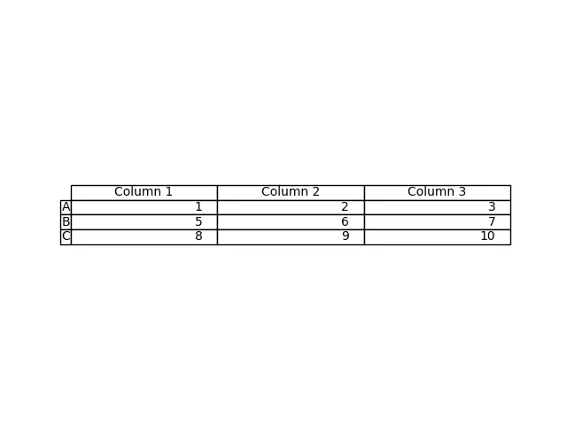
이 프로세스는 DataFrame df에서 테이블을 생성합니다. df의 값을cellText 매개 변수로 전달하고df의 열 이름을colLabels로 전달합니다. rowLabels 값은 테이블 행의 레이블 역할을합니다.
테이블에서 행 레이블과 열 레이블을 구별하려면 해당 특정 필드의 스타일을 다르게 지정하십시오.
import pandas as pd
import matplotlib.pyplot as plt

fig, ax = plt.subplots(1, 1)
data = [[1, 2, 3], [5, 6, 7], [8, 9, 10]]
column_labels = ["Column 1", "Column 2", "Column 3"]
df = pd.DataFrame(data, columns=column_labels)
ax.axis("tight")
ax.axis("off")
ax.table(
    cellText=df.values,
    colLabels=df.columns,
    rowLabels=["A", "B", "C"],
    rowColours=["yellow"] * 3,
    colColours=["yellow"] * 3,
    loc="center",
)

plt.show()
출력:
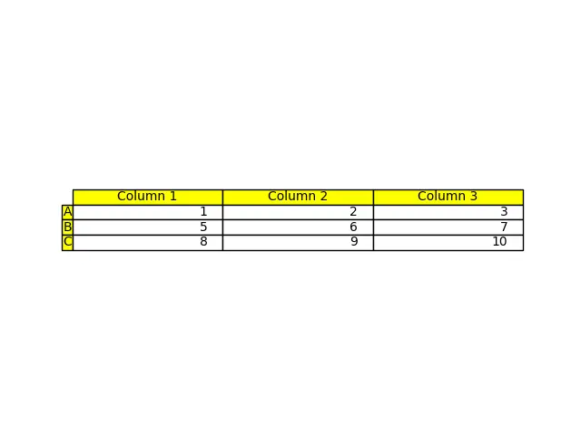
여기에서 행 레이블과 열 레이블의 스타일을 노란색으로 지정하여 이러한 필드를 나머지 테이블과 구분합니다. 매개 변수rowColours 및colColours를 사용하여 수행됩니다.
튜토리얼이 마음에 드시나요? DelftStack을 구독하세요 YouTube에서 저희가 더 많은 고품질 비디오 가이드를 제작할 수 있도록 지원해주세요. 구독하다
작가: Suraj Joshi

Suraj Joshi is a backend software engineer at Matrice.ai.
LinkedIn