How to Add Value Labels on Matplotlib Bar Chart
-
Add Value Labels on Matplotlib Bar Chart Using
pyplot.text()Method -
Add Value Labels on Matplotlib Bar Chart Using
pyplot.annotate()Function - Conclusion
Matplotlib bar charts are a good way to visualize data in python. In the bar charts, we often need to add labels to visualize the data.
This article will look at the various ways to add value labels on a Matplotlib bar chart.
Add Value Labels on Matplotlib Bar Chart Using pyplot.text() Method
To add value labels on a Matplotlib bar chart, we can use the pyplot.text() function.
The pyplot.text() function from the Matplotlib module is used to add text values to any location in the graph. The syntax for the pyplot.text() function is as follows.
matplotlib.pyplot.text(x, y, s, fontdict=None, **kwargs)
Here,
- The parameters
xandyare the coordinates of the graph where the text will be placed. The parameterscontains the text string. - The parameter
fontdictis used to change properties like font and size of the text. Its default value isNone. - The
**kwargsparameter represents other parameters used to decide the position of the text in the bar chart.
In this article, we will use the parameter ha to decide the horizontal alignment of the text. You can get more insight into other parameters of the function from the official documentation of the text() function.
Let us now plot a bar graph and then add value labels to it. Suppose that we have data of the number of students of a class in a school from classes 1 to 10 in the form of a list as follows.
no_of_students = [10, 24, 45, 30, 23, 56, 67, 34, 45, 50]
Here, the index i represents the number of students in the class i+1. To plot the data, we will create a list class_number that contains numbers from 1 to 10. After that, we will plot the bar chart using the pyplot.bar() function. Then, we will add title, xlabel, and ylabel to the graph using the title(), xlabel(), and ylabel() functions respectively.
To add value labels, we will define a function add_value_label(x_list,y_list). Here, x_list and y_list are the lists containing data for the x-axis and y-axis i.e class_number and no_of_students.
In the function add_value_label(), we will specify the coordinates of value labels as (x, the height of the bar chart at x) so that the value label will be added to the top of the bar chart. The text value passed to the text function will be the height of the bar chart at x. Here, x will be the elements of class_number, and the height of bar chart at x will be the corresponding number of students in class x.
For instance, we will add the number of students in each class as a value label to the top of the bar graph.
import matplotlib.pyplot as plt


def add_value_label(x_list, y_list):
    for i in range(1, len(x_list) + 1):
        plt.text(i, y_list[i - 1], y_list[i - 1])


no_of_students = [10, 24, 45, 30, 23, 56, 67, 34, 45, 50]
class_number = [1, 2, 3, 4, 5, 6, 7, 8, 9, 10]
plt.bar(class_number, no_of_students)
add_value_label(class_number, no_of_students)
plt.title("No of Students in a class")
plt.xlabel("Class")
plt.ylabel("Number of Students")
plt.show()
Output:
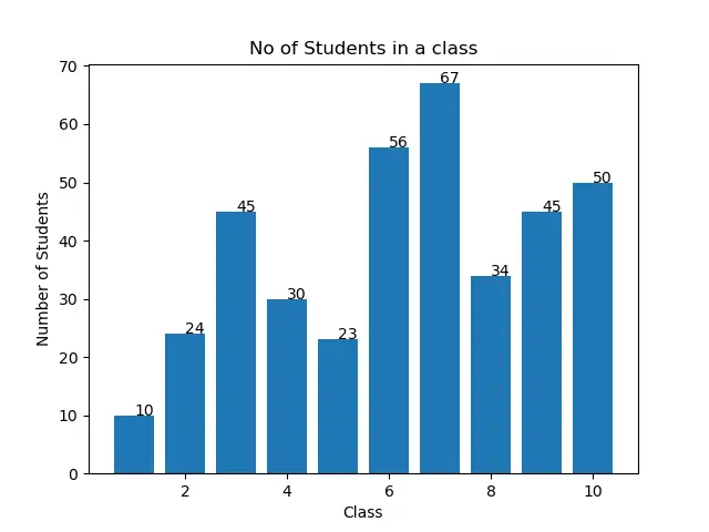
You might observe that the value labels are not in the center at the top of the bar chart in the output. We can do so by manipulating the input arguments as discussed in the following sections.
Add Value Labels on Matplotlib Bar Chart in the Center of Each Bar
To add the value labels on the Matplotlib bar chart in the center at the top of the bar chart, we will specify horizontal alignment as center in the pyplot.text() function as follows.
import matplotlib.pyplot as plt


def add_value_label(x_list, y_list):
    for i in range(1, len(x_list) + 1):
        plt.text(i, y_list[i - 1], y_list[i - 1], ha="center")


no_of_students = [10, 24, 45, 30, 23, 56, 67, 34, 45, 50]
class_number = [1, 2, 3, 4, 5, 6, 7, 8, 9, 10]
plt.bar(class_number, no_of_students)
add_value_label(class_number, no_of_students)
plt.title("No of Students in a class")
plt.xlabel("Class")
plt.ylabel("Number of Students")
plt.show()
Output:

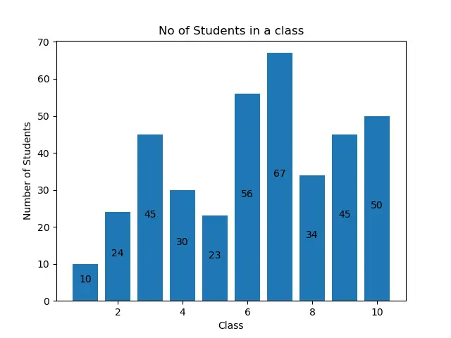
Add Value Labels on Matplotlib Bar Chart in the Middle of the Height of Each Bar
You can also add value labels in the middle of the height of each bar. For this, we have to specify the y coordinate in the pyplot.text() function as (the height of bar chart at x)/2. You can see this in the following example code.
import matplotlib.pyplot as plt


def add_value_label(x_list, y_list):
    for i in range(1, len(x_list) + 1):
        plt.text(i, y_list[i - 1] / 2, y_list[i - 1], ha="center")


no_of_students = [10, 24, 45, 30, 23, 56, 67, 34, 45, 50]
class_number = [1, 2, 3, 4, 5, 6, 7, 8, 9, 10]
plt.bar(class_number, no_of_students)
add_value_label(class_number, no_of_students)
plt.title("No of Students in a class")
plt.xlabel("Class")
plt.ylabel("Number of Students")
plt.show()
Output:

Add Value Labels on Matplotlib Bar Chart Using pyplot.annotate() Function
Instead of the pyplot.text() function, we can use the pyplot.annotate() function to add value labels on a matplotlib bar chart. The syntax of the pyplot.annotate() function is as follows.
matplotlib.pyplot.annotate(text, xy, *args, **kwargs)
Here,
- The parameter
textis the label that will be added to the graph. - The parameter
xyaccepts a tuple(x,y)wherexandyare the coordinates where the label will be added to the graph. - The function accepts many different arguments. This article will just use the parameter
hato set the horizontal alignment for the label in the bar chart.
We will plot the bar chart using the pyplot.bar() function. Then, we will add title, xlablel, and ylabel to the graph using the title(), xlabel(), and ylabel() functions respectively.
To add value labels on the Matplotlib bar chart, we will define a function add_value_label(x_list,y_list). Here, x and y are the lists containing data for the x-axis and y-axis. In the function add_value_label(), we will pass the tuples created from the data given for x and y coordinates as an input argument to the parameter xy. With that, we will pass other values to the annotate() function to add value labels on the Matplotlib bar chart as follows.
import matplotlib.pyplot as plt


def add_value_label(x_list, y_list):
    for i in range(1, len(x_list) + 1):
        plt.annotate(y_list[i - 1], (i, y_list[i - 1]))


no_of_students = [10, 24, 45, 30, 23, 56, 67, 34, 45, 50]
class_number = [1, 2, 3, 4, 5, 6, 7, 8, 9, 10]
plt.bar(class_number, no_of_students)
add_value_label(class_number, no_of_students)
plt.title("No of Students in a class")
plt.xlabel("Class")
plt.ylabel("Number of Students")
plt.show()
Output:

Again, you can observe that the labels are not aligned with the bar chart. To align them, you can use the horizontal alignment parameter ha to set the following alignment.
import matplotlib.pyplot as plt


def add_value_label(x_list, y_list):
    for i in range(1, len(x_list) + 1):
        plt.annotate(y_list[i - 1], (i, y_list[i - 1]), ha="center")


no_of_students = [10, 24, 45, 30, 23, 56, 67, 34, 45, 50]
class_number = [1, 2, 3, 4, 5, 6, 7, 8, 9, 10]
plt.bar(class_number, no_of_students)
add_value_label(class_number, no_of_students)
plt.title("No of Students in a class")
plt.xlabel("Class")
plt.ylabel("Number of Students")
plt.show()
Output:

You can also add value labels in the middle of the height of each bar. For this, we have to specify the y coordinate in the tuples as (the height of bar chart at x)/2. You can see this in the following example code.
import matplotlib.pyplot as plt


def add_value_label(x_list, y_list):
    for i in range(1, len(x_list) + 1):
        plt.annotate(y_list[i - 1], (i, y_list[i - 1] / 2), ha="center")


no_of_students = [10, 24, 45, 30, 23, 56, 67, 34, 45, 50]
class_number = [1, 2, 3, 4, 5, 6, 7, 8, 9, 10]
plt.bar(class_number, no_of_students)
add_value_label(class_number, no_of_students)
plt.title("No of Students in a class")
plt.xlabel("Class")
plt.ylabel("Number of Students")
plt.show()
Output:
Conclusion
This article has discussed two ways to add value labels on a Matplotlib bar chart using the text() function and annotate() function. We also saw how we could decide the alignment and position of the labels by changing the parameter. You can use any of the discussed ways to add value labels on a Matplotlib bar chart according to your convenience.

Aditya Raj is a highly skilled technical professional with a background in IT and business, holding an Integrated B.Tech (IT) and MBA (IT) from the Indian Institute of Information Technology Allahabad. With a solid foundation in data analytics, programming languages (C, Java, Python), and software environments, Aditya has excelled in various roles. He has significant experience as a Technical Content Writer for Python on multiple platforms and has interned in data analytics at Apollo Clinics. His projects demonstrate a keen interest in cutting-edge technology and problem-solving, showcasing his proficiency in areas like data mining and software development. Aditya's achievements include securing a top position in a project demonstration competition and gaining certifications in Python, SQL, and digital marketing fundamentals.
GitHub