Matplotlib 막대 차트에 값 레이블 추가
-
pyplot.text()메서드를 사용하여 Matplotlib 막대 차트에 값 레이블 추가 -
pyplot.annotate()함수를 사용하여 Matplotlib 막대 차트에 값 레이블 추가 - 결론
Matplotlib 막대 차트는 파이썬에서 데이터를 시각화하는 좋은 방법입니다. 막대 차트에서 데이터를 시각화하기 위해 레이블을 추가해야 하는 경우가 많습니다. 이 기사에서는 Matplotlib 막대 차트에 값 레이블을 추가하는 다양한 방법을 살펴봅니다.
pyplot.text() 메서드를 사용하여 Matplotlib 막대 차트에 값 레이블 추가
Matplotlib 막대 차트에 값 레이블을 추가하려면 pyplot.text() 함수를 사용할 수 있습니다.
Matplotlib 모듈의 pyplot.text() 함수는 그래프의 모든 위치에 텍스트 값을 추가하는 데 사용됩니다. pyplot.text() 함수의 구문은 다음과 같습니다.
matplotlib.pyplot.text(x, y, s, fontdict=None, **kwargs)
여기,
- 매개변수
x및y는 텍스트가 배치될 그래프의 좌표입니다.s매개변수는 텍스트 문자열을 포함합니다. fontdict매개변수는 텍스트의 글꼴 및 크기와 같은 속성을 변경하는 데 사용됩니다. 기본값은없음입니다.**kwargs매개변수는 막대 차트에서 텍스트의 위치를 결정하는 데 사용되는 다른 매개변수를 나타냅니다.
이 기사에서는 ha 매개변수를 사용하여 텍스트의 수평 정렬을 결정합니다. text() 함수의 공식 문서에서 함수의 다른 매개변수에 대한 더 많은 통찰력을 얻을 수 있습니다.
이제 막대 그래프를 그린 다음 값 레이블을 추가해 보겠습니다. 다음과 같은 리스트 형태로 1학년부터 10학년까지 한 학교의 한 학급의 학생 수 데이터가 있다고 가정하자.
no_of_students = [10, 24, 45, 30, 23, 56, 67, 34, 45, 50]
여기서 인덱스 i는 i+1 클래스의 학생 수를 나타냅니다. 데이터를 플로팅하기 위해 1에서 10까지의 숫자가 포함된 class_number 목록을 만듭니다. 그런 다음 pyplot.bar() 함수를 사용하여 막대 차트를 플로팅합니다. 그런 다음 title(), xlabel(), ylabel() 함수를 각각 사용하여 title, xlabel, ylabel을 그래프에 추가합니다.
값 레이블을 추가하기 위해 add_value_label(x_list,y_list) 함수를 정의합니다. 여기에서 x_list와 y_list는 x축과 y축에 대한 데이터를 포함하는 목록, 즉 class_number 및 no_of_students입니다.
add_value_label() 함수에서 값 레이블의 좌표를 (x, x에서 막대 차트의 높이)로 지정하여 값 레이블이 막대 차트 상단에 추가되도록 합니다. 텍스트 함수에 전달된 텍스트 값은 x에서 막대 차트의 높이가 됩니다. 여기서 x는 class_number의 요소이고 height of bar chart at x는 x 클래스의 해당 학생 수입니다.
예를 들어, 각 학급의 학생 수를 막대 그래프 상단에 값 레이블로 추가합니다.
import matplotlib.pyplot as plt


def add_value_label(x_list, y_list):
    for i in range(1, len(x_list) + 1):
        plt.text(i, y_list[i - 1], y_list[i - 1])


no_of_students = [10, 24, 45, 30, 23, 56, 67, 34, 45, 50]
class_number = [1, 2, 3, 4, 5, 6, 7, 8, 9, 10]
plt.bar(class_number, no_of_students)
add_value_label(class_number, no_of_students)
plt.title("No of Students in a class")
plt.xlabel("Class")
plt.ylabel("Number of Students")
plt.show()
출력:
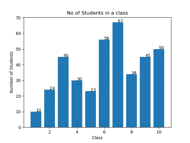
값 레이블이 출력의 막대 차트 상단 중앙에 있지 않은 것을 관찰할 수 있습니다. 다음 섹션에서 설명하는 대로 입력 인수를 조작하여 그렇게 할 수 있습니다.
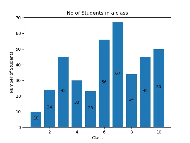
각 막대의 중앙에 있는 Matplotlib 막대 차트에 값 레이블 추가
Matplotlib 막대 차트의 값 레이블을 막대 차트 상단 중앙에 추가하기 위해 다음과 같이 pyplot.text() 함수에서 수평 정렬을 center로 지정합니다.
import matplotlib.pyplot as plt


def add_value_label(x_list, y_list):
    for i in range(1, len(x_list) + 1):
        plt.text(i, y_list[i - 1], y_list[i - 1], ha="center")


no_of_students = [10, 24, 45, 30, 23, 56, 67, 34, 45, 50]
class_number = [1, 2, 3, 4, 5, 6, 7, 8, 9, 10]
plt.bar(class_number, no_of_students)
add_value_label(class_number, no_of_students)
plt.title("No of Students in a class")
plt.xlabel("Class")
plt.ylabel("Number of Students")
plt.show()
출력:

Matplotlib 막대 차트의 각 막대 높이 중간에 값 레이블 추가
각 막대의 높이 중간에 값 레이블을 추가할 수도 있습니다. 이를 위해 pyplot.text() 함수의 y 좌표를 (막대 차트 x에서의 높이)/2로 지정해야 합니다. 다음 예제 코드에서 이를 확인할 수 있습니다.
import matplotlib.pyplot as plt


def add_value_label(x_list, y_list):
    for i in range(1, len(x_list) + 1):
        plt.text(i, y_list[i - 1] / 2, y_list[i - 1], ha="center")


no_of_students = [10, 24, 45, 30, 23, 56, 67, 34, 45, 50]
class_number = [1, 2, 3, 4, 5, 6, 7, 8, 9, 10]
plt.bar(class_number, no_of_students)
add_value_label(class_number, no_of_students)
plt.title("No of Students in a class")
plt.xlabel("Class")
plt.ylabel("Number of Students")
plt.show()
출력:

pyplot.annotate() 함수를 사용하여 Matplotlib 막대 차트에 값 레이블 추가
pyplot.text() 함수 대신 pyplot.annotate() 함수를 사용하여 matplotlib 막대 차트에 값 레이블을 추가할 수 있습니다. pyplot.annotate() 함수의 구문은 다음과 같습니다.
matplotlib.pyplot.annotate(text, xy, *args, **kwargs)
여기,
- 매개변수
text는 그래프에 추가될 레이블입니다. - 매개변수
xy는(x,y)튜플을 허용합니다. 여기서x와y는 레이블이 그래프에 추가될 좌표입니다. - 함수는 다양한 인수를 허용합니다. 이 기사에서는
ha매개변수를 사용하여 막대 차트의 레이블에 대한 수평 정렬을 설정합니다.
pyplot.bar() 함수를 사용하여 막대 차트를 플로팅합니다. 그런 다음 title(), xlabel(), ylabel() 함수를 사용하여 그래프에 title, xlablel, ylabel을 추가합니다.
Matplotlib 막대 차트에 값 레이블을 추가하기 위해 add_value_label(x_list,y_list) 함수를 정의합니다. 여기서 x와 y는 x축과 y축에 대한 데이터를 포함하는 목록입니다. add_value_label() 함수에서 x 및 y 좌표에 대해 제공된 데이터에서 생성된 튜플을 매개변수 xy에 대한 입력 인수로 전달합니다. 이를 통해 다음과 같이 Matplotlib 막대 차트에 값 레이블을 추가하기 위해 annotate() 함수에 다른 값을 전달합니다.
import matplotlib.pyplot as plt


def add_value_label(x_list, y_list):
    for i in range(1, len(x_list) + 1):
        plt.annotate(y_list[i - 1], (i, y_list[i - 1]))


no_of_students = [10, 24, 45, 30, 23, 56, 67, 34, 45, 50]
class_number = [1, 2, 3, 4, 5, 6, 7, 8, 9, 10]
plt.bar(class_number, no_of_students)
add_value_label(class_number, no_of_students)
plt.title("No of Students in a class")
plt.xlabel("Class")
plt.ylabel("Number of Students")
plt.show()
출력:

다시 말하지만 레이블이 막대 차트와 정렬되지 않은 것을 볼 수 있습니다. 정렬하려면 수평 정렬 매개변수 ha를 사용하여 다음 정렬을 설정할 수 있습니다.
import matplotlib.pyplot as plt


def add_value_label(x_list, y_list):
    for i in range(1, len(x_list) + 1):
        plt.annotate(y_list[i - 1], (i, y_list[i - 1]), ha="center")


no_of_students = [10, 24, 45, 30, 23, 56, 67, 34, 45, 50]
class_number = [1, 2, 3, 4, 5, 6, 7, 8, 9, 10]
plt.bar(class_number, no_of_students)
add_value_label(class_number, no_of_students)
plt.title("No of Students in a class")
plt.xlabel("Class")
plt.ylabel("Number of Students")
plt.show()
출력:

각 막대의 높이 중간에 값 레이블을 추가할 수도 있습니다. 이를 위해 튜플의 y 좌표를 (x에서 막대 차트의 높이)/2로 지정해야 합니다. 다음 예제 코드에서 이를 확인할 수 있습니다.
import matplotlib.pyplot as plt


def add_value_label(x_list, y_list):
    for i in range(1, len(x_list) + 1):
        plt.annotate(y_list[i - 1], (i, y_list[i - 1] / 2), ha="center")


no_of_students = [10, 24, 45, 30, 23, 56, 67, 34, 45, 50]
class_number = [1, 2, 3, 4, 5, 6, 7, 8, 9, 10]
plt.bar(class_number, no_of_students)
add_value_label(class_number, no_of_students)
plt.title("No of Students in a class")
plt.xlabel("Class")
plt.ylabel("Number of Students")
plt.show()
출력:
결론
이 기사에서는 text() 함수와 annotate() 함수를 사용하여 Matplotlib 막대 차트에 값 레이블을 추가하는 두 가지 방법에 대해 논의했습니다. 또한 매개변수를 변경하여 레이블의 정렬과 위치를 결정하는 방법도 보았습니다. 논의된 모든 방법을 사용하여 편의에 따라 Matplotlib 막대 차트에 값 레이블을 추가할 수 있습니다.

Aditya Raj is a highly skilled technical professional with a background in IT and business, holding an Integrated B.Tech (IT) and MBA (IT) from the Indian Institute of Information Technology Allahabad. With a solid foundation in data analytics, programming languages (C, Java, Python), and software environments, Aditya has excelled in various roles. He has significant experience as a Technical Content Writer for Python on multiple platforms and has interned in data analytics at Apollo Clinics. His projects demonstrate a keen interest in cutting-edge technology and problem-solving, showcasing his proficiency in areas like data mining and software development. Aditya's achievements include securing a top position in a project demonstration competition and gaining certifications in Python, SQL, and digital marketing fundamentals.
GitHub