Matplotlib 棒グラフに値ラベルを追加する
-
pyplot.text()メソッドを使用して Matplotlib 棒グラフに値ラベルを追加する -
pyplot.annotate()関数を使用して Matplotlib 棒グラフに値ラベルを追加する - まとめ
Matplotlib 棒グラフは、Python でデータを視覚化するための優れた方法です。棒グラフでは、データを視覚化するためにラベルを追加する必要があることがよくあります。この記事では、Matplotlib 棒グラフに値ラベルを追加するさまざまな方法について説明します。
pyplot.text() メソッドを使用して Matplotlib 棒グラフに値ラベルを追加する
Matplotlib 棒グラフに値ラベルを追加するには、pyplot.text() 関数を使用できます。
Matplotlib モジュールの pyplot.text() 関数は、グラフ内の任意の場所にテキスト値を追加するために使用されます。pyplot.text() 関数の構文は次のとおりです。
matplotlib.pyplot.text(x, y, s, fontdict=None, **kwargs)
ここ、
- パラメータ
xおよびyは、テキストが配置されるグラフの座標です。パラメータsにはテキスト文字列が含まれています。 - パラメータ
fontdictは、テキストのフォントやサイズなどのプロパティを変更するために使用されます。デフォルト値はNoneです。 **kwargsパラメータは、棒グラフ内のテキストの位置を決定するために使用される他のパラメータを表します。
この記事では、パラメータ ha を使用してテキストの水平方向の配置を決定します。text() 関数の公式ドキュメントから、関数の他のパラメーターについてより多くの洞察を得ることができます。
次に、棒グラフをプロットしてから、それに値ラベルを追加しましょう。次のようなリストの形式で、クラス 1 からクラス 10 までの学校のクラスの生徒数のデータがあるとします。
no_of_students = [10, 24, 45, 30, 23, 56, 67, 34, 45, 50]
ここで、インデックス i はクラス i+1 の生徒数を表します。データをプロットするには、1 から 10 までの数値を含むリスト class_number を作成します。その後、pyplot.bar() 関数を使用して棒グラフをプロットします。次に、title()、xlabel()、および ylabel() 関数をそれぞれ使用して、title、xlabel、および ylabel をグラフに追加します。
値ラベルを追加するには、関数 add_value_label(x_list,y_list) を定義します。ここで、x_list と y_list は、x 軸と y 軸のデータを含むリストです。つまり、class_number と no_of_students です。
関数 add_value_label() では、値ラベルの座標を(x、x での棒グラフの高さ)として指定し、値ラベルが棒グラフの上部に追加されるようにします。text 関数に渡されるテキスト値は、x での棒グラフの高さになります。ここで、x は class_number の要素になり、x での棒グラフの高さはクラス x の対応する生徒数になります。
たとえば、各クラスの生徒数を値ラベルとして棒グラフの上部に追加します。
import matplotlib.pyplot as plt


def add_value_label(x_list, y_list):
    for i in range(1, len(x_list) + 1):
        plt.text(i, y_list[i - 1], y_list[i - 1])


no_of_students = [10, 24, 45, 30, 23, 56, 67, 34, 45, 50]
class_number = [1, 2, 3, 4, 5, 6, 7, 8, 9, 10]
plt.bar(class_number, no_of_students)
add_value_label(class_number, no_of_students)
plt.title("No of Students in a class")
plt.xlabel("Class")
plt.ylabel("Number of Students")
plt.show()
出力:
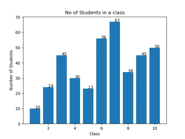
値ラベルが出力の棒グラフの上部の中央にないことに気付くかもしれません。これを行うには、次のセクションで説明するように入力引数を操作します。
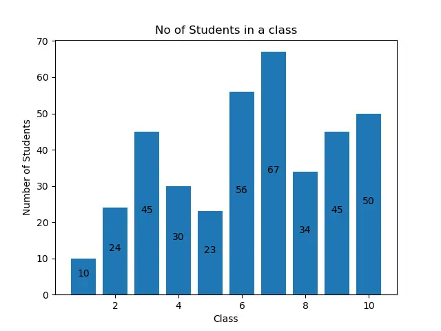
各バーの中央にある Matplotlib 棒グラフに値ラベルを追加する
棒グラフの上部中央にある Matplotlib 棒グラフに値ラベルを追加するには、次のように pyplot.text() 関数で center として水平方向の配置を指定します。
import matplotlib.pyplot as plt


def add_value_label(x_list, y_list):
    for i in range(1, len(x_list) + 1):
        plt.text(i, y_list[i - 1], y_list[i - 1], ha="center")


no_of_students = [10, 24, 45, 30, 23, 56, 67, 34, 45, 50]
class_number = [1, 2, 3, 4, 5, 6, 7, 8, 9, 10]
plt.bar(class_number, no_of_students)
add_value_label(class_number, no_of_students)
plt.title("No of Students in a class")
plt.xlabel("Class")
plt.ylabel("Number of Students")
plt.show()
出力:

各バーの高さの中央にある Matplotlib 棒グラフに値ラベルを追加する
各バーの高さの中央に値ラベルを追加することもできます。このため、pyplot.text() 関数の y 座標を(x での棒グラフの高さ)/ 2 として指定する必要があります。これは、次のサンプルコードで確認できます。
import matplotlib.pyplot as plt


def add_value_label(x_list, y_list):
    for i in range(1, len(x_list) + 1):
        plt.text(i, y_list[i - 1] / 2, y_list[i - 1], ha="center")


no_of_students = [10, 24, 45, 30, 23, 56, 67, 34, 45, 50]
class_number = [1, 2, 3, 4, 5, 6, 7, 8, 9, 10]
plt.bar(class_number, no_of_students)
add_value_label(class_number, no_of_students)
plt.title("No of Students in a class")
plt.xlabel("Class")
plt.ylabel("Number of Students")
plt.show()
出力:

pyplot.annotate() 関数を使用して Matplotlib 棒グラフに値ラベルを追加する
pyplot.text() 関数の代わりに、pyplot.annotate() 関数を使用して、matplotlib 棒グラフに値ラベルを追加できます。pyplot.annotate() 関数の構文は次のとおりです。
matplotlib.pyplot.annotate(text, xy, *args, **kwargs)
ここでは、
- パラメータ
textは、グラフに追加されるラベルです。 - パラメータ
xyはタプルxyを受け入れます。ここで、xとyは、ラベルがグラフに追加される座標です。 - 関数は多くの異なる引数を受け入れます。この記事では、パラメータ
haを使用して、棒グラフのラベルの水平方向の配置を設定します。
pyplot.bar() 関数を使用して棒グラフをプロットします。次に、title()、xlabel()、および ylabel() 関数をそれぞれ使用して、title、xlablel、および ylabel をグラフに追加します。
Matplotlib 棒グラフに値ラベルを追加するには、関数 add_value_label(x_list,y_list) を定義します。ここで、x と y は、x 軸と y 軸のデータを含むリストです。関数 add_value_label() では、x および y 座標に指定されたデータから作成されたタプルを、パラメーターxy への入力引数として渡します。これで、他の値を annotate() 関数に渡して、Matplotlib 棒グラフに次のように値ラベルを追加します。
import matplotlib.pyplot as plt


def add_value_label(x_list, y_list):
    for i in range(1, len(x_list) + 1):
        plt.annotate(y_list[i - 1], (i, y_list[i - 1]))


no_of_students = [10, 24, 45, 30, 23, 56, 67, 34, 45, 50]
class_number = [1, 2, 3, 4, 5, 6, 7, 8, 9, 10]
plt.bar(class_number, no_of_students)
add_value_label(class_number, no_of_students)
plt.title("No of Students in a class")
plt.xlabel("Class")
plt.ylabel("Number of Students")
plt.show()
出力:

ここでも、ラベルが棒グラフと整列していないことがわかります。それらを位置合わせするには、水平方向の位置合わせパラメーターha を使用して、次の位置合わせを設定できます。
import matplotlib.pyplot as plt


def add_value_label(x_list, y_list):
    for i in range(1, len(x_list) + 1):
        plt.annotate(y_list[i - 1], (i, y_list[i - 1]), ha="center")


no_of_students = [10, 24, 45, 30, 23, 56, 67, 34, 45, 50]
class_number = [1, 2, 3, 4, 5, 6, 7, 8, 9, 10]
plt.bar(class_number, no_of_students)
add_value_label(class_number, no_of_students)
plt.title("No of Students in a class")
plt.xlabel("Class")
plt.ylabel("Number of Students")
plt.show()
出力:

各バーの高さの中央に値ラベルを追加することもできます。このために、タプルの y 座標を(x での棒グラフの高さ)/ 2 として指定する必要があります。これは、次のサンプルコードで確認できます。
import matplotlib.pyplot as plt


def add_value_label(x_list, y_list):
    for i in range(1, len(x_list) + 1):
        plt.annotate(y_list[i - 1], (i, y_list[i - 1] / 2), ha="center")


no_of_students = [10, 24, 45, 30, 23, 56, 67, 34, 45, 50]
class_number = [1, 2, 3, 4, 5, 6, 7, 8, 9, 10]
plt.bar(class_number, no_of_students)
add_value_label(class_number, no_of_students)
plt.title("No of Students in a class")
plt.xlabel("Class")
plt.ylabel("Number of Students")
plt.show()
出力:
まとめ
この記事では、text() 関数と annotate() 関数を使用して Matplotlib 棒グラフに値ラベルを追加する 2つの方法について説明しました。また、パラメータを変更することで、ラベルの配置と位置を決定する方法も確認しました。説明した方法のいずれかを使用して、都合に応じて Matplotlib 棒グラフに値ラベルを追加できます。

Aditya Raj is a highly skilled technical professional with a background in IT and business, holding an Integrated B.Tech (IT) and MBA (IT) from the Indian Institute of Information Technology Allahabad. With a solid foundation in data analytics, programming languages (C, Java, Python), and software environments, Aditya has excelled in various roles. He has significant experience as a Technical Content Writer for Python on multiple platforms and has interned in data analytics at Apollo Clinics. His projects demonstrate a keen interest in cutting-edge technology and problem-solving, showcasing his proficiency in areas like data mining and software development. Aditya's achievements include securing a top position in a project demonstration competition and gaining certifications in Python, SQL, and digital marketing fundamentals.
GitHub