Matplotlib で棒グラフの幅パラメーターを設定する
このデモでは、棒グラフについて説明し、Matplotlib の棒関数の幅パラメーターを見ていきます。
Matplotlib で棒グラフの幅パラメーターを設定する
棒グラフは、さまざまな高さの棒を使用してデータをグラフィカルに表示したものです。 この棒グラフを使用して、さまざまな種類のデータを比較できます。
棒グラフを作成するには、Matplotlib の bar() 関数を使用できます。 この関数の構文を見てみましょう。
構文:
bar(x, height, width=0.8, bottom=None, align="center", data=None, **kwargs)
bar() にはいくつかのパラメーターがあります。 最初の 2つのパラメータ x と height は必須です。
これらのパラメーターを使用して棒グラフを作成し、残りのパラメーターにはデフォルト値が含まれていると役立ちます。 このチュートリアルでは、width パラメータについて説明します。
x と height を定義し、x は x 座標値です。 x をスカラーのシーケンスとして取ることができます。
2 番目のパラメータは height です。 また、スカラーのシーケンスとして取得することもできます。
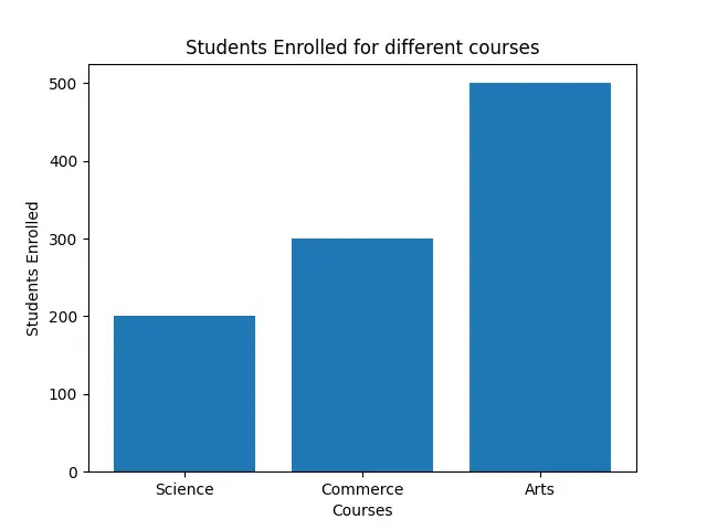
コースに登録している学生の数を表す棒グラフを描く例を見てみましょう。 X 座標のランダム リストを作成し、高さのリストを作成します。
x1 = ["Science", "Commerce", "Arts"]
h = [200, 300, 500]
これで、デフォルトの幅の値でプロットが表示されます。
コード:
import matplotlib.pyplot as plot

x1 = ["Science", "Commerce", "Arts"]
h = [200, 300, 500]

plot.bar(x1, h)
plot.xlabel("Courses")
plot.ylabel("Students Enrolled")
plot.title("Students Enrolled for different courses")
plot.show()
バーの幅がデフォルト値の 0.8 になっていることがわかります。
出力:
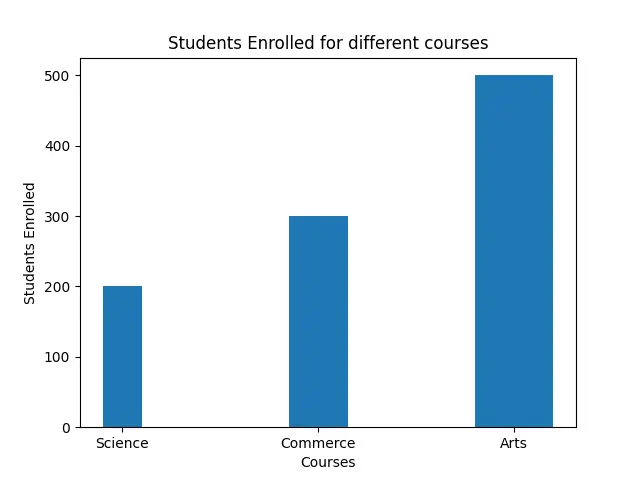
width を変更したい場合は、浮動小数点数を渡すことができます。 width はバーの幅で、スカラー値もとります。
コード:
import matplotlib.pyplot as plot

x1 = ["Science", "Commerce", "Arts"]
h = [200, 300, 500]

plot.bar(x1, h, 0.4)
plot.xlabel("Courses")
plot.ylabel("Students Enrolled")
plot.title("Students Enrolled for different courses")
plot.show()
次の図では、幅が変更されていることがわかります。
出力:

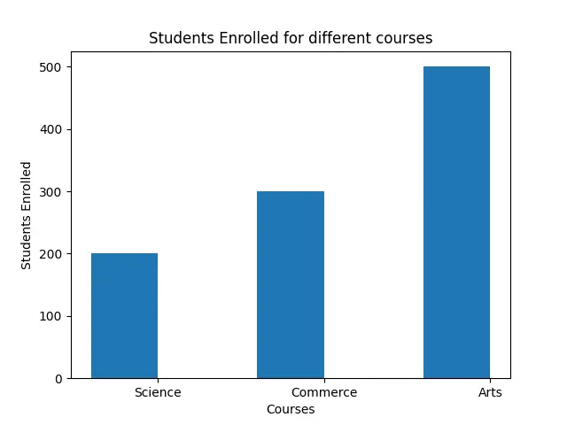
width 引数を使用して幅を指定する別の方法があります。
plot.bar(x1, h, width=0.4)
対応するバーを含むさまざまな幅のリストを渡すこともできます。
コード:
import matplotlib.pyplot as plot

x1 = ["Science", "Commerce", "Arts"]
h = [200, 300, 500]
w = [0.2, 0.3, 0.4]

plot.bar(x1, h, width=w)
plot.xlabel("Courses")
plot.ylabel("Students Enrolled")
plot.title("Students Enrolled for different courses")
plot.show()
ここでは、さまざまなコースのさまざまな幅を参照してください。
出力:
バーのデフォルトの配置は中央です。 "edge" を align 引数に渡すと、左揃えが表示されます。
右側でこの配置を行いたい場合は、幅を負の値にする必要があります。
コード:
import matplotlib.pyplot as plot

x1 = ["Science", "Commerce", "Arts"]
h = [200, 300, 500]

plot.bar(x1, h, width=-0.4, align="edge")
plot.xlabel("Courses")
plot.ylabel("Students Enrolled")
plot.title("Students Enrolled for different courses")
plot.show()
出力:

Hello! I am Salman Bin Mehmood(Baum), a software developer and I help organizations, address complex problems. My expertise lies within back-end, data science and machine learning. I am a lifelong learner, currently working on metaverse, and enrolled in a course building an AI application with python. I love solving problems and developing bug-free software for people. I write content related to python and hot Technologies.
LinkedIn