Matplotlib에서 막대 그래프의 너비 매개변수 설정

이 데모에서는 막대 그래프에 대해 설명하고 Matplotlib에서 막대 함수의 너비 매개변수를 살펴봅니다.
Matplotlib에서 막대 그래프의 너비 매개변수 설정
막대 그래프는 다양한 높이의 막대를 사용하여 데이터를 그래픽으로 표시한 것입니다. 이 막대 그래프를 사용하여 다양한 유형의 데이터를 비교할 수 있습니다.
막대 그래프를 만들기 위해 Matplotlib의 bar() 함수를 사용할 수 있습니다. 이 함수의 구문을 살펴보겠습니다.
통사론:
bar(x, height, width=0.8, bottom=None, align="center", data=None, **kwargs)
bar()에는 여러 매개변수가 있습니다. 처음 두 개의 매개변수인 x와 height는 필수입니다.
이러한 매개변수를 사용하여 막대 그래프를 만들고 나머지 매개변수에 기본값을 포함하면 도움이 됩니다. 이 튜토리얼에서는 width 매개변수에 대해 설명합니다.
우리는 x와 높이를 정의하고 x는 x 좌표 값입니다. x를 스칼라 시퀀스로 사용할 수 있습니다.
두 번째 매개변수는 높이입니다. 우리는 그것을 스칼라의 시퀀스로 받아들일 수도 있습니다.
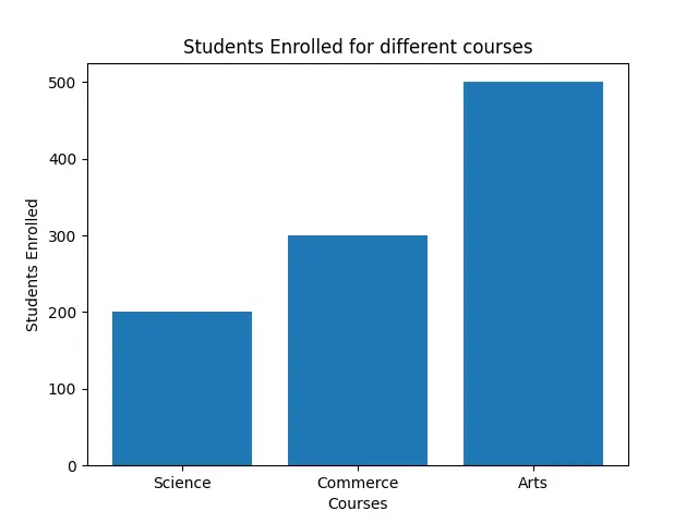
과정에 등록된 학생 수를 나타내는 막대 그래프를 그리는 예를 들어 보겠습니다. X 좌표에 대한 임의 목록을 만들고 높이 목록을 만듭니다.
x1 = ["Science", "Commerce", "Arts"]
h = [200, 300, 500]
이제 기본 너비 값이 있는 플롯이 표시됩니다.
암호:
import matplotlib.pyplot as plot

x1 = ["Science", "Commerce", "Arts"]
h = [200, 300, 500]

plot.bar(x1, h)
plot.xlabel("Courses")
plot.ylabel("Students Enrolled")
plot.title("Students Enrolled for different courses")
plot.show()
이제 막대의 너비가 기본값인 0.8임을 알 수 있습니다.
출력:
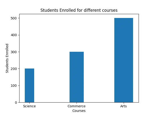
너비를 변경하려면 float 숫자를 전달할 수 있습니다. 너비는 막대의 너비이며 스칼라 값도 사용합니다.
암호:
import matplotlib.pyplot as plot

x1 = ["Science", "Commerce", "Arts"]
h = [200, 300, 500]

plot.bar(x1, h, 0.4)
plot.xlabel("Courses")
plot.ylabel("Students Enrolled")
plot.title("Students Enrolled for different courses")
plot.show()
다음 그림에서 너비가 변경된 것을 볼 수 있습니다.
출력:

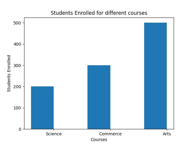
width 인수를 사용하여 너비를 지정하는 다른 방법이 있습니다.
plot.bar(x1, h, width=0.4)
또한 해당 막대와 함께 다양한 폭의 목록을 전달할 수도 있습니다.
암호:
import matplotlib.pyplot as plot

x1 = ["Science", "Commerce", "Arts"]
h = [200, 300, 500]
w = [0.2, 0.3, 0.4]

plot.bar(x1, h, width=w)
plot.xlabel("Courses")
plot.ylabel("Students Enrolled")
plot.title("Students Enrolled for different courses")
plot.show()
여기에서 다른 코스에 대한 다른 너비를 참조하십시오.
출력:
막대의 기본 정렬은 중앙입니다. "edge"를 align 인수로 전달하면 왼쪽 정렬을 볼 수 있습니다.
오른쪽에 이 정렬을 만들려면 너비를 음수 값으로 가져와야 합니다.
암호:
import matplotlib.pyplot as plot

x1 = ["Science", "Commerce", "Arts"]
h = [200, 300, 500]

plot.bar(x1, h, width=-0.4, align="edge")
plot.xlabel("Courses")
plot.ylabel("Students Enrolled")
plot.title("Students Enrolled for different courses")
plot.show()
출력:

Hello! I am Salman Bin Mehmood(Baum), a software developer and I help organizations, address complex problems. My expertise lies within back-end, data science and machine learning. I am a lifelong learner, currently working on metaverse, and enrolled in a course building an AI application with python. I love solving problems and developing bug-free software for people. I write content related to python and hot Technologies.
LinkedIn