如何在 Matplotlib 中的第二 Y 軸上新增 Y 軸標籤
Suraj Joshi
2023年1月30日
Matplotlib
Matplotlib Axes
我們可以直接與 axes 物件互動,或者使用 DataFrame.plot 方法在 Matplotlib 中的 y 軸輔助標籤上新增 y 軸標籤。
與軸物件直接互動
我們可以在 twinx() 函式的幫助下使用兩個不同的 axes 物件來繪製帶有兩個不同 Y 軸的圖。現在,我們可以使用第二個 axes 物件來繪製第二個 y 軸變數的圖並更新其標籤。
import numpy as np
import matplotlib.pyplot as plt

a = np.linspace(0, 5, 100)

y1 = np.sin(2 * np.pi * a)
y2 = np.cos(2 * np.pi * a)

fig, ax1 = plt.subplots()

ax1.set_xlabel("time (s)")
ax1.set_ylabel("sin", color="red")
ax1.plot(a, y1, color=color)
ax1.tick_params(axis="y", labelcolor=color)

ax2 = ax1.twinx()
ax2.set_ylabel("cos", color="green")
ax2.plot(a, y2, color=color)
ax2.tick_params(axis="y", labelcolor=color)

fig.tight_layout()
plt.show()
輸出:
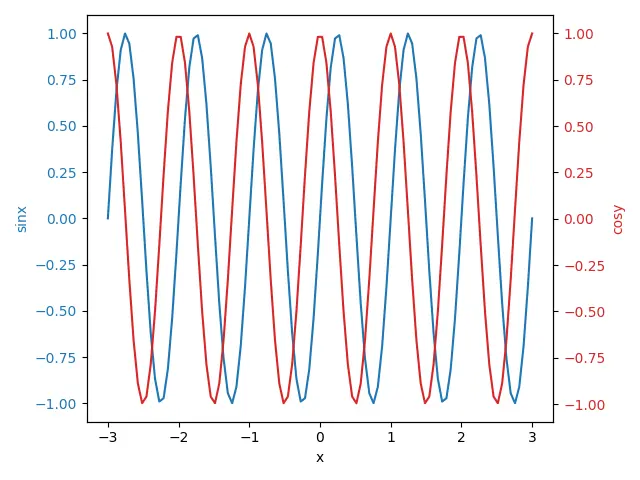
ax2 = ax1.twinx()
Axes.twinx() 建立一個新的 Axes,其 Y 軸與原始軸相反,在本例中為 ax1。
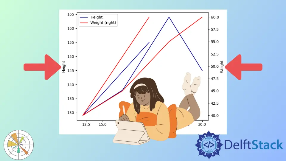
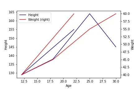
使用 DataFrame.plot 方法將 y 軸標籤新增到輔助 y 軸
我們也可以使用 pandas 將 Y 軸標籤新增到第二 Y 軸。當我們在 DataFrame.plot 方法中將 secondary_y 選項設定為 True 時,它將返回可用於設定標籤的不同軸。
import pandas as pd
import matplotlib.pyplot as plt

df = pd.DataFrame(
    {
        "Age": [22, 12, 18, 25, 30],
        "Height": [155, 129, 138, 164, 145],
        "Weight": [60, 40, 45, 55, 60],
    }
)
ax = df.plot(kind="line", x="Age", y="Height", color="DarkBlue")

ax2 = df.plot(kind="line", x="Age", y="Weight", secondary_y=True, color="Red", ax=ax)

ax.set_ylabel("Height")
ax2.set_ylabel("Weight")
plt.tight_layout()
plt.show()
輸出:
Enjoying our tutorials? Subscribe to DelftStack on YouTube to support us in creating more high-quality video guides. Subscribe
作者: Suraj Joshi

Suraj Joshi is a backend software engineer at Matrice.ai.
LinkedIn