R の scale_y_continuous 関数
-
scale_y_continuousを使用して、Y 軸ラベルを R のパーセンテージとして出力する -
scale_y_continuousを使用して、R の Y 軸のスケーリング比を設定する -
scale_y_continuousを使用して、R の Y 軸のラベルを削除する -
R のカスタム値で
scale_y_continuousを使用して Y 軸ラベルを変更する

この記事では、R の scale_y_continuous 関数を紹介します。
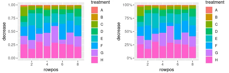
scale_y_continuous を使用して、Y 軸ラベルを R のパーセンテージとして出力する
scale_y_continuous は、連続的な y 軸スケールの美学の値を設定するために使用されます。この関数は ggplot2 パッケージの一部であり、描画するグラフのさまざまなパラメーターを変更するために、主に ggplot オブジェクトで使用されます。この例は、scale_y_continuous を使用して Y 軸ラベルをパーセンテージ値として出力する方法を示しています。積み上げ棒グラフは geom_col(position = "fill") 関数呼び出しを使用して作成され、パーセンテージは scales::percent 関数を labels パラメーター値として使用して出力されることに注意してください。library 呼び出しを使用して scales パッケージを含めたので、このスクリプトのスコープで percent 表記を使用してそれを参照することができます。
library(ggplot2)
library(gridExtra)
library(scales)

p1 <- ggplot(OrchardSprays, aes(x = rowpos, y = decrease, fill = treatment)) +
  geom_col(position = "fill")

p2 <- ggplot(OrchardSprays, aes(x = rowpos, y = decrease, fill = treatment)) +
  geom_col(position = "fill") +
  scale_y_continuous(labels = percent)

grid.arrange(p1, p2, ncol = 2, nrow =2)
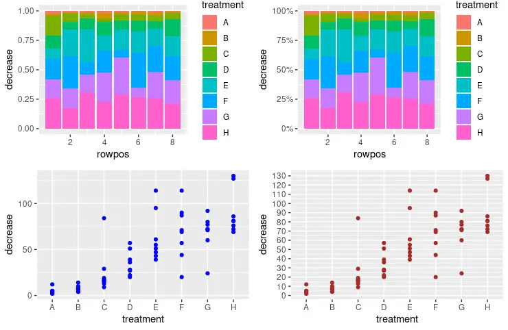
scale_y_continuous を使用して、R の Y 軸のスケーリング比を設定する
scale_y_continuous を利用して y 軸のスケールと増分値を設定し、次のラベルを出力することもできます。seq 関数は、scale_y_continuous 呼び出しの breaks パラメーターに数列を渡すために使用されます。数値を seq(from, to, by= ) 表現として解釈します。
library(ggplot2)
library(gridExtra)
library(scales)

p1 <- ggplot(OrchardSprays, aes(x = rowpos, y = decrease, fill = treatment)) +
  geom_col(position = "fill")

p2 <- ggplot(OrchardSprays, aes(x = rowpos, y = decrease, fill = treatment)) +
  geom_col(position = "fill") +
  scale_y_continuous(labels = percent)

p3 <- ggplot(OrchardSprays, aes(x = treatment, y = decrease)) +
  geom_point(colour = "blue")

p4 <- ggplot(OrchardSprays, aes(x = treatment, y = decrease)) +
  geom_point(colour = "brown") +
  scale_y_continuous(breaks = seq(0, 150, 10))

grid.arrange(p1, p2, p3, p4, ncol = 2, nrow =2)
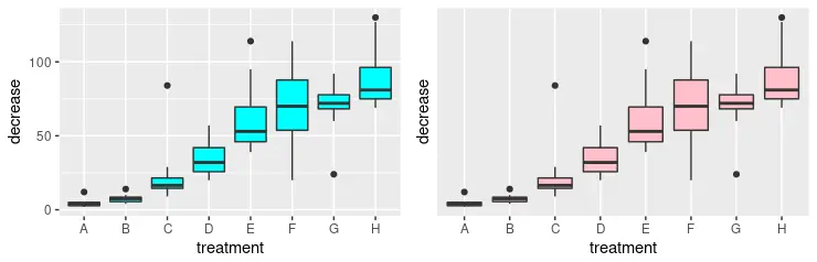
scale_y_continuous を使用して、R の Y 軸のラベルを削除する
または、scale_y_continuous 関数を使用して、y 軸のラベルを完全に削除することもできます。このために、NULL 値を breaks パラメーターとして渡す必要があります。grid.arrange 関数と視覚的に比較するために 2つのグラフを描画していることに注意してください。
library(ggplot2)
library(gridExtra)

p3 <- ggplot(OrchardSprays, aes(x = treatment, y = decrease)) +
  geom_boxplot(fill = "cyan")

p4 <- ggplot(OrchardSprays, aes(x = treatment, y = decrease)) +
  geom_boxplot(fill = "pink") +
  scale_y_continuous(breaks = NULL)

grid.arrange(p3, p4, ncol = 2, nrow =2)
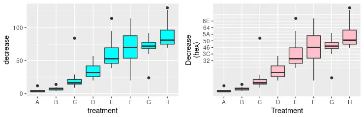
R のカスタム値で scale_y_continuous を使用して Y 軸ラベルを変更する
以前の方法のいくつかを組み合わせて、y 軸の美学のより高度なフォーマットを形成することができます。次のコードスニペットでは、出力する複数のラベルを明示的に指定し、同時に labels パラメーターを使用してそれらの新しい値を定義します。新しい値は、対応する数値の 16 進数表記にすぎないことに注意してください。最後に、指定された文字列と x 軸で y 軸のスケールの名前を変更します。これは、scale_x_discrete 関数を使用して行われます。
library(ggplot2)
library(gridExtra)

p3 <- ggplot(OrchardSprays, aes(x = treatment, y = decrease)) +
  geom_boxplot(fill = "cyan")

p4 <- ggplot(OrchardSprays, aes(x = treatment, y = decrease)) +
  geom_boxplot(fill = "pink") +
  scale_y_continuous(
    breaks = c(50, 60, 70, 80, 90, 100, 110),
    labels = c("32", "3C", "46", "50", "5A", "64", "6E"),
    name = "Decrease\n(hex)") +
  scale_x_discrete(name = "Treatment")

grid.arrange(p3, p4, ncol = 2, nrow =2)