How to Change the Header Style of reactTable

The reactTable is a built-in library in React to create an attractive table. You are always bound to make changes to the table when you use any library to create the table in any programming language.
There are very few libraries that can make all components customizable. In this article, we will learn to create the table using the reactTable library and apply custom CSS to the table header and body.
Use the styled-components React Library to Change the Header Style of reactTable
In the example below, we have used the reactTable library to create the table and styled-components to style the table. To install both libraries, open the terminal in your project directory and execute the following:
npm install styled-components react-table
Also, users can use the default CSS of reactTable by importing it like import "react-table/react-table.css";. However, using that, users can make minimal changes to the style of the table.
So, we have decided to style the table manually using the styled-component library. It adds style to the whole component in React.
First, we created the array of objects of columns and table data to render on the screen and passed it to the Table component as a prop. Also, we have embedded the Table component inside the Styles component to apply CSS defined in the Styles.
<Styles>
    <Table columns={columns} data={data} />
</Styles>
After that, we created the Table functional component and used the useTable from react-table to get the states and props from the columns and data.
const { getTableProps, getTableBodyProps, headerGroups, rows, prepareRow } = useTable({columns,data,});
We used the <table> tag from HTML to create the rendering component and the <thead> tag to create the header. The headerGroups contains all header elements, and we are iterating through every header element using the .map() method of JavaScript and creating the custom header component.
Next, we used the getTableBodyProps and created the rows and columns for the table body. Also, we have used the <th> tag to create a header, the <tr> tag to create rows, and the <td> tag to create columns.
<table {...getTableProps()}>
    <thead>
        {headerGroups.map((singleHeader) => (
        // create table header
       ))}
    </thead>
    <tbody {...getTableBodyProps()}>
        {rows.map((tableRow, i) => {
            // create table row
        })}
      </tbody>
    </table>
We have initialized the Styles variable for styling the Table component. Users can use the styled-components like below.
const Styles = styled.div`
    // style for the component elements
`
The complete working code for the App.js file is given below.
Example Code:
//  import required libraries
import React from "react";
import styled from "styled-components";
import { useTable } from "react-table";
// creating the style component
const Styles = styled.div`
  // style for the body
  text-align: center;
  padding-left: 50px;
  padding-top: 50px;
  // style for the whole table
  table {
    border-spacing: 0;
    border: 0.2rem solid black;

    //  style for every column
    td {
      margin: 0;
      padding: 0.5rem;
      border-bottom: 0.1rem solid black;
      border-right: 0.1rem solid black;

      :last-child {
        border-right: 0;
      }
    }
    // style for every header
    th {
      padding: 0.5rem;
      border-bottom: 0.1rem dashed black;
      border-right: 0.1rem solid black;
    }
  }
`;

// function table creates the table from props and returns the table
function Table({ columns, data }) {
  // The useTable, returns the state and props from the header and table data
  const { getTableProps, getTableBodyProps, headerGroups, rows, prepareRow } =
    useTable({
      columns,
      data,
    });

  // Creating the table component
  return (
    <table {...getTableProps()}>
      {/* creating the header */}
      <thead>
        {/* iterate through every header and create the single header using the <th> HTML tag. */}
        {headerGroups.map((singleHeader) => (
          <tr {...singleHeader.getHeaderGroupProps()}>
            {/* create a column for every single header */}
            {singleHeader.headers.map((singleColumn) => (
              <th {...singleColumn.getHeaderProps()}>
                {singleColumn.render("Header")}
              </th>
            ))}
          </tr>
        ))}
      </thead>
      {/* creating the table body */}
      <tbody {...getTableBodyProps()}>
        {/* iterate through every row of table */}
        {rows.map((tableRow, i) => {
          prepareRow(tableRow);
          return (
            // create table row
            <tr {...tableRow.getRowProps()}>
              {/* create table column for every table row */}
              {tableRow.cells.map((tableColumn) => {
                return (
                  <td {...tableColumn.getCellProps()}>
                    {tableColumn.render("Cell")}
                  </td>
                );
              })}
            </tr>
          );
        })}
      </tbody>
    </table>
  );
}

function App() {
  // header data
  const columns = [
    {
      Header: "Programming Langugage",
      accessor: "ProgrammingLangugage",
    },
    {
      Header: "Rating",
      accessor: "Rating",
    },
  ];
  //  table data
  const data = [
    {
      ProgrammingLangugage: "JavaScript",
      Rating: 8,
    },
    {
      ProgrammingLangugage: "Python",
      Rating: 7,
    },
    {
      ProgrammingLangugage: "C",
      Rating: 8,
    },
    {
      ProgrammingLangugage: "C++",
      Rating: 8,
    },
    {
      ProgrammingLangugage: "NodeJs",
      Rating: 9,
    },
    {
      ProgrammingLangugage: "MongoDB",
      Rating: 8,
    },
  ];

  return (
    // embedded the Table component inside the style component to apply style on the table
    <Styles>
      {/* passed columns and data as props in Table component */}
      <Table columns={columns} data={data} />
    </Styles>
  );
}
export default App;
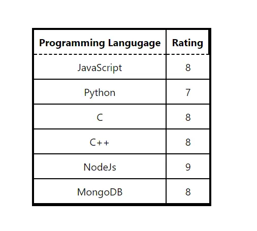
Output:

Users can observe the dashed border for the header in the output. Also, they can change the style according to their requirements.
We have created the Table component in a single file, but users can make it in another file and make it reusable.
