reactTable의 헤더 스타일 변경

reactTable은 매력적인 테이블을 만들기 위한 React의 내장 라이브러리입니다. 라이브러리를 사용하여 프로그래밍 언어로 테이블을 만들 때 항상 테이블을 변경해야 합니다.
모든 구성 요소를 사용자 지정 가능하게 만들 수 있는 라이브러리는 거의 없습니다. 이 기사에서는 reactTable 라이브러리를 사용하여 테이블을 생성하고 테이블 헤더 및 본문에 사용자 정의 CSS를 적용하는 방법을 배웁니다.
styled-component 반응 라이브러리를 사용하여 reactTable의 헤더 스타일 변경
아래 예제에서는 reactTable 라이브러리를 사용하여 테이블을 만들고 styled-components를 사용하여 테이블 스타일을 지정했습니다. 두 라이브러리를 모두 설치하려면 프로젝트 디렉토리에서 터미널을 열고 다음을 실행하십시오.
npm install styled-components react-table
또한 사용자는 import "react-table/react-table.css";와 같이 import하여 reactTable의 기본 CSS를 사용할 수 있습니다. 그러나 이를 사용하여 사용자는 테이블 스타일을 최소한으로 변경할 수 있습니다.
따라서 styled-component 라이브러리를 사용하여 수동으로 테이블 스타일을 지정하기로 결정했습니다. React의 전체 구성 요소에 스타일을 추가합니다.
먼저 화면에 렌더링할 열과 테이블 데이터의 객체 배열을 생성하고 Table 구성 요소에 소품으로 전달했습니다. 또한 Styles 컴포넌트 내부에 Table 컴포넌트를 삽입하여 Styles에 정의된 CSS를 적용했습니다.
<Styles>
    <Table columns={columns} data={data} />
</Styles>
그런 다음 Table 기능 구성 요소를 만들고 react-table의 useTable을 사용하여 columns 및 data에서 state 및 props를 가져옵니다.
const { getTableProps, getTableBodyProps, headerGroups, rows, prepareRow } = useTable({columns,data,});
HTML의 <table> 태그를 사용하여 렌더링 구성 요소를 만들고 <thead> 태그를 사용하여 헤더를 만들었습니다. headerGroups에는 모든 헤더 요소가 포함되어 있으며 JavaScript의 .map() 메서드를 사용하여 모든 헤더 요소를 반복하고 사용자 지정 헤더 구성 요소를 생성합니다.
다음으로 getTableBodyProps를 사용하고 테이블 본문의 행과 열을 생성했습니다. 또한 <th> 태그를 사용하여 헤더를 만들고 <tr> 태그를 사용하여 행을 만들고 <td> 태그를 사용하여 열을 만듭니다.
<table {...getTableProps()}>
    <thead>
        {headerGroups.map((singleHeader) => (
        // create table header
       ))}
    </thead>
    <tbody {...getTableBodyProps()}>
        {rows.map((tableRow, i) => {
            // create table row
        })}
      </tbody>
    </table>
Table 구성 요소의 스타일을 지정하기 위해 Styles 변수를 초기화했습니다. 사용자는 아래와 같이 styled-components를 사용할 수 있습니다.
const Styles = styled.div`
    // style for the component elements
`
App.js 파일의 전체 작업 코드는 다음과 같습니다.
예제 코드:
//  import required libraries
import React from "react";
import styled from "styled-components";
import { useTable } from "react-table";
// creating the style component
const Styles = styled.div`
  // style for the body
  text-align: center;
  padding-left: 50px;
  padding-top: 50px;
  // style for the whole table
  table {
    border-spacing: 0;
    border: 0.2rem solid black;

    //  style for every column
    td {
      margin: 0;
      padding: 0.5rem;
      border-bottom: 0.1rem solid black;
      border-right: 0.1rem solid black;

      :last-child {
        border-right: 0;
      }
    }
    // style for every header
    th {
      padding: 0.5rem;
      border-bottom: 0.1rem dashed black;
      border-right: 0.1rem solid black;
    }
  }
`;

// function table creates the table from props and returns the table
function Table({ columns, data }) {
  // The useTable, returns the state and props from the header and table data
  const { getTableProps, getTableBodyProps, headerGroups, rows, prepareRow } =
    useTable({
      columns,
      data,
    });

  // Creating the table component
  return (
    <table {...getTableProps()}>
      {/* creating the header */}
      <thead>
        {/* iterate through every header and create the single header using the <th> HTML tag. */}
        {headerGroups.map((singleHeader) => (
          <tr {...singleHeader.getHeaderGroupProps()}>
            {/* create a column for every single header */}
            {singleHeader.headers.map((singleColumn) => (
              <th {...singleColumn.getHeaderProps()}>
                {singleColumn.render("Header")}
              </th>
            ))}
          </tr>
        ))}
      </thead>
      {/* creating the table body */}
      <tbody {...getTableBodyProps()}>
        {/* iterate through every row of table */}
        {rows.map((tableRow, i) => {
          prepareRow(tableRow);
          return (
            // create table row
            <tr {...tableRow.getRowProps()}>
              {/* create table column for every table row */}
              {tableRow.cells.map((tableColumn) => {
                return (
                  <td {...tableColumn.getCellProps()}>
                    {tableColumn.render("Cell")}
                  </td>
                );
              })}
            </tr>
          );
        })}
      </tbody>
    </table>
  );
}

function App() {
  // header data
  const columns = [
    {
      Header: "Programming Langugage",
      accessor: "ProgrammingLangugage",
    },
    {
      Header: "Rating",
      accessor: "Rating",
    },
  ];
  //  table data
  const data = [
    {
      ProgrammingLangugage: "JavaScript",
      Rating: 8,
    },
    {
      ProgrammingLangugage: "Python",
      Rating: 7,
    },
    {
      ProgrammingLangugage: "C",
      Rating: 8,
    },
    {
      ProgrammingLangugage: "C++",
      Rating: 8,
    },
    {
      ProgrammingLangugage: "NodeJs",
      Rating: 9,
    },
    {
      ProgrammingLangugage: "MongoDB",
      Rating: 8,
    },
  ];

  return (
    // embedded the Table component inside the style component to apply style on the table
    <Styles>
      {/* passed columns and data as props in Table component */}
      <Table columns={columns} data={data} />
    </Styles>
  );
}
export default App;
출력:
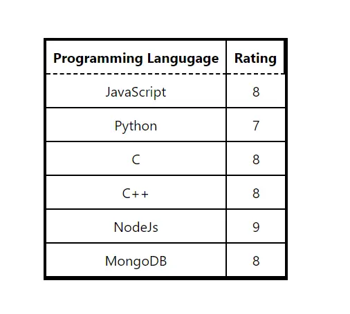
사용자는 출력에서 헤더의 파선 테두리를 볼 수 있습니다. 또한 요구 사항에 따라 스타일을 변경할 수 있습니다.
단일 파일에 Table 구성 요소를 만들었지만 사용자가 다른 파일에서 만들어 재사용할 수 있습니다.