How to Test for Normality of Data in R
- Applicability of the Given Techniques
- Plot the Data
- Use the Shapiro-Wilk Normality Test in R
- The Quantile-Quantile Plot in R
- Conclusion
Many statistical tests or techniques assume that the sample we have is related to the normal distribution. Some tests or procedures may assume that the sample is drawn from a normally distributed population.
Others may assume that our data’s random errors (residuals) are drawn from a normal distribution. R gives us multiple ways to test whether our data (original or residual) follows a normal distribution.
This article will look at three simple, popular techniques to test ungrouped, univariate data for normality.
Example Code:
# First, we will create the data for our demonstrations.

# Large normal population.
set.seed(951)
p = rnorm(100000,100,5)

# Plot the population.
hist(p, breaks=100)

# Take a sample from the normal population.
set.seed(753)
s1 = sample(p, size=125, replace=FALSE)

# Create a non-normal sample.
# A vector (population).
v = c(31:81)

# Non-normal sample.
set.seed(159)
s2 = sample(v, 2000, replace=TRUE)
Applicability of the Given Techniques
The techniques that follow are for the data available to us. They tell us whether or not the data is acceptably normal.
Therefore, they are to be used only to conclude the available data.
In particular, they do not allow us to conclude the population from which the data (sample) was taken. Those conclusions will depend on the statistical theory relevant to the sampling technique used to obtain the sample.
Plot the Data
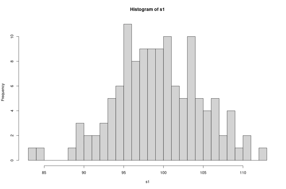
We will begin with a qualitative approach, suitable as a starting point. A simple histogram will show whether the data has a bell shape like the normal curve.
Example Code:
# Plot the sample from the normal population.
hist(s1, breaks=25)

# Plot the non-normal sample.
hist(s2, breaks=25)
A plot of the sample drawn from the normal population.
A plot of the non-normal sample.
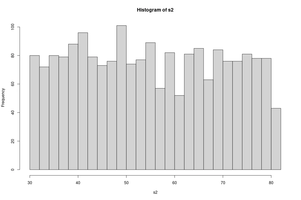
We find that the sample from the normal population has an approximate bell shape. The non-normal sample resembles a rectangle.
Use the Shapiro-Wilk Normality Test in R
The Shapiro-Wilk test for normality of data is a widely-used statistical test.
The shapiro.test() function takes a data vector of 3 to 5000 elements. More correctly, this is the vector’s range for the number of non-missing elements.
The test assumes that the data is normal. That is the null hypothesis.
It returns a W-statistic and a p-value. A W-statistic close to 1 implies that the distribution is almost normal.
However, this interpretation needs to be combined with the p-value returned.
A p-value greater than 0.05 supports the conclusion that the sample is normally distributed.
Example Code:
# Run the Shapiro-Wilk test on the samples.

# Sample from normal population.
shapiro.test(s1)

# Non-normal sample.
shapiro.test(s2)
Output:
> # Sample from normal population.
> shapiro.test(s1)

	Shapiro-Wilk normality test

data:  s1
W = 0.99353, p-value = 0.8383

> # Non-normal sample.
> shapiro.test(s2)

	Shapiro-Wilk normality test

data:  s2
W = 0.95117, p-value < 2.2e-16
We find that the sample from the normal population has a high W-statistic and a high p-value. The sample closely follows the normal distribution.
However, as expected, the non-normal sample has an extremely low p-value. It confirms that the sample does not follow the normal distribution.
The Quantile-Quantile Plot in R
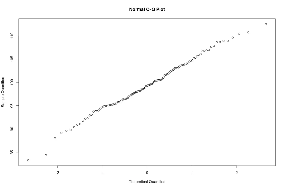
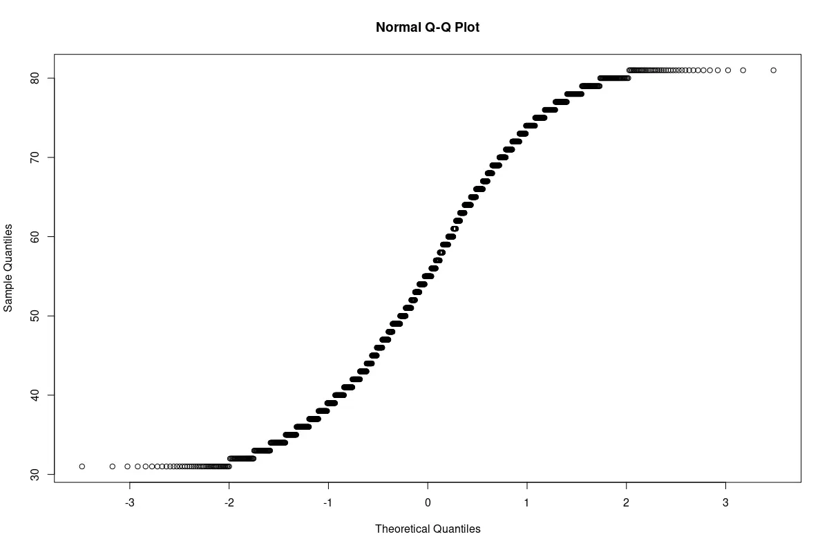
The Quantile-Quantile Plot (also called the Q-Q plot) is another qualitative technique to test for normality.
In this test, quantiles from the sample data are plotted against corresponding quantiles from a standard normal distribution. If there is sufficient linear correlation between the quantiles, both distributions are similar; the sample data follows a normal distribution.
Graphically, if the plot results in an almost straight line, it supports the conclusion that the sample is almost normal.
The qqnorm() function creates a Q-Q plot in R.
Example Code:
# Plot the Q-Q plots for both the samples.

# Q-Q plot of sample from the normal population.
qqnorm(s1)

# Q-Q plot for the non-normal sample.
qqnorm(s2)
Q-Q plot of the sample from the normal population. The graph is nearly a straight line.
Q-Q plot of the non-normal sample. The plot is a curved line. The sample was not normal.
Conclusion
In practice, all three approaches given above are complementary. The Shapiro-Wilk test may give a very low p-value when the sample size is very large.
Visual techniques help us draw a correct conclusion.

Jesse is passionate about data analysis and visualization. He uses the R statistical programming language for all aspects of his work.