How to Plot Confusion Matrix in Python
- Use Matplotlib to Plot Confusion Matrix in Python
- Use Seaborn to Plot Confusion Matrix in Python
- Use Pretty Confusion Matrix to Plot Confusion Matrix in Python

This article will discuss plotting a confusion matrix in Python using different library packages.
Use Matplotlib to Plot Confusion Matrix in Python
This program represents how we can plot the confusion matrix using Matplotlib.
Below are the two library packages we need to plot our confusion matrix.
from sklearn.metrics import confusion_matrix
import matplotlib.pyplot as plt
After importing the necessary packages, we need to create the confusion matrix from the given data.
First, we declare the variables y_true and y_pred. y-true is filled with the actual values while y-pred is filled with the predicted values.
y_true = ["bat", "ball", "ball", "bat", "bat", "bat"]
y_pred = ["bat", "bat", "ball", "ball", "bat", "bat"]
We then declare a variable mat_con to store the matrix. Below is the syntax we will use to create the confusion matrix.
mat_con = confusion_matrix(y_true, y_pred, labels=["bat", "ball"])
It tells the program to create a confusion matrix with the two parameters, y_true and y_pred. labels tells the program that the confusion matrix will be made with two input values, bat and ball.
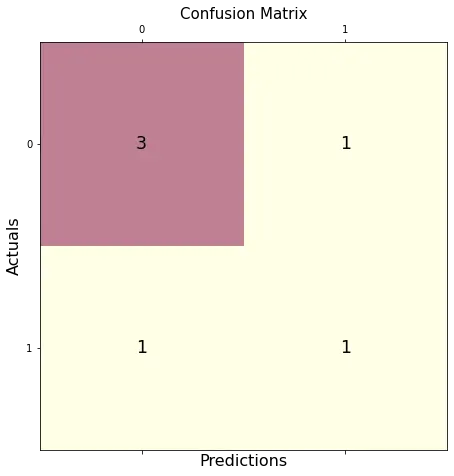
To plot a confusion matrix, we also need to indicate the attributes required to direct the program in creating a plot.
fig, px = plt.subplots(figsize=(7.5, 7.5))
px.matshow(mat_con, cmap=plt.cm.YlOrRd, alpha=0.5)
plt.subplots() creates an empty plot px in the system, while figsize=(7.5, 7.5) decides the x and y length of the output window. An equal x and y value will display your plot on a perfectly squared window.
px.matshow is used to fill our confusion matrix in the empty plot, whereas the cmap=plt.cm.YlOrRd directs the program to fill the columns with yellow-red gradients.
alpha=0.5 is used to decide the depth of gradient or how dark the yellow and red are.
Then, we run a nested loop to plot our confusion matrix in a 2X2 format.
for m in range(mat_con.shape[0]):
    for n in range(mat_con.shape[1]):
        px.text(x=m, y=n, s=mat_con[m, n], va="center", ha="center", size="xx-large")
for m in range(mat_con.shape[0]): runs the loop for the number of rows, (shape[0] stands for number of rows). for n in range(mat_con.shape[1]): runs another loop inside the existing loop for the number of columns present.
px.text(x=m,y=n,s=mat_con[m, n], va='center', ha='center', size='xx-large') fills the confusion matrix plot with the rows and columns values.
In the final step, we use plt.xlabel() and plt.ylabel() to label the axes, and we put the title plot with the syntax plt.title().
plt.xlabel("Predictions", fontsize=16)
plt.ylabel("Actuals", fontsize=16)
plt.title("Confusion Matrix", fontsize=15)
plt.show()
Putting it all together, we generate the complete code below.
# imports
from sklearn.metrics import confusion_matrix
import matplotlib.pyplot as plt

# creates confusion matrix
y_true = ["bat", "ball", "ball", "bat", "bat", "bat"]
y_pred = ["bat", "bat", "ball", "ball", "bat", "bat"]
mat_con = confusion_matrix(y_true, y_pred, labels=["bat", "ball"])

# Setting the attributes
fig, px = plt.subplots(figsize=(7.5, 7.5))
px.matshow(mat_con, cmap=plt.cm.YlOrRd, alpha=0.5)
for m in range(mat_con.shape[0]):
    for n in range(mat_con.shape[1]):
        px.text(x=m, y=n, s=mat_con[m, n], va="center", ha="center", size="xx-large")

# Sets the labels
plt.xlabel("Predictions", fontsize=16)
plt.ylabel("Actuals", fontsize=16)
plt.title("Confusion Matrix", fontsize=15)
plt.show()
Output:
Use Seaborn to Plot Confusion Matrix in Python
Using Seaborn allows us to create different-looking plots without dwelling much into attributes or the need to create nested loops.
Below is the library package needed to plot our confusion matrix.
import seaborn as sebrn
As represented in the previous program, we would be creating a confusion matrix using the confusion_matrix() method.
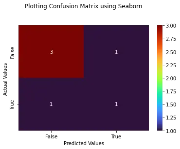
To create the plot, we will be using the syntax below.
fx = sebrn.heatmap(conf_matrix, annot=True, cmap="turbo")
We used the seaborn heatmap plot. annot=True fills the plot with data; a False value would result in a plot with no values.
cmap='turbo' stands for the color shading; we can choose from tens of different shading for our plot.
The code below will label our axes and set the title.
fx.set_title("Plotting Confusion Matrix using Seaborn\n\n")
fx.set_xlabel("\nValues model predicted")
fx.set_ylabel("True Values ")
Lastly, we label the boxes with the following syntax. This step is optional, but not using it will decrease the visible logic clarity of the matrix.
fx.xaxis.set_ticklabels(["False", "True"])
fx.yaxis.set_ticklabels(["False", "True"])
Let’s put everything together into a working program.
# imports
import seaborn as sebrn
from sklearn.metrics import confusion_matrix
import matplotlib.pyplot as atlas

y_true = ["bat", "ball", "ball", "bat", "bat", "bat"]
y_pred = ["bat", "bat", "ball", "ball", "bat", "bat"]
conf_matrix = confusion_matrix(y_true, y_pred, labels=["bat", "ball"])

# Using Seaborn heatmap to create the plot
fx = sebrn.heatmap(conf_matrix, annot=True, cmap="turbo")

# labels the title and x, y axis of plot
fx.set_title("Plotting Confusion Matrix using Seaborn\n\n")
fx.set_xlabel("Predicted Values")
fx.set_ylabel("Actual Values ")

# labels the boxes
fx.xaxis.set_ticklabels(["False", "True"])
fx.yaxis.set_ticklabels(["False", "True"])

atlas.show()
Output:
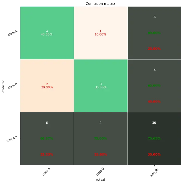
Use Pretty Confusion Matrix to Plot Confusion Matrix in Python
The Pretty Confusion Matrix is a Python library created to plot a stunning confusion matrix filled with lots of data related to metrics. This python library is useful when creating a highly detailed confusion matrix for your data sets.
In the below program, we plotted a confusion matrix using two sets of arrays: true_values and predicted_values. As we can see, plotting through Pretty Confusion Matrix is relatively simple than other plotting libraries.
from pretty_confusion_matrix import pp_matrix_from_data

true_values = [1, 0, 0, 1, 0, 0, 1, 0, 0, 1]
predicted_values = [1, 0, 0, 1, 0, 1, 0, 0, 1, 1]

cmap = "PuRd"
pp_matrix_from_data(true_values, predicted_values)
Output: