Matplotlib.pyplot.specgram() in Python
-
Plot Spectrogram Using the
matplotlib.pyplot.specgram()Method -
Plot Spectrogram Using the
scipy.signal.spectrogram()Method

This tutorial explains how we can plot spectrograms in Python using the matplotlib.pyplot.specgram() and scipy.signal.spectrogram() methods.
We can get details about the strength of a signal using a spectrogram. The darker the color of the spectrogram at a point, the stronger is the signal at that point.
Plot Spectrogram Using the matplotlib.pyplot.specgram() Method
matplotlib.pyplot.specgram(x,
                           NFFT=None,
                           Fs=None,
                           Fc=None,
                           detrend=None,
                           window=None,
                           noverlap=None,
                           cmap=None,
                           xextent=None,
                           pad_to=None,
                           sides=None,
                           scale_by_freq=None,
                           mode=None,
                           scale=None,
                           vmin=None,
                           vmax=None, *,
                           data=None,
                           **kwargs)
Example: Plot Spectrogram Using the matplotlib.pyplot.specgram() Method
import math
import numpy as np
import matplotlib.pyplot as plt

dt = 0.0001
w = 2
t = np.linspace(0, 5, math.ceil(5 / dt))
A = 20 * (np.sin(3 * np.pi * t))

plt.specgram(A, Fs=1)
plt.title("Spectrogram Using matplotlib.pyplot.specgram() method")
plt.show()
Output:
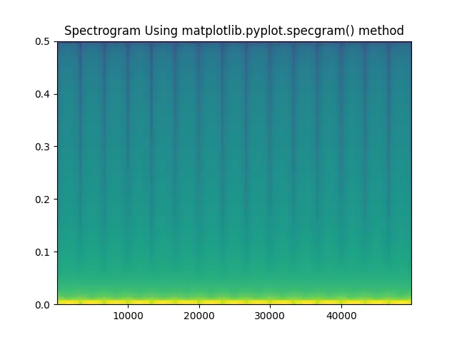
It creates a spectrogram for the function A=20sin(3*np.pi*t) using the matplotlib.pyplot.specgram() method. The argument fs in the method represents the sampling frequency.
Plot Spectrogram Using the scipy.signal.spectrogram() Method
import math
import numpy as np
import matplotlib.pyplot as plt
from scipy import signal

dt = 0.0001
w = 2
t = np.linspace(0, 5, math.ceil(5 / dt))
A = 2 * (np.sin(1 * np.pi * 300 * t))

f, t, Sxx = signal.spectrogram(A, fs=1, nfft=514)
plt.pcolormesh(t, f, Sxx)
plt.ylabel("Frequency")
plt.xlabel("Time")
plt.title("Spectrogram Using scipy.signal.spectrogram() method")
plt.show()
Output:
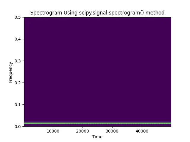
It creates a spectrogram for the function A=2sin(300*np.pi*t) using the scipy.signal.spectrogram() method. The argument fs in the method represents the sampling frequency and ntft represents the length of the FFT used.
The method returns three values f, t, and Sxx. f represents the array of sample frequencies, t represents the array of sample times and Sxx represents the spectrogram of A.
This method doesn’t generate the spectrogram plot of the input signal. We can use matplotlib.pyplot.colormesh() to generate the figure.

Suraj Joshi is a backend software engineer at Matrice.ai.
LinkedIn