How to Display a Tooltip Message on Hover Using jQuery
- jQuery-UI Tooltip
-
Use the
tooltip()Method WithoptionsParameter to Display a Tooltip Message on Hover Using jQuery -
Use the
tooltip()Method WithactionsParameter to Display a Tooltip Message on Hover Using jQuery

The Tooltip is a widget from jQuery-UI used to add new themes and allow customization.
This tutorial demonstrates how to use the jQuery-UI Tooltip.
jQuery-UI Tooltip
The Tooltip from jQuery is used to allow customization and create new themes. The tooltips are attached to any element; to display them, we add a title attribute to them, which will be used as a tooltip.
When we hover over that element, the Tooltip with the title attribute will be visible. The jQuery-UI provides a method tooltip(), which can add tooltips to any element.
The tooltip() method gives a fade animation, by default, when showing and hiding the Tooltip.
The syntax for this method is:
Method 1:
$(selector, context).tooltip (options)

Method 2:
$(selector, context).tooltip ("action", [params])
There are two ways to use the tooltip() method.
Use the tooltip() Method With options Parameter to Display a Tooltip Message on Hover Using jQuery
The first method with the options parameter is used to specify the behavior and appearance of the tooltip. The parameter options can be inserted multiple times and has multiple types.
The table below shows the type of options:
| Option | Description |
|---|---|
content |
This option represents the tooltip’s content with the function’s default value, which returns the title attribute. |
disabled |
This option is used to disable the tooltip with true or false values. |
hide |
This option represents the animation of a tooltip when hiding it. The values are true or false. |
show |
This option represents the animation of the tooltip while showing it. The values are true or false. |
track |
This option tracks the mouse when working with tooltips. The default value is false. |
items |
This option is used to choose which item will show the tooltip. The default value is title |
position |
This option is used to decide the tooltip’s position. The default value is the function returning the title attribute. |
tooltip class |
This option represents a class that can be added to the tooltip. It can represent the warning or errors; this option’s default value is null. |
First, let’s try a simple tooltip() example with no parameters. Ensure you import the jQuery-UI so the tooltip() method can work.
See example:
<!doctype html>
<html lang = "en">
<head>
<meta charset = "utf-8">
<title>jQuery Tooltip</title>
<script src = "https://code.jquery.com/jquery-1.10.2.js"></script>
<script src = "https://code.jquery.com/ui/1.10.4/jquery-ui.js"></script>
<link href = "https://code.jquery.com/ui/1.10.4/themes/ui-lightness/jquery-ui.css" rel = "stylesheet">
<script>
$(function() {
$("#Demotooltip1").tooltip();
$("#Demotooltip2").tooltip();
});
</script>
</head>
<body>
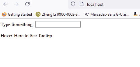
Type Something: <input id = "Demotooltip1" title = "Please Type Something">
<p><label id = "Demotooltip2" title = "This is tooltip Demo"> Hover Here to See Tooltip </label></p>
</body>
</html>
The code above will show the tooltip on the text input and the label. See output:
Now, let’s try an example with the content, disabled, and track options:
<!doctype html>
<html lang = "en">
<head>
<meta charset = "utf-8">
<title>jQuery Tooltip </title>
<link href = "https://code.jquery.com/ui/1.10.4/themes/ui-lightness/jquery-ui.css" rel = "stylesheet">
<script src = "https://code.jquery.com/jquery-1.10.2.js"></script>
<script src = "https://code.jquery.com/ui/1.10.4/jquery-ui.js"></script>
<script>
$(function() {
$( "#Demotooltip1" ).tooltip({
content: "Tooltip from Content",
track:true
}),
$( "#Demotooltip2" ).tooltip({
disabled: true
});
});
</script>
</head>
<body>
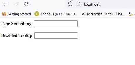
Type Something: <input id = "Demotooltip1" title = "Original">
<br><br>
Disabled Tooltip: <input id = "Demotooltip2" title = "Demotooltip">
</body>
</html>
The code above demonstrates using the content, track, and disabled options. See output:
Let’s try one more example with the option position. See example:
<!doctype html>
<html lang = "en">
<head>
<meta charset = "utf-8">
<title>jQuery Tooltip</title>
<link href = "https://code.jquery.com/ui/1.10.4/themes/ui-lightness/jquery-ui.css" rel = "stylesheet">
<script src = "https://code.jquery.com/jquery-1.10.2.js"></script>
<script src = "https://code.jquery.com/ui/1.10.4/jquery-ui.js"></script>
<style>
body {
margin-top: 50px;
}
.ui-tooltip-content::after, .ui-tooltip-content::before {
position: absolute;
content: "";
display: block;
left: 100px;
border-style: solid;
}
.ui-tooltip-content::before {
bottom: -5px;
border-width: 5px 5px 0;
border-color: #AAA transparent;
}
.ui-tooltip-content::after {
bottom: -7px;
border-width: 10px 10px 0;
border-color: white transparent;
}
</style>
<script>
$(function() {
$( "#Demotooltip" ).tooltip({
position: {
my: "center bottom",
at: "center top-10",
collision: "none"
}
});
});
</script>
</head>
<body>
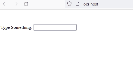
Type Something: <input id = "Demotooltip" title = "Please Type Something.">
</body>
</html>
The code above shows the demo of the position option, which adds a tip to the tooltip. See output:
Similarly, other options can be used for the purpose described in the table above. Now, let’s see method 2.
Use the tooltip() Method With actions Parameter to Display a Tooltip Message on Hover Using jQuery
The method $ (selector, context).tooltip ("action", [params]) will perform the actions on the elements for example disabling the tooltip. The action represents a string in the first argument, and params will be provided based on the given actions.
There are multiple types of actions, which are given below in the table:
| Action | Description |
|---|---|
close |
This action is used to close the tooltip. It has no arguments. |
destroy |
This action will remove the tooltip completely. It has no arguments. |
disable |
This action will deactivate the tooltip. It has no arguments. |
enable |
This action will activate the tooltip. It has no arguments. |
open |
This action will open the tooltip programmatically. No arguments. |
option() |
This action will get the key-value pairs representing the current tooltip option hash. |
option(Options) |
This action is used to set the options for the tooltip. |
option(OptionName) |
This action is to get the value of OptionName. No other arguments. |
option(OptionName, value) |
This action will set the value of OptionName according to given value. |
widget |
This action will return a jQuery object containing the original element. No Arguments. |
Let’s try a simple example for the open and close action, which will keep the tooltip open by pressing the button and closing it on another button press. See example:
<!doctype html>
<html lang = "en">
<head>
<meta charset = "utf-8">
<title>jQuery Tooltip</title>
<link href = "https://code.jquery.com/ui/1.10.4/themes/ui-lightness/jquery-ui.css"
rel = "stylesheet">
<script src = "https://code.jquery.com/jquery-1.10.2.js"></script>
<script src = "https://code.jquery.com/ui/1.10.4/jquery-ui.js"></script>
<script>
$(function() {
$("#Demotooltip").tooltip({
//the 'of' keyword will be used to link the tooltip to the specified input
position: { of: '#DemoInput', my: 'left center', at: 'left center' },
}),
$('#DemoButton1').click(function () {
$('#Demotooltip').tooltip("open");
});
$('#DemoButton2').click(function () {
$('#Demotooltip').tooltip("close");
});
});
</script>
</head>
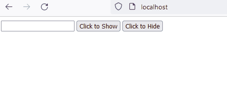
<body >
<label id = "Demotooltip" title = "Open and Close"></label>
<input id = "DemoInput" type = "text" size = "20" />
<input id = "DemoButton1" type = "submit" value = "Click to Show" />
<input id = "DemoButton2" type = "submit" value = "Click to Hide" />
</body>
</html>
The code above will open and close the tooltip on the button clicks. See output:
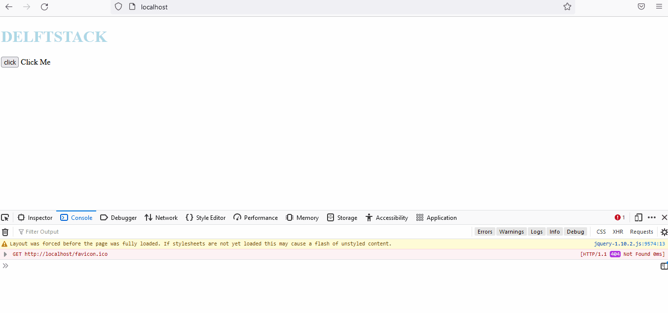
Now, let’s try an example for the widget action. The widget method is used to get the instance of jQuery-UI.
See example:
<!DOCTYPE html>
<html lang="en">
<head>
    <meta charset="utf-8" />
    <link href= "https://code.jquery.com/ui/1.10.4/themes/ui-lightness/jquery-ui.css" rel="stylesheet"/>
    <script src= "https://code.jquery.com/jquery-1.10.2.js"> </script>
    <script src= "https://code.jquery.com/ui/1.10.4/jquery-ui.js"> </script>


    <script>
        $(function () {
            $("#Demo2").tooltip({
                track: true,
            });
            $("#Demo1").click(function () {
            var a = $("#Demo2").tooltip("widget");
                console.log(a);
            });
        });
    </script>
</head>

<body>
    <h1 style="color: lightblue">DELFTSTACK</h1>
    <input id="Demo1" type="submit" name="delftstack" value="click" />
    <span id="Demo2" title="delftstack"> Click Me</span>
</body>
</html>
The code above will use the widget method to get the instance of jQuery-UI. See output:
Similarly, the other actions can also be used for the purpose described in the table.

Sheeraz is a Doctorate fellow in Computer Science at Northwestern Polytechnical University, Xian, China. He has 7 years of Software Development experience in AI, Web, Database, and Desktop technologies. He writes tutorials in Java, PHP, Python, GoLang, R, etc., to help beginners learn the field of Computer Science.
LinkedIn Facebook