How to Get the Screen, Window, and Webpage Sizes in JavaScript
- Difference Between Screen, Window, and Webpage in JavaScript
- Get the Screen, Window, and Webpage Sizes in JavaScript
In Web development, to get the size of the screen, window, or web page shown on the screen, we use the width and height properties. The width represents the horizontal axis, and the height represents the vertical axis. With the help of these two properties, it becomes much easier for us to accurately get the size of the device screen, browser window, and webpage in JavaScript.
Difference Between Screen, Window, and Webpage in JavaScript
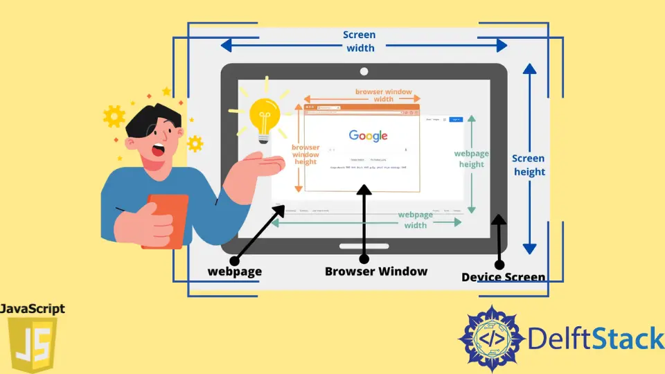
Let’s understand the difference between screen, window, and webpage using the below diagram because these terms might seem quite confusing at first.
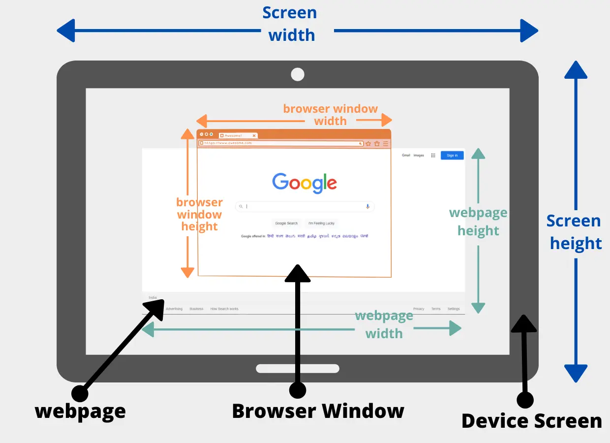
In the above diagram, there are three different dimensions:
-
Device Screen (represented with blue color)
A device screen can be a computer screen, tablet, or laptop screen that our client will use. Depending upon the resolution of the device a client is using, its size i.e., width and height, would also change. -
Browser window (represented with teal color)
It is the browser on which your website will be rendered. The browser can be Google Chrome, Microsoft Edge, Mozilla Firefox, etc. As we all know, we can resize the browser window the way we want to, which will eventually change its width and height. -
Webpage (represented with orange color)
Your website consists of many different pages. Each webpage consists of various sizes. You can get the size of the entire webpage. At a specific moment, only some part of the webpage can be displayed on the browser window. Sometimes, it is impossible to show the entire webpage on the browser window because our device’s screen has a smaller height.
For example, In the above image, the google webpage is bigger in size than our browser window. Only some parts of the webpage can be showing on the screen. And the rest of the part will only be visible to the user when we scroll the webpage horizontally or vertically. When we talk about the web page size, we refer to the entire web page irrespective of how much of the web page is currently visible to the user.
Get the Screen, Window, and Webpage Sizes in JavaScript
Now we know the difference between the screen, window, and webpage. Let’s write some code to get the size of each dimension with the help of JavaScript. The below code snippets can return different results of its screen resolution, web browser size, and the webpage size.
<!DOCTYPE html>
<html>
<body>

<h2>Sizes:</h2>

<p id="screen"></p>
<p id="window"></p>
<p id="page"></p>

<script>

// Get the size of the device screen
var screenWidth = screen.width;
var screenHeight = screen.height;

// Get the browser window size
var windowWidth = window.innerWidth;
var windowHeight = window.innerHeight;

// Get the size of the entire webpage
const pageWidth  = document.documentElement.scrollWidth;
const pageHeight = document.documentElement.scrollHeight;

// Showing the sizes on the webpage
var x = document.getElementById("screen");
x.innerHTML = "Device Screen: width: " + screenWidth + ", height: " + screenHeight + ".";

var y = document.getElementById("window");
y.innerHTML = "Browser Window: width: " + windowWidth + ", height: " + windowHeight + ".";

var z = document.getElementById("page");
z.innerHTML = "Webpage: width:" + pageWidth + ", height: " + pageHeight + ".";

</script>
</body>
</html>
Output:
Sizes:

Device Screen: width: 1366, height: 768.
Browser Window: width: 834, height: 514.
Webpage: width:834, height: 514.
Inside the body tag, we have the h2 tag that will print the heading Sizes. Then, we have 3 paragraph tag inside it we will show the width and height for the screen, window, and page.
To get the computer, laptop, or tablet screen size, you have to use screen.width, which will give you the width of the screen, and use screen.height to get the height of the screen.
To get the size of the browser window, you have to use the window object. Each browser tab will have its window object. This object contains various properties related to the contents present inside that browser tab or browser window. The window object has something called innerWidth and innerHeight, which will eventually provide us with the width and height of the browser window.
As we all know, the document object represents our website, and all the webpage-related information is stored inside this object. To get the width of the webpage we have to use document.documentElement.scrollWidth and to get the height of the webpage we have to use document.documentElement.scrollHeight. The scrollWidth and scrollHeight represent the entire width and height of the webpage.
Now that we have all the sizes of our screen, window, and webpage, it’s time to add these values to the paragraphs tag we have created in our HTML document. We first have to get all the paragraph tags using there id’s in JavaScript, and then we can use the innerHTML property to set the values.

Sahil is a full-stack developer who loves to build software. He likes to share his knowledge by writing technical articles and helping clients by working with them as freelance software engineer and technical writer on Upwork.
LinkedIn