How to Embed Image in a Button in HTML
- What Is an Image Button?
- How to Create an HTML Image Button
- Styling Image Buttons With CSS
- Additional Attributes
- Overriding Default Form Behaviors
- Adjusting the Image’s Position and Scaling Algorithm
- Conclusion
This article will discuss several methods to embed an image in a tag in an HTML document. It means to fix or set a picture inside the button.
HyperText Markup Language serves as the backbone of web development, providing a standardized way to structure content on the internet. It employs a system of tags to define elements on a web page, influencing how browsers display text, images, links, and more.
What Are We Creating?
In this article, we’ll delve into the creation of image buttons using HTML. We’ll explore the essential components of an image button, the HTML tags involved, and additional attributes that can be leveraged to enhance functionality and aesthetics using these images.
 |
 |
|---|
What Is an Image Button?
When a person clicks on it, an HTML image button becomes a clickable element on a web page, visually appearing as an image. They are particularly useful when you want to make certain elements stand out or convey a specific message through visuals. They are commonly employed for calls to action, navigation links, or interactive features.
By combining the functionality of a button with a graphical representation, image button contribute to a more engaging and user-friendly web experience, improving the overall usability and aesthetics of a site.
How to Create an HTML Image Button
To create an HTML image button, you can use the <button> element with the type="image" attribute and include an <img> element inside it.
<button type="image">
    <img src="your-image-url.jpg" alt="Image Alt Text">
</button>
When a person clicks button, the following attributes inside the <button> are triggered.
Using the Tag With type="image"
One intriguing tool in the developer’s toolkit is the HTML image button with the type="image" attribute. This approach seamlessly integrates visual elements, adding a layer of interactivity and aesthetic appeal to web applications.
Example:
<!DOCTYPE html>
<html lang="en">
<head>
    <meta charset="UTF-8">
    <meta name="viewport" content="width=device-width, initial-scale=1.0">
    <title>HTML Image Button</title>
</head>
<body>

    <button type="image">
        <img src="button-image.png" alt="Click me!">
    </button>

</body>
</html>
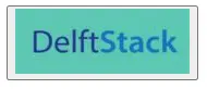
The <button> element is used to create a button, but what makes it distinct is the type attribute. This attribute transforms the button into an image button, allowing us to embed an image within it.
Inside the <button> tag, we include an <img> tag. The src attribute of the <img> tag specifies the path or URL of the image file on the button.
The alt attribute provides alternative text for accessibility, describing the purpose of the button.
Output:
 |
 |
|---|
Users can interact with this visually appealing button, illustrating the practicality and effectiveness of using the type="image" method in HTML button creation.
Styling Image Buttons With CSS
Basic CSS Properties
Using basic CSS properties for image buttons is crucial for consistent and professional visuals on a website.
These properties also ensure responsiveness, adapting image buttons to different devices seamlessly. Additionally, basics like color and font-size enhance text readability within buttons, making content more accessible.
Some common properties for styling image button:
| Property | Description |
|---|---|
width |
Sets the width. |
height |
Sets the height. |
background-color |
Specifies the color. |
border |
Sets the border properties. |
border-radius |
Defines the radius to create rounded corners. |
padding |
Controls the padding space inside. |
margin |
Sets the margin around. (margin top, margin bottom, margin right, margin left) |
text-align |
Aligns the text or content. |
color |
Specifies the text color. |
font-size |
Sets the font size of the font. |
cursor |
Defines the cursor type on hover over the button. |
box-shadow |
Adds a shadow effect. |
These properties can be combined and adjusted according to design requirements to achieve a visually appealing and functional image button.
Let’s start with the following example:
<!DOCTYPE html>
<html lang="en">
<head>
    <meta charset="UTF-8">
    <meta name="viewport" content="width=device-width, initial-scale=1.0">
    <title>Styled Button</title>
    <style>
        button {
            width: 160px;
            height: 60px;
            background-color: #3498db;
            border: 2px solid #2980b9;
            border-radius: 5px;
            padding: 10px;
            margin: 10px;
            color: #ffffff;
            box-shadow: 0 4px 8px rgba(0, 0, 0, 0.1);
        }
    </style>
</head>
<body>

    <button type="image">
        <img src="button-image.png" alt="Click me!">
    </button>

</body>
</html>
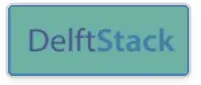
In this example, the <style> tag holds rules for styling the <button> element.
The width and height properties determine the button’s size, giving it specific dimensions. The background-color sets the button’s color for a distinct appearance.
Using the border property creates a border around the button.
For a sleek design, the border-radius rounds the corners, and the padding adds internal space, influencing content positioning.
The margin provides spacing around the button, preventing closeness to other elements. The color sets the text color for readability.
Finally, the box-shadow adds a subtle shadow beneath the button, giving it depth and making it stand out.
Output:
People can interact with this button, blending functionality and style—a testament to the effectiveness of basic CSS in image button.
Advanced CSS Styling
Using advanced CSS properties for image button is crucial for enhancing a website’s visual and interactive elements. These properties empower developers to create modern, dynamic, and engaging user experiences, aligning with design expectations.
Here are some advanced CSS properties that can be used for more sophisticated styling:
| Property | Description |
|---|---|
background-size |
Controls the size of the background image. |
background-position |
Sets the starting position of the background image. |
transition |
Adds smooth transitions to property changes. |
transform |
Applies 2D or 3D transformations. |
opacity |
Adjusts the transparency. |
filter |
Applies visual effects like blur or grayscale. |
outline |
Sets the outline properties. |
user-select |
Controls user selection of the button’s content. |
overflow |
Specifies how content that is too big for the button should be handled. |
These advanced CSS properties provide more fine-grained control over the appearance to display and behavior of image button, allowing developers to create visually stunning and interactive interfaces.
Let’s start with the following example:
<!DOCTYPE html>
<html lang="en">
<head>
    <meta charset="UTF-8">
    <meta name="viewport" content="width=device-width, initial-scale=1.0">
    <title>Advanced</title>
    <style>
        button {
            width: 160px;
            height: 60px;
            background-color: #3498db;
            border: 2px solid #2980b9;
            border-radius: 5px;
            padding: 10px;
            margin: 10px;
            color: #ffffff;
            box-shadow: 0 4px 8px rgba(0, 0, 0, 0.1);
            transition: transform 0.3s ease-in-out, opacity 0.3s ease-in-out;
        }

        button:hover {
            transform: scale(1.1);
            opacity: 0.8;
            filter: brightness(80%);
            outline: 2px solid #ffffff;
            overflow: hidden;
        }
    </style>
</head>
<body>

    <button type="image">
        <img src="your-image.png" alt="Click me!">
    </button>
    <button type="image">
        <img src="button-image.png" alt="Click me!">
    </button>

</body>
</html>
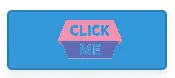
From the above example, we’ve crafted a lively image button enclosed in a <button> tag. The accompanying CSS employs the transition property for smooth animations, focusing on transform and opacity changes over a 0.3-second period with an ease-in-out timing function.
Upon hover, the button transforms by scaling to 110%, creating a subtle zoom effect via the transform property. Simultaneously, the opacity property adjusts transparency, and the filter property dims the button.
For added emphasis, the outline property introduces a white border during hover, and the overflow property ensures a tidy appearance by hiding any content overflow.
Output:

 |
 |
|---|---|
 |
 |
Hovering over the button reveals a smooth transition, subtle scale-up, dimming, highlight, and hidden overflow—demonstrating the power of advanced CSS for improved interaction and visual appeal to display.
Additional Attributes
Enhance your image buttons with additional attributes that can be used with an image button in HTML:
| Attribute | Description |
|---|---|
height |
Specifies the height of the image button, providing control over its visual size. |
src |
Specifies the source URL of the image to be displayed on the button. |
form |
Associates the image button with a specific form, determining the form to be submitted. |
formaction |
Overrides the form’s action attribute for the specific image button. |
formenctype |
Specifies the encoding type to submit forms when triggered by the image button. |
formmethod |
Overrides the form’s method attribute for the specific image button. |
formnovalidate |
Disables data validation when the image button is clicked, allowing to submit forms even if validation fails. |
formtarget |
Specifies the target window or frame to submit the associated form. |
Additional attributes, including boolean attribute, provide developers with extended control over the behavior and appearance of image buttons. Incorporating these attributes, such as form data attributes, strengthens the integration of image buttons within forms, facilitating the submission of form in a structured manner.
These attributes provide developers with a range of options to customize the behavior, appearance, and functionality of image buttons in HTML.
Overriding Default Form Behaviors
Image buttons within forms typically act as submit buttons. Understanding how to override default value form behaviors using provides greater control over interactions. This skill empowers developers to create seamless, customized experiences for website visitors.
In web development, the creation of interactive and visually appealing interfaces often involves the use of image buttons. These buttons not only enhance the aesthetic appeal of a webpage but also serve crucial functional roles, such as form submissions.
One effective method of incorporating image buttons into forms is by leveraging the form behaviors in HTML. This approach simplifies the process, providing a seamless and intuitive experience.
In this section, we’ll explore the concept of adding image buttons using default behaviors, providing a complete working example for practical understanding.
Let’s begin by examining a complete HTML code snippet that demonstrates the addition of an image button within a form using default behaviors:
<!DOCTYPE html>
<html lang="en">
<head>
  <meta charset="UTF-8">
  <meta name="viewport" content="width=device-width, initial-scale=1.0">
  <title>Image Button Example</title>
</head>
<body>

  <form action="/submit" method="post">
    <label for="username">Username:</label>
    <input type="text" id="username" name="username" required>

    <label for="password">Password:</label>
    <input type="password" id="password" name="password" required>

    <input type="image" src="submit-button.png" alt="Submit">
  </form>

</body>
</html>
Let’s dissect the code to understand its components and how they contribute to the desired outcome.
Initially, we define a form using the <form> tag. This form has attributes action="/submit" and method="post", indicating that submitted data will be sent to the "/submit" URL using the HTTP POST method.
We include username input field and password input field, each defined by the <input> tag with id and name attributes for identification.
The pivotal piece is the image button itself, created using the <input> tag with type="image". Its src attribute specifies the image file’s source URL, while the alt attribute ensures alternative text for accessibility.
This straightforward implementation seamlessly integrates an image button into the form, ready for interaction.
Output:
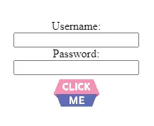
Upon rendering this code, you’ll observe a form on the webpage with username and password fields. The image button, when clicked, triggers the form submission process, demonstrating the successful integration of an image button.
Adjusting the Image’s Position and Scaling Algorithm
Fine-tune the appearance of your image buttons by adjusting their position and scaling algorithm. Utilize CSS styling to control the placement of image buttons within your layout, ensuring a visually cohesive and appealing design.
Adjusting the position and scaling algorithm of an image button can be achieved using CSS styles. Here’s a table showcasing some CSS properties that can be used to control the position and scaling of an image button:
| CSS Property | Description |
|---|---|
position |
Sets the positioning method (e.g., relative, absolute). |
top, right, bottom, left |
Specifies the offset from the edges of the container when using absolute or fixed positioning. |
margin |
Sets the margins of an element, influencing its position relative to its surroundings. |
padding |
Specifies the padding within, affecting its content positioning. |
transform |
Applies 2D or 3D transformations to an element, including scaling (scale()), translation (translate()), and rotation (rotate()). |
width |
Sets the width, affecting the image button’s size. |
height |
Sets the height, influencing the image button’s dimensions. |
object-fit |
Specifies how the content of the replaced image should be resized to fit its container. |
object-position |
Sets the alignment of the replaced part within its container. |
These CSS properties can be applied to the style attribute of the HTML <input> or, preferably, through an external stylesheet. Experimenting with these properties allows developers to achieve precise control over the position and scaling of image buttons, ensuring a visually appealing and cohesive design within a web page layout.
Conclusion
HTML image buttons prove to be versatile components for enhancing user interactions on web forms. By styling image buttons with CSS, developers can achieve a cohesive and visually appealing design.
Ensuring the form elements are the same size contributes to a polished layout, and aligning text within the buttons adds to the overall aesthetic. Employing font-family attributes allows for consistent typography across buttons, enhancing the uniformity of the user interface.
Adjusting the image position and scaling algorithm using CSS properties allows for fine-tuning the visual aspects of image buttons. Developers can implement these adjustments to maintain a consistent design language and user experience.
In this way, HTML image buttons, when styled with CSS and enhanced with additional attributes, become powerful tools for creating intuitive and visually appealing web forms, seamlessly handling form data submission in the same way across various applications.

Sushant is a software engineering student and a tech enthusiast. He finds joy in writing blogs on programming and imparting his knowledge to the community.
LinkedIn