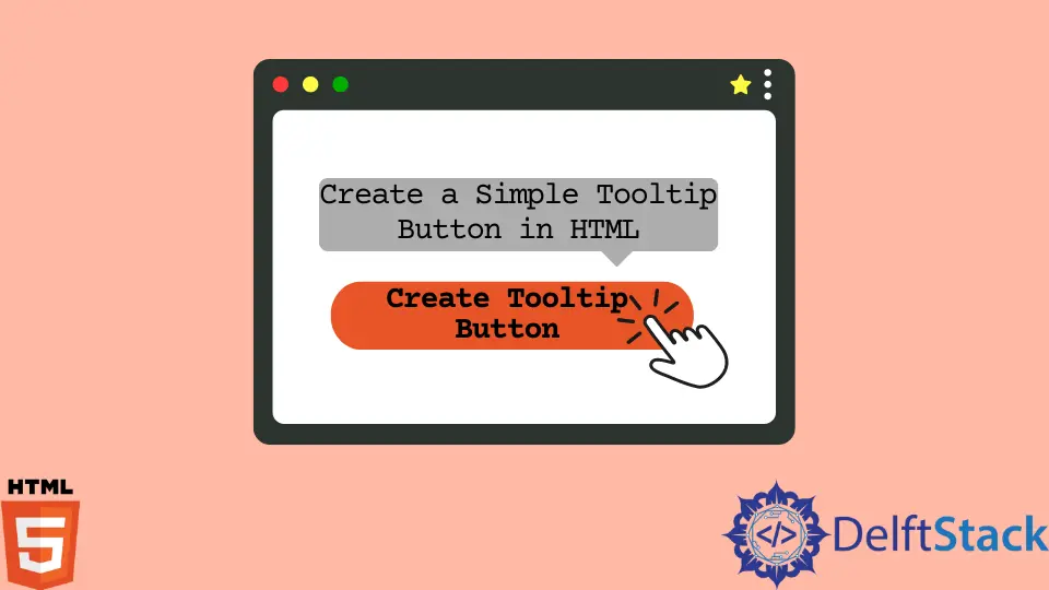
How to Create a Simple Tooltip Button in HTML
- Tooltip in HTML
- Basic Tooltip for the Button Using HTML
- Advanced Tooltip for the Button Using HTML and CCS
- Positioning Tooltips
- Conclusion
HyperText Markup Language, also known as HTML, is a standard markup language used to create web pages. A web browser’s commands on how to display text, pictures, and other multimedia on a webpage are provided by HTML elements.
Tooltip in HTML
In HTML, a tooltip is used to provide more information about the selected element; it may be a button or a word. When a user moves the mouse over an element utilizing a tooltip to show specific information about that element, this may be done on the mouse hover effect.
Let’s see how to add a tooltip to the button.
We can add a tooltip to the button by using the title attribute to the button element. Enter the details inside the comas of the title attribute, which want to show when the user moves the mouse.
<button title="Click Here"> Button </button>
Basic Tooltip for the Button Using HTML
Create a button in HTML. Then, add the title attribute to the button element.
The sample code is as follows.
<!DOCTYPE html>
<html lang="en">
    <head>
        <meta charset="UTF-8">
        <title>Tooltip</title>
    </head>
    <body>
        <!-- creating a simple button & Adding a tooltip to button -->
            <button title="Click Here">Button</button>
    </body>
</html>
As you can see, when the mouse moves over the button, the tooltip appears.
Advanced Tooltip for the Button Using HTML and CCS
Let’s see other advanced tooltip examples for the button.
Firstly, create a button using a container element (<div>) and add a tooltip class. This <div> will display the tooltip text when the user hovers their mouse over it.
A <span> style inline element with the class="tooltiptext" is used to contain the tooltip text.
<!DOCTYPE html>
<html lang="en">
    <head>
        <meta charset="UTF-8">
        <link rel="stylesheet" href="style.css">
        <title>Tooltip</title>
    </head>
    <body>
        <!-- creating a button -->
        <div class="tooltip">
            <button class="button">Button
                <span class="tooltiptext"> Click Me </span>
            </button>
        </div>
    </body>
</html>
Create a CSS File
Let’s create a CSS file named style.css and link it to the HTML file by including the below syntax between the <head> tags in HTML.
<link rel="stylesheet" href="style.css">
Let’s style the tooltip button using CSS. The button’s style is included inside the .button class.
/* Style for button*/
.button {
    position: relative;
    background: #151a5f;
    padding: 10px;
    border-radius: 4px;
    border: none;
    text-transform: uppercase;
    font-weight: bold;
    color: white;
 }
The .tooltip class is used to display the position of the tooltip.
.tooltip {
    position: relative;
    display: inline-block;
}
The tooltip text is stored in the .tooltiptext class. It is normally concealed but becomes visible when you hover over it.
Additionally, we added some fundamental styles to it, as below.
- A 120px width
- A yellow background
- A white text color
- The ability to center the text
- Top and bottom padding of 5px
The tooltip text has rounded edges due to the CSS border-radius feature.
When a user drags their cursor over a <div> element with the class tooltip, the tooltip text is shown using the: hover selector.
  /* Tooltip text */
.tooltip .tooltiptext {
    visibility: hidden;
    width: 120px;
    background-color: rgb(235, 182, 38);
    color: #fff;
    text-align: center;
    padding: 5px 0;
    border-radius: 6px;

    /* Position the tooltip text */
    position: absolute;
    z-index: 1;
}

  /* When you mouse over the tooltip container, the tooltip text is displayed. */
.tooltip:hover .tooltiptext {
    visibility: visible;
}
<!DOCTYPE html>
<html lang="en">
    <head>
        <meta charset="UTF-8">
        <link rel="stylesheet" href="style.css">
        <title>Tooltip</title>
    </head>
    <body>
        <!-- creating a button -->
        <div class="tooltip">
            <button class="button">Button
                <span class="tooltiptext"> Click Me </span>
            </button>
        </div>
    </body>
</html>
/* Style for button*/
.button {
    position: relative;
    background: #151a5f;
    padding: 10px;
    border-radius: 4px;
    border: none;
    text-transform: uppercase;
    font-weight: bold;
    color: white;
 }
Positioning Tooltips
Tooltips can be made to appear to the right, left, bottom, and top of the button. Let’s see how to do it.
The below examples show how to display tooltips on the left or right. The top property has a value of minus 5 pixels.
The value is calculated by considering the padding. If you are willing to increase the padding, increase the top property.
Right Tooltip
.tooltip .tooltiptext {

  /* Position the tooltip text */
    position: absolute;
    z-index: 1;
    top: -5px;
    left: 105%;
}
  /* Tooltip text */
.tooltip .tooltiptext {
    visibility: hidden;
    width: 120px;
    background-color: rgb(235, 182, 38);
    color: #fff;
    text-align: center;
    padding: 5px 0;
    border-radius: 6px;

    /* Position the tooltip text */
    position: absolute;
    z-index: 1;
}

  /* When you mouse over the tooltip container, the tooltip text is displayed. */
.tooltip:hover .tooltiptext {
    visibility: visible;
}
<!DOCTYPE html>
<html lang="en">
    <head>
        <meta charset="UTF-8">
        <link rel="stylesheet" href="style.css">
        <title>Tooltip</title>
    </head>
    <body>
        <!-- creating a button -->
        <div class="tooltip">
            <button class="button">Button
                <span class="tooltiptext"> Click Me </span>
            </button>
        </div>
    </body>
</html>
/* Style for button*/
.button {
    position: relative;
    background: #151a5f;
    padding: 10px;
    border-radius: 4px;
    border: none;
    text-transform: uppercase;
    font-weight: bold;
    color: white;
 }
As you can see, when the mouse moves in any direction, the tooltip only appears on the right side.
Left Tooltip
.tooltip .tooltiptext {

  /* Position the tooltip text */
    position: absolute;
    z-index: 1;
    top: -5px;
    right: 105%;
}
  /* Tooltip text */
.tooltip .tooltiptext {
    visibility: hidden;
    width: 120px;
    background-color: rgb(235, 182, 38);
    color: #fff;
    text-align: center;
    padding: 5px 0;
    border-radius: 6px;

    /* Position the tooltip text */
    position: absolute;
    z-index: 1;
}

  /* When you mouse over the tooltip container, the tooltip text is displayed. */
.tooltip:hover .tooltiptext {
    visibility: visible;
}
<!DOCTYPE html>
<html lang="en">
    <head>
        <meta charset="UTF-8">
        <link rel="stylesheet" href="style.css">
        <title>Tooltip</title>
    </head>
    <body>
        <!-- creating a button -->
        <div class="tooltip">
            <button class="button">Button
                <span class="tooltiptext"> Click Me </span>
            </button>
        </div>
    </body>
</html>
/* Style for button*/
.button {
    position: relative;
    background: #151a5f;
    padding: 10px;
    border-radius: 4px;
    border: none;
    text-transform: uppercase;
    font-weight: bold;
    color: white;
    margin-left: 120px;
 }
As you can see, when the mouse moves in any direction, the tooltip only appears on the left side.
The below examples show how to display tooltips on top or bottom. The margin-left property has a value of minus 60 pixels.
The value is calculated by half of the tooltip’s width (120/2 = 60).
Top Tooltip
.tooltip .tooltiptext {
     /* Position the tooltip text */
  position: absolute;
  z-index: 1;
  width: 120px;
  bottom: 100%;
  left: 50%;
  margin-left: -60px;
}
  /* Tooltip text */
.tooltip .tooltiptext {
    visibility: hidden;
    width: 120px;
    background-color: rgb(235, 182, 38);
    color: #fff;
    text-align: center;
    padding: 5px 0;
    border-radius: 6px;

    /* Position the tooltip text */
    position: absolute;
    z-index: 1;
}

  /* When you mouse over the tooltip container, the tooltip text is displayed. */
.tooltip:hover .tooltiptext {
    visibility: visible;
}
<!DOCTYPE html>
<html lang="en">
    <head>
        <meta charset="UTF-8">
        <link rel="stylesheet" href="style.css">
        <title>Tooltip</title>
    </head>
    <body>
        <!-- creating a button -->
        <div class="tooltip">
            <button class="button">Button
                <span class="tooltiptext"> Click Me </span>
            </button>
        </div>
    </body>
</html>
/* Style for button*/
.button {
    position: relative;
    background: #151a5f;
    padding: 10px;
    border-radius: 4px;
    border: none;
    text-transform: uppercase;
    font-weight: bold;
    color: white;
    margin-top: 40px;
    margin-left: 120px;
 }
As you can see, when the mouse moves in any direction, the tooltip only appears on the top.
Bottom Tooltip
.tooltip .tooltiptext {
 /* Position the tooltip text */
  position: absolute;
  z-index: 1;
  width: 120px;
  top: 100%;
  left: 50%;
  margin-left: -60px;
}
  /* Tooltip text */
.tooltip .tooltiptext {
    visibility: hidden;
    width: 120px;
    background-color: rgb(235, 182, 38);
    color: #fff;
    text-align: center;
    padding: 5px 0;
    border-radius: 6px;

    /* Position the tooltip text */
    position: absolute;
    z-index: 1;
}

  /* When you mouse over the tooltip container, the tooltip text is displayed. */
.tooltip:hover .tooltiptext {
    visibility: visible;
}
<!DOCTYPE html>
<html lang="en">
    <head>
        <meta charset="UTF-8">
        <link rel="stylesheet" href="style.css">
        <title>Tooltip</title>
    </head>
    <body>
        <!-- creating a button -->
        <div class="tooltip">
            <button class="button">Button
                <span class="tooltiptext"> Click Me </span>
            </button>
        </div>
    </body>
</html>
/* Style for button*/
.button {
    position: relative;
    background: #151a5f;
    padding: 10px;
    border-radius: 4px;
    border: none;
    text-transform: uppercase;
    font-weight: bold;
    color: white;
    margin-left: 120px;
 }
As you can see, when the mouse moves in any direction, the tooltip only appears on the bottom.
Conclusion
This article discussed how to create a simple tooltip button using HTML. Then, we discussed creating an advanced tooltip button using HTML and CSS and displaying tooltips on the right, left, top, and bottom of the button.

Nimesha is a Full-stack Software Engineer for more than five years, he loves technology, as technology has the power to solve our many problems within just a minute. He have been contributing to various projects over the last 5+ years and working with almost all the so-called 03 tiers(DB, M-Tier, and Client). Recently, he has started working with DevOps technologies such as Azure administration, Kubernetes, Terraform automation, and Bash scripting as well.