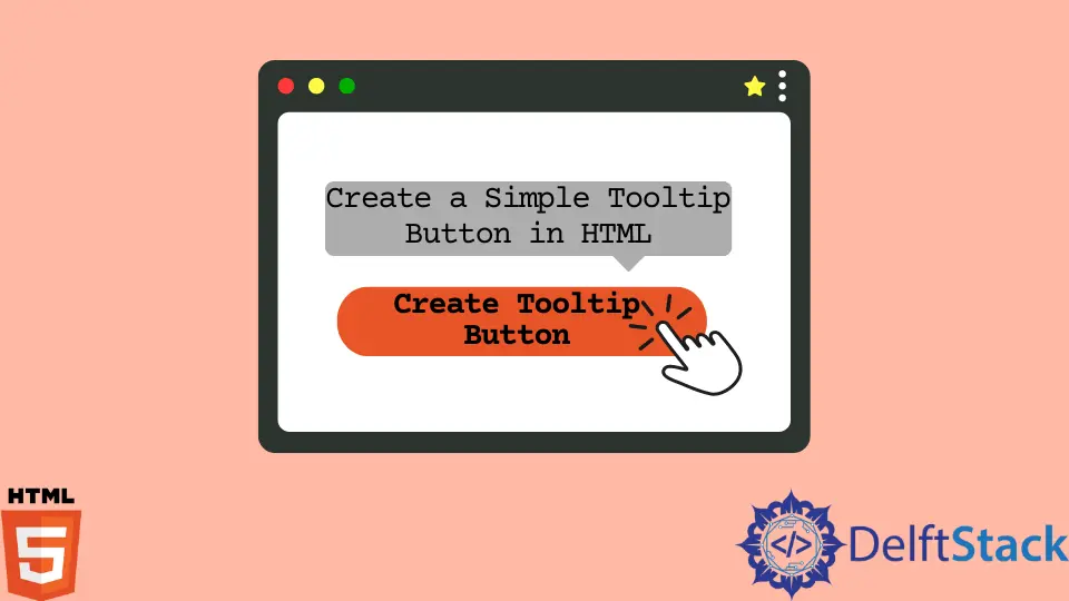
HTML로 간단한 툴팁 버튼 만들기
HTML이라고도 하는 HyperText Markup Language는 웹 페이지를 만드는 데 사용되는 표준 마크업 언어입니다. 웹 페이지에 텍스트, 그림 및 기타 멀티미디어를 표시하는 방법에 대한 웹 브라우저의 명령은 HTML 요소에 의해 제공됩니다.
HTML의 툴팁
HTML에서 도구 설명은 선택한 요소에 대한 자세한 정보를 제공하는 데 사용됩니다. 버튼이나 단어일 수 있습니다. 사용자가 해당 요소에 대한 특정 정보를 표시하기 위해 툴팁을 사용하여 요소 위로 마우스를 이동하면 마우스 호버 효과에서 수행될 수 있습니다.
버튼에 도구 설명을 추가하는 방법을 살펴보겠습니다.
버튼 요소에 제목 속성을 사용하여 버튼에 툴팁을 추가할 수 있습니다. 사용자가 마우스를 움직일 때 표시할 제목 속성의 쉼표 안에 세부 정보를 입력합니다.
<button title="Click Here"> Button </button>
HTML을 사용하는 버튼에 대한 기본 툴팁
HTML로 버튼을 만듭니다. 그런 다음 title 특성을 button 요소에 추가합니다.
샘플 코드는 다음과 같습니다.
<!DOCTYPE html>
<html lang="en">
    <head>
        <meta charset="UTF-8">
        <title>Tooltip</title>
    </head>
    <body>
        <!-- creating a simple button & Adding a tooltip to button -->
            <button title="Click Here">Button</button>
    </body>
</html>
보시다시피 버튼 위로 마우스를 이동하면 툴팁이 나타납니다.
HTML 및 CCS를 사용하는 버튼에 대한 고급 도구 설명
단추에 대한 다른 고급 도구 설명 예제를 살펴보겠습니다.
먼저 컨테이너 요소(<div>)를 사용하여 버튼을 만들고 tooltip 클래스를 추가합니다. 이 <div>는 사용자가 마우스를 가리키면 도구 설명 텍스트를 표시합니다.
class="tooltiptext"가 있는 <span> 스타일 인라인 요소는 도구 설명 텍스트를 포함하는 데 사용됩니다.
<!DOCTYPE html>
<html lang="en">
    <head>
        <meta charset="UTF-8">
        <link rel="stylesheet" href="style.css">
        <title>Tooltip</title>
    </head>
    <body>
        <!-- creating a button -->
        <div class="tooltip">
            <button class="button">Button
                <span class="tooltiptext"> Click Me </span>
            </button>
        </div>
    </body>
</html>
CSS 파일 만들기
HTML에서 <head> 태그 사이에 아래 구문을 포함하여 style.css라는 CSS 파일을 만들고 HTML 파일에 연결해 보겠습니다.
<link rel="stylesheet" href="style.css">
CSS를 사용하여 툴팁 버튼의 스타일을 지정해 보겠습니다. 버튼의 스타일은 .button 클래스 안에 포함됩니다.
/* Style for button*/
.button {
    position: relative;
    background: #151a5f;
    padding: 10px;
    border-radius: 4px;
    border: none;
    text-transform: uppercase;
    font-weight: bold;
    color: white;
 }
.tooltip 클래스는 툴팁의 위치를 표시하는 데 사용됩니다.
.tooltip {
    position: relative;
    display: inline-block;
}
툴팁 텍스트는 .tooltiptext 클래스에 저장됩니다. 일반적으로 숨겨져 있지만 마우스를 가져가면 표시됩니다.
또한 아래와 같이 몇 가지 기본 스타일을 추가했습니다.
- 너비 120px
- 노란색 배경
- 흰색 텍스트 색상
- 텍스트 중앙 정렬 기능
- 상하 패딩 5px
툴팁 텍스트는 CSS border-radius 기능으로 인해 모서리가 둥글게 표시됩니다.
사용자가 tooltip 클래스가 있는 <div> 요소 위로 커서를 드래그하면 도구 설명 텍스트가 hover 선택기를 사용하여 표시됩니다.
  /* Tooltip text */
.tooltip .tooltiptext {
    visibility: hidden;
    width: 120px;
    background-color: rgb(235, 182, 38);
    color: #fff;
    text-align: center;
    padding: 5px 0;
    border-radius: 6px;

    /* Position the tooltip text */
    position: absolute;
    z-index: 1;
}

  /* When you mouse over the tooltip container, the tooltip text is displayed. */
.tooltip:hover .tooltiptext {
    visibility: visible;
}
<!DOCTYPE html>
<html lang="en">
    <head>
        <meta charset="UTF-8">
        <link rel="stylesheet" href="style.css">
        <title>Tooltip</title>
    </head>
    <body>
        <!-- creating a button -->
        <div class="tooltip">
            <button class="button">Button
                <span class="tooltiptext"> Click Me </span>
            </button>
        </div>
    </body>
</html>
/* Style for button*/
.button {
    position: relative;
    background: #151a5f;
    padding: 10px;
    border-radius: 4px;
    border: none;
    text-transform: uppercase;
    font-weight: bold;
    color: white;
 }
배치 툴팁
도구 설명은 단추의 오른쪽, 왼쪽, 아래쪽 및 위쪽에 나타나도록 만들 수 있습니다. 어떻게 하는지 봅시다.
아래 예제는 왼쪽 또는 오른쪽에 툴팁을 표시하는 방법을 보여줍니다. top 속성의 값은 마이너스 5픽셀입니다.
값은 패딩을 고려하여 계산됩니다. 패딩을 늘리려면 top 속성을 늘리십시오.
오른쪽 툴팁
.tooltip .tooltiptext {

  /* Position the tooltip text */
    position: absolute;
    z-index: 1;
    top: -5px;
    left: 105%;
}
  /* Tooltip text */
.tooltip .tooltiptext {
    visibility: hidden;
    width: 120px;
    background-color: rgb(235, 182, 38);
    color: #fff;
    text-align: center;
    padding: 5px 0;
    border-radius: 6px;

    /* Position the tooltip text */
    position: absolute;
    z-index: 1;
}

  /* When you mouse over the tooltip container, the tooltip text is displayed. */
.tooltip:hover .tooltiptext {
    visibility: visible;
}
<!DOCTYPE html>
<html lang="en">
    <head>
        <meta charset="UTF-8">
        <link rel="stylesheet" href="style.css">
        <title>Tooltip</title>
    </head>
    <body>
        <!-- creating a button -->
        <div class="tooltip">
            <button class="button">Button
                <span class="tooltiptext"> Click Me </span>
            </button>
        </div>
    </body>
</html>
/* Style for button*/
.button {
    position: relative;
    background: #151a5f;
    padding: 10px;
    border-radius: 4px;
    border: none;
    text-transform: uppercase;
    font-weight: bold;
    color: white;
 }
보시다시피 마우스를 어느 방향으로든 움직이면 오른쪽에만 툴팁이 나타납니다.
왼쪽 툴팁
.tooltip .tooltiptext {

  /* Position the tooltip text */
    position: absolute;
    z-index: 1;
    top: -5px;
    right: 105%;
}
  /* Tooltip text */
.tooltip .tooltiptext {
    visibility: hidden;
    width: 120px;
    background-color: rgb(235, 182, 38);
    color: #fff;
    text-align: center;
    padding: 5px 0;
    border-radius: 6px;

    /* Position the tooltip text */
    position: absolute;
    z-index: 1;
}

  /* When you mouse over the tooltip container, the tooltip text is displayed. */
.tooltip:hover .tooltiptext {
    visibility: visible;
}
<!DOCTYPE html>
<html lang="en">
    <head>
        <meta charset="UTF-8">
        <link rel="stylesheet" href="style.css">
        <title>Tooltip</title>
    </head>
    <body>
        <!-- creating a button -->
        <div class="tooltip">
            <button class="button">Button
                <span class="tooltiptext"> Click Me </span>
            </button>
        </div>
    </body>
</html>
/* Style for button*/
.button {
    position: relative;
    background: #151a5f;
    padding: 10px;
    border-radius: 4px;
    border: none;
    text-transform: uppercase;
    font-weight: bold;
    color: white;
    margin-left: 120px;
 }
보시다시피 마우스를 어느 방향으로든 움직이면 왼쪽에만 툴팁이 나타납니다.
아래 예제는 툴팁을 상단 또는 하단에 표시하는 방법을 보여줍니다. margin-left 속성의 값은 마이너스 60픽셀입니다.
값은 도구 설명 너비의 절반(120/2 = 60)으로 계산됩니다.
상단 툴팁
.tooltip .tooltiptext {
     /* Position the tooltip text */
  position: absolute;
  z-index: 1;
  width: 120px;
  bottom: 100%;
  left: 50%;
  margin-left: -60px;
}
  /* Tooltip text */
.tooltip .tooltiptext {
    visibility: hidden;
    width: 120px;
    background-color: rgb(235, 182, 38);
    color: #fff;
    text-align: center;
    padding: 5px 0;
    border-radius: 6px;

    /* Position the tooltip text */
    position: absolute;
    z-index: 1;
}

  /* When you mouse over the tooltip container, the tooltip text is displayed. */
.tooltip:hover .tooltiptext {
    visibility: visible;
}
<!DOCTYPE html>
<html lang="en">
    <head>
        <meta charset="UTF-8">
        <link rel="stylesheet" href="style.css">
        <title>Tooltip</title>
    </head>
    <body>
        <!-- creating a button -->
        <div class="tooltip">
            <button class="button">Button
                <span class="tooltiptext"> Click Me </span>
            </button>
        </div>
    </body>
</html>
/* Style for button*/
.button {
    position: relative;
    background: #151a5f;
    padding: 10px;
    border-radius: 4px;
    border: none;
    text-transform: uppercase;
    font-weight: bold;
    color: white;
    margin-top: 40px;
    margin-left: 120px;
 }
보시다시피 마우스가 어느 방향으로든 움직이면 툴팁이 맨 위에만 나타납니다.
하단 툴팁
.tooltip .tooltiptext {
 /* Position the tooltip text */
  position: absolute;
  z-index: 1;
  width: 120px;
  top: 100%;
  left: 50%;
  margin-left: -60px;
}
  /* Tooltip text */
.tooltip .tooltiptext {
    visibility: hidden;
    width: 120px;
    background-color: rgb(235, 182, 38);
    color: #fff;
    text-align: center;
    padding: 5px 0;
    border-radius: 6px;

    /* Position the tooltip text */
    position: absolute;
    z-index: 1;
}

  /* When you mouse over the tooltip container, the tooltip text is displayed. */
.tooltip:hover .tooltiptext {
    visibility: visible;
}
<!DOCTYPE html>
<html lang="en">
    <head>
        <meta charset="UTF-8">
        <link rel="stylesheet" href="style.css">
        <title>Tooltip</title>
    </head>
    <body>
        <!-- creating a button -->
        <div class="tooltip">
            <button class="button">Button
                <span class="tooltiptext"> Click Me </span>
            </button>
        </div>
    </body>
</html>
/* Style for button*/
.button {
    position: relative;
    background: #151a5f;
    padding: 10px;
    border-radius: 4px;
    border: none;
    text-transform: uppercase;
    font-weight: bold;
    color: white;
    margin-left: 120px;
 }
보시다시피 마우스가 어느 방향으로든 움직이면 툴팁이 하단에만 나타납니다.
결론
이 기사에서는 HTML을 사용하여 간단한 툴팁 버튼을 만드는 방법에 대해 설명했습니다. 그런 다음 HTML과 CSS를 사용하여 고급 툴팁 버튼을 만들고 버튼의 오른쪽, 왼쪽, 위, 아래에 툴팁을 표시하는 방법에 대해 논의했습니다.

Nimesha is a Full-stack Software Engineer for more than five years, he loves technology, as technology has the power to solve our many problems within just a minute. He have been contributing to various projects over the last 5+ years and working with almost all the so-called 03 tiers(DB, M-Tier, and Client). Recently, he has started working with DevOps technologies such as Azure administration, Kubernetes, Terraform automation, and Bash scripting as well.