How to Plot an ROC Curve in Python
- ROC Curve Definition in Python
- Scikit-Learn Library in Python
- Python Code to Plot the ROC Curve
- Code Explanation
In this guide, we’ll help you get to know more about this Python function and the method you can use to plot a ROC curve as the program output.
ROC Curve Definition in Python
The term ROC curve stands for Receiver Operating Characteristic curve. This curve is basically a graphical representation of the performance of any classification model at all classification thresholds.
There are two parameters of this curve:
- True Positive Rate(TPR) - Stands for real, i.e true sensitivity
- False Positive Rate(FPR) - Stands for pseudo, i.e false sensitivity
Both parameters are known as operating characteristics and are used as factors to define the ROC curve.
In Python, the model’s efficiency is determined by seeing the area under the curve (AUC). Thus, the most efficient model has the AUC equal to 1, and the least efficient model has the AUC equal to 0.5.
Scikit-Learn Library in Python
The Scikit-learn library is one of the most important open-source libraries used to perform machine learning in Python. This library consists of many tools for tasks like classification, clustering, and regression.
In this tutorial, several functions are used from this library that will help in plotting the ROC curve. These functions are:
make_classification- This function is imported because it helps in generating a random n-class classification problem by creating clusters of points.RandomForestClassifier- This function is imported asRandom Forest Classifierand is used as a sample model in this tutorial on which the ROC curve is made.train_test_split- This function is used to split the whole data into two subsets (TrainandTest) that are used for training and testing the data.roc_curve- This function is used to return the ROC curve of a given model.
Python Code to Plot the ROC Curve
import numpy as np
import pandas as pd
import matplotlib.pyplot as plt
import seaborn as sns
from sklearn.datasets import make_classification
from sklearn.ensemble import RandomForestClassifier
from sklearn.model_selection import train_test_split
from sklearn.metrics import roc_curve
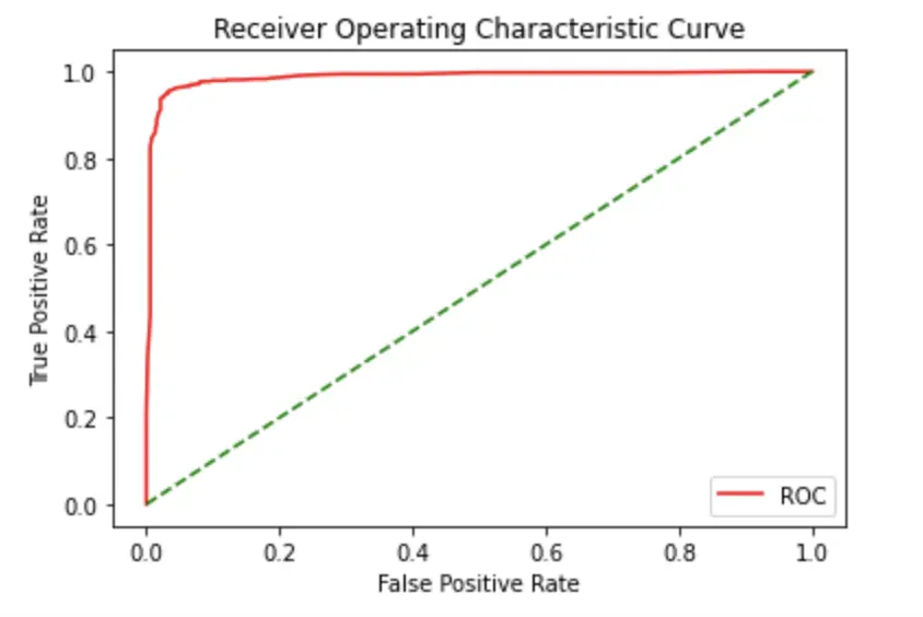
def plot_roc_curve(fper, tper):
plt.plot(fper, tper, color="red", label="ROC")
plt.plot([0, 1], [0, 1], color="green", linestyle="--")
plt.xlabel("False Positive Rate")
plt.ylabel("True Positive Rate")
plt.title("Receiver Operating Characteristic Curve")
plt.legend()
plt.show()
data_X, cls_lab = make_classification(
n_samples=2100, n_classes=2, weights=[1, 1], random_state=2
)
train_X, test_X, train_y, test_y = train_test_split(
data_X, cls_lab, test_size=0.5, random_state=2
)
model = RandomForestClassifier()
model.fit(train_X, train_y)
prob = model.predict_proba(test_X)
prob = probs[:, 1]
fper, tper, thresholds = roc_curve(test_y, prob)
plot_roc_curve(fper, tper)
Output:
Code Explanation
First, all the libraries and functions that are required to plot a ROC curve are imported. Then a function called plot_roc_curve is defined in which all the critical factors of the curve like the color, labels, and title are mentioned using the Matplotlib library. After that, the make_classification function is used to make random samples, and then they are divided into train and test sets with the help of the train_test_split function. Here, the train-test ratio of the data is 0.50. Then the RandomForestClassifier algorithm is used to fit the train_X and train_y data. Finally, the roc_curve function is used to plot the ROC Curve.

Lakshay Kapoor is a final year B.Tech Computer Science student at Amity University Noida. He is familiar with programming languages and their real-world applications (Python/R/C++). Deeply interested in the area of Data Sciences and Machine Learning.
LinkedIn