Matplotlib에서 데이터 목록에 대한 히스토그램을 그리는 방법
Suraj Joshi
2024년2월15일
Matplotlib
Matplotlib Visualizations
plt.hist()메서드를 사용하여 데이터 목록에서 히스토그램을 그릴 수 있습니다.
Maplotlib [hist()메소드](https://matplotlib.org/3.3.1/api/_as_gen/matplotlib.pyplot.hist.html) 구문
matplotlib.pyplot.hist(x,
                       bins=None,
                       range=None,
                       density=False,
                       weights=None,
                       cumulative=False,
                       bottom=None,
                       histtype='bar',
                       align='mid',
                       orientation='vertical',
                       rwidth=None,
                       log=False,
                       color=None,
                       label=None,
                       stacked=False, *,
                       data=None,
                       **kwargs)
예: 데이터 목록에서 Matplotlib를 사용하여 히스토그램 플로팅
import matplotlib.pyplot as plt

data = [3, 4, 2, 3, 4, 5, 4, 7, 8, 5, 4, 6, 2, 1, 0, 9, 7, 6, 6, 5, 4]

n, bins, patches = plt.hist(data)
plt.xlabel("Values")
plt.ylabel("Frequency")
plt.title("Histogram")
plt.show()
출력:
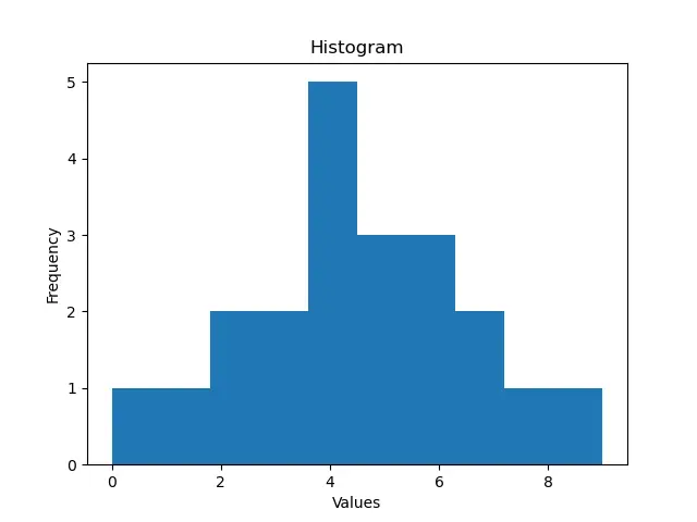
여기에는 data목록에 값이 있습니다. 이 목록을plt.hist()명령에 전달하여 값 목록에서 히스토그램을 생성합니다. plt.hist()메서드는 빈의 빈도, 빈의 끝점, 히스토그램을 만드는 데 사용 된 패치 목록을 반환합니다.
이 예에서는bins 매개 변수의 값을 설정하지 않았습니다. 기본적으로 bins의 수는 10 개이므로 스크립트는 빈이 10 개인 데이터 목록에서 히스토그램을 생성합니다.
또한 히스토그램을 만드는 동안bins 명령을 사용하여 빈 수를 제어 할 수 있습니다.
import matplotlib.pyplot as plt

data = [3, 4, 2, 3, 4, 5, 4, 7, 8, 5, 4, 6, 2, 1, 0, 9, 7, 6, 6, 5, 4]
n, bins, patches = plt.hist(data, bins=20)
plt.xlabel("Values")
plt.ylabel("Frequency")
plt.title("Histogram with 20 bins")
plt.show()
출력:
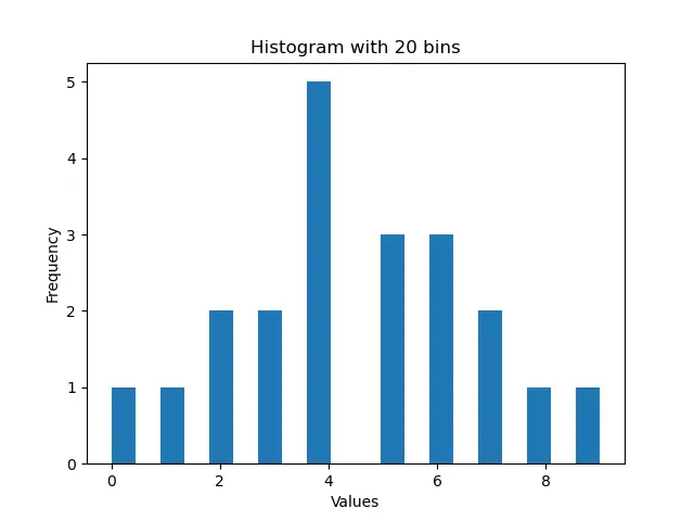
이 프로세스는 목록 값의 전체 범위를 균등하게 나눈 결과로 20 개의 빈으로 만든 히스토그램을 표시합니다.
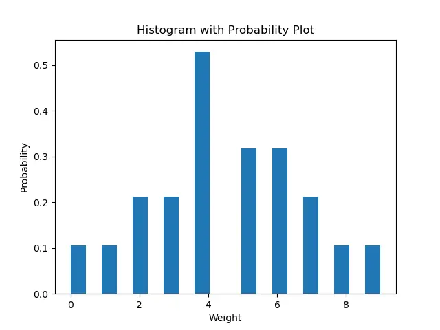
기본적으로density 매개 변수의 값은False로 설정됩니다. 이것은 우리가 히스토그램에서 각 빈의 정확한 개수의 플롯을 얻는다는 것을 의미합니다. 목록에있는 각 빈의 확률 밀도 플롯을 만들려면 density를 True로 설정해야합니다. density가 True이면 히스토그램 아래 영역이 1로 통합됩니다.
import matplotlib.pyplot as plt

data = [3, 4, 2, 3, 4, 5, 4, 7, 8, 5, 4, 6, 2, 1, 0, 9, 7, 6, 6, 5, 4]
n, bins, patches = plt.hist(data, bins=20, density=True)
plt.xlabel("Weight")
plt.ylabel("Probability")
plt.title("Histogram with Probability Plot")
plt.show()
출력:
이제 color매개 변수를 사용하여 히스토그램의 색상을 설정할 수 있습니다.
import matplotlib.pyplot as plt

data = [3, 4, 2, 3, 4, 5, 4, 7, 8, 5, 4, 6, 2, 1, 0, 9, 7, 6, 6, 5, 4]
n, bins, patches = plt.hist(data, bins=20, density=True, color="red")
plt.xlabel("Weight")
plt.ylabel("Probability")
plt.title("Red Histogram Plot")
plt.show()
출력:
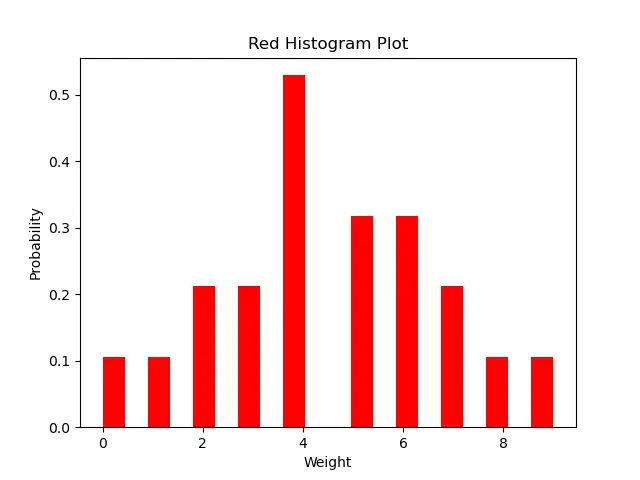
이 방법은 붉은 색의 히스토그램을 생성합니다.
튜토리얼이 마음에 드시나요? DelftStack을 구독하세요 YouTube에서 저희가 더 많은 고품질 비디오 가이드를 제작할 수 있도록 지원해주세요. 구독하다
작가: Suraj Joshi

Suraj Joshi is a backend software engineer at Matrice.ai.
LinkedIn