如何在 Matplotlib 中繪製資料列表的直方圖
Suraj Joshi
2020年11月7日
Matplotlib
Matplotlib Visualizations
我們可以使用 plt.hist() 方法從資料列表中繪製直方圖。
plt.hist() 方法的語法
matplotlib.pyplot.hist(x,
                       bins=None,
                       range=None,
                       density=False,
                       weights=None,
                       cumulative=False,
                       bottom=None,
                       histtype='bar',
                       align='mid',
                       orientation='vertical',
                       rwidth=None,
                       log=False,
                       color=None,
                       label=None,
                       stacked=False, *,
                       data=None,
                       **kwargs)
示例:從資料列表中使用 Matplotlib 繪製直方圖
import matplotlib.pyplot as plt

data = [3, 4, 2, 3, 4, 5, 4, 7, 8, 5, 4, 6, 2, 1, 0, 9, 7, 6, 6, 5, 4]

n, bins, patches = plt.hist(data)
plt.xlabel("Values")
plt.ylabel("Frequency")
plt.title("Histogram")
plt.show()
輸出:
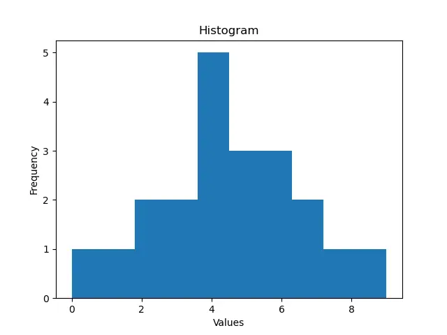
在這裡,我們在一個列表 data 中有數值。我們將這個列表傳入 plt.hist() 命令,從值列表中生成一個直方圖。plt.hist() 方法會返回二進位制的頻率、二進位制的端點以及用於建立直方圖的補丁列表。
在本例中,我們沒有設定 bins 引數的值。預設情況下,bins 的值是 10,所以指令碼會從 10 個 bins 的資料列表中建立直方圖。
此外,我們可以在製作直方圖時使用 bins 命令控制直方塊的數量。
import matplotlib.pyplot as plt

data = [3, 4, 2, 3, 4, 5, 4, 7, 8, 5, 4, 6, 2, 1, 0, 9, 7, 6, 6, 5, 4]
n, bins, patches = plt.hist(data, bins=20)
plt.xlabel("Values")
plt.ylabel("Frequency")
plt.title("Histogram with 20 bins")
plt.show()
輸出:
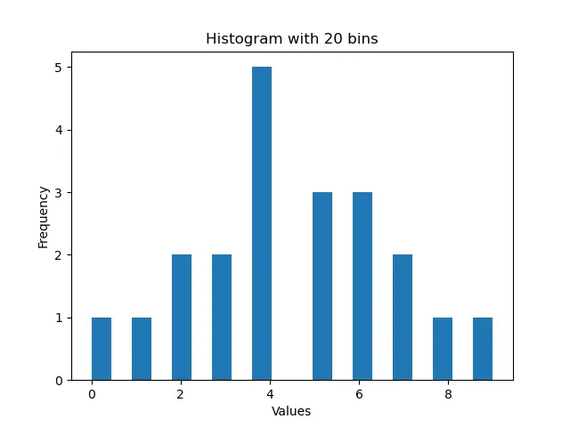
這個過程顯示了由 20 個直方塊組成的直方圖,這是平均劃分整個列表值範圍的結果。
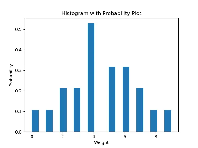
預設情況下,density 引數的值被設定為 False;這意味著我們在直方圖中得到每個 bin 的精確計數的圖。如果我們想讓列表中每個 bin 的概率密度圖,我們需要將 density 設定為 True。如果 density 為 True,直方圖下的區域積分為 1。
import matplotlib.pyplot as plt

data = [3, 4, 2, 3, 4, 5, 4, 7, 8, 5, 4, 6, 2, 1, 0, 9, 7, 6, 6, 5, 4]
n, bins, patches = plt.hist(data, bins=20, density=True)
plt.xlabel("Weight")
plt.ylabel("Probability")
plt.title("Histogram with Probability Plot")
plt.show()
輸出:
現在我們可以使用 color 引數設定直方圖的顏色。
import matplotlib.pyplot as plt

data = [3, 4, 2, 3, 4, 5, 4, 7, 8, 5, 4, 6, 2, 1, 0, 9, 7, 6, 6, 5, 4]
n, bins, patches = plt.hist(data, bins=20, density=True, color="red")
plt.xlabel("Weight")
plt.ylabel("Probability")
plt.title("Red Histogram Plot")
plt.show()
輸出:
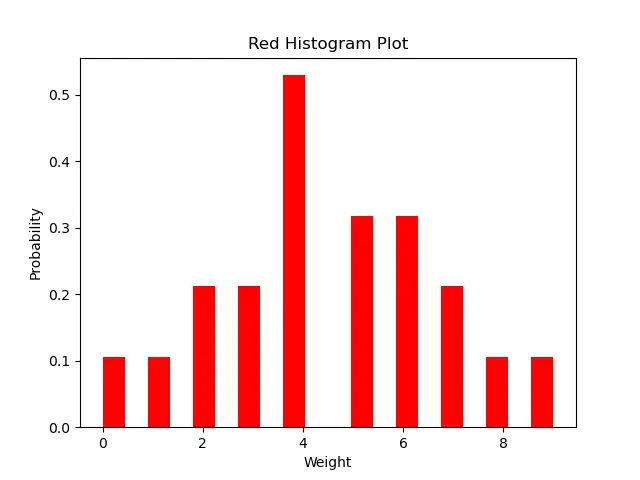
此方法生成紅色的直方圖。
Enjoying our tutorials? Subscribe to DelftStack on YouTube to support us in creating more high-quality video guides. Subscribe
作者: Suraj Joshi

Suraj Joshi is a backend software engineer at Matrice.ai.
LinkedIn