HOWTO · React Native
React ネイティブ ナビゲーション バー
この記事は、React Native アプリケーションのナビゲーション バーを使用してページ間を移動する方法を理解するのに役立ちます。
このページの内容
このセクションでは、ヘッダー ナビゲーションに集中します。 ヘッダーにボタンを追加するのは、ヘッダーを操作するための最良の方法であるためです。
React Native でナビゲーション バーを使用する
タイトルにボタンを追加することから始めましょう。次に、コードを 1つずつ見ていきます。 まず、FirstPage.js と SecondPage.js の 2つの JavaScript ファイルを作成する必要があります。
コード例 (FirstPage.js):
import React from 'react';
import {SafeAreaView, StyleSheet, Text, TouchableOpacity, View,} from 'react-native';

const FirstPage = ({navigation}) => {
  React.useLayoutEffect(() => {
    navigation.setOptions({
      headerTitle: (props) => (
        <Text
          {...props}
          style={{ color: 'black', fontWeight: 'bold', fontSize: 26 }}
        >
          React Native Navigation Bar
        </Text>
      ),
      headerStyle: {
        backgroundColor: "#71b5f5",
      },
    });
  }, [navigation]);

  return (
    <SafeAreaView style={{ flex: 1, backgroundColor: "#e6ffff" }}>
      <View style={styles.container}>
        <Text style={styles.header}>Welcome to first page</Text>
        <TouchableOpacity
          onPress={() => navigation.navigate('SecondPage')}
          style={styles.button_Style}
        >
          <Text style={styles.text_Style}>Click Here to see what's Next</Text>
        </TouchableOpacity>
      </View>
    </SafeAreaView>
  );
};

export default FirstPage;

const styles = StyleSheet.create({
  container: {
    flex: 1,
    padding: 30,
  },
  button_Style: {
    height: 40,
    padding: 10,
    backgroundColor: "#b3ffff",
    borderRadius: 2,
    marginTop: 12,
  },
  header: {
    fontSize: 30,
    textAlign: "center",
    fontWeight: "bold",
    marginVertical: 200,
  },
  text_Style: {
    color: "black",
  },
});
このコード セクションでは、ヘッダーを宣言し、React Native Navigation Bar という名前を付け、スタイルを設定しました。
ボタンを作成しました。onPress プロップが、クリックしたときに何が起こるかを決定することがわかっています。 したがって、ユーザーがボタンに触れると、2 番目のページに送られると言いました。
どこに行くのも自由です。 適切な構文と構造を使用することを忘れないでください。
コード例 (SecondPage.js):
import React from 'react';
import {SafeAreaView, StyleSheet, Text, TouchableOpacity, View,} from 'react-native';

const SecondPage = ({navigation}) => {
  React.useLayoutEffect(() => {
    navigation.setOptions({
      title: 'Second Page',
      headerStyle: {
        backgroundColor: '#99ffcc',
      },
      headerTitleStyle: {
        fontWeight: 'bold',
        fontSize: 20,
        padding: 15,
      },
      headerLeft: () => (
        <TouchableOpacity
          onPress={() => alert('hello from left Button')}
          style={{ marginLeft: 10 }}
        >
          <Text style={{ color: 'black' }}>Left Button</Text>
        </TouchableOpacity>
      ),
      headerRight: () => (
        <TouchableOpacity
          onPress={() => alert('hello from Right Button ')}
          style={{ marginRight: 25 }}
        >
          <Text style={{ color: 'black' }}>Right Button</Text>
        </TouchableOpacity>
      ),
    });
  }, [navigation]);

  return (
    <SafeAreaView style={{ flex: 1, backgroundColor: '#ccffe6' }}>
      <View style={styles.container}>
        <Text style={styles.header}>
          you can see right and left button around corner
        </Text>
      </View>
    </SafeAreaView>
  );
};

export default SecondPage;

const styles = StyleSheet.create({
  container: {
    padding: 20,
    flex: 1,
    justifyContent: "center",
    alignItems: "center",
  },
  header: {
    fontSize: 25,
    marginVertical: 25,
    textAlign: "center",
  },
  text_Style: {
    color: "#fff",
    textAlign: "center",
  },
});
上記の説明で、基本的なヘッダーに関するいくつかの考えが得られたはずです。
このファイルには右タイトルと左タイトルがあります。 以下でそれらについて説明します。
headerLeft: () => (
<TouchableOpacity
  onPress={() => alert('hello from left Button')}
  style={{
  marginLeft: 10 }}
>
  <Text style={{
  color: 'black' }}>Left Button</Text>
</TouchableOpacity>
      ),
これは左側の見出しです。 これをボタンとして指定し、押すとアラートが発生します。
ですから、左ヘッダーに追加したいものは何でも headerLeft に入れます。
headerRight: () => (
    <TouchableOpacity
      onPress={() => alert('hello from Right Button ')}
      style={{
  marginRight: 25 }}
    >
      <Text style={{
  color: 'black' }}>Right Button</Text>
    </TouchableOpacity>
      ),
右側の見出しも同じ処理を受けています。 左のヘッダーの仕組みがわかれば、コードが似ているので右のタイトルの仕組みも簡単に理解できます。
唯一の違いは、可用性と表示名です。
コード例 (App.js):
import 'react-native-gesture-handler';

import {NavigationContainer} from '@react-navigation/native';
import {createStackNavigator} from '@react-navigation/stack';
import React from 'react';

import FirstPage from './pages/FirstPage';
import SecondPage from './pages/SecondPage';

const Stack = createStackNavigator();

const App = () => {
  return (
      <NavigationContainer><Stack.Navigator initialRouteName = 'FirstPage'>
      <Stack.Screen name = 'FirstPage' component =
       {
         FirstPage
       } />
        <Stack.Screen name="SecondPage" component={SecondPage} />
      </Stack.Navigator>
    </NavigationContainer>);
};
export default App;
First Pages と Second Pages がどのように機能するかについては、すでに説明しました。
スタック ナビゲーションは、App.js コードで使用されます。 スタック ナビゲーターのドキュメントを読めば、このコードを理解するのは簡単です。 それ以外の場合は、スタック ナビゲーションのドキュメントをお読みください。
ここでは、2つのスタック スクリーンが定義されています。これらは、最初のページと 2 番目のページからコンポーネントを取得し、それらを出力にレンダリングします。
出力:
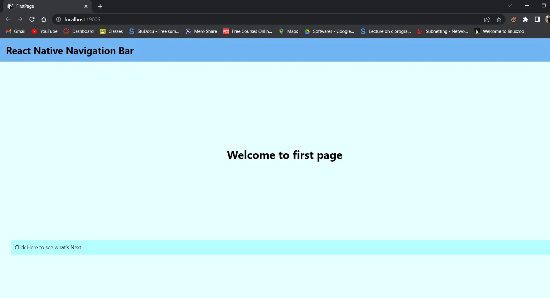
最初のページのボタンをクリックすると、2 番目のページに移動します。
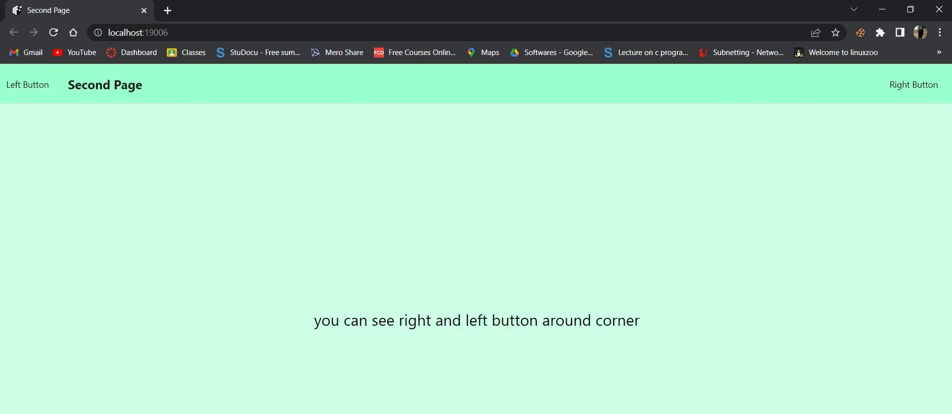
このスクリーンショットには、Left と Right の 2つのボタンが表示されます。
左のボタン:
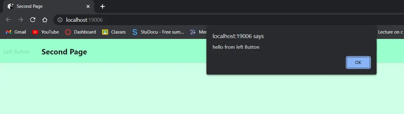
右ボタン:

左側のメニューを選択すると、hello from the left button というメッセージが表示されます。 それをクリックすると、右ボタンからこんにちはというアラートが表示されます。
これは、レスポンシブでパーソナライズされたヘッダーまたはナビゲーション バーの作成に関するものでした。