Barra de navegación nativa de React
Nos concentraremos en la navegación de encabezados en esta sección. Agregaremos botones al encabezado porque ese es el mejor método para interactuar con él.
Usar la barra de navegación en React Native
Comencemos agregando botones al título y luego repasaremos el código pieza por pieza. Primero, tenemos que crear dos archivos JavaScript: FirstPage.js y SecondPage.js.
Código de ejemplo (FirstPage.js):
import React from 'react';
import {SafeAreaView, StyleSheet, Text, TouchableOpacity, View,} from 'react-native';

const FirstPage = ({navigation}) => {
  React.useLayoutEffect(() => {
    navigation.setOptions({
      headerTitle: (props) => (
        <Text
          {...props}
          style={{ color: 'black', fontWeight: 'bold', fontSize: 26 }}
        >
          React Native Navigation Bar
        </Text>
      ),
      headerStyle: {
        backgroundColor: "#71b5f5",
      },
    });
  }, [navigation]);

  return (
    <SafeAreaView style={{ flex: 1, backgroundColor: "#e6ffff" }}>
      <View style={styles.container}>
        <Text style={styles.header}>Welcome to first page</Text>
        <TouchableOpacity
          onPress={() => navigation.navigate('SecondPage')}
          style={styles.button_Style}
        >
          <Text style={styles.text_Style}>Click Here to see what's Next</Text>
        </TouchableOpacity>
      </View>
    </SafeAreaView>
  );
};

export default FirstPage;

const styles = StyleSheet.create({
  container: {
    flex: 1,
    padding: 30,
  },
  button_Style: {
    height: 40,
    padding: 10,
    backgroundColor: "#b3ffff",
    borderRadius: 2,
    marginTop: 12,
  },
  header: {
    fontSize: 30,
    textAlign: "center",
    fontWeight: "bold",
    marginVertical: 200,
  },
  text_Style: {
    color: "black",
  },
});
En esta sección de código, declaramos un encabezado, lo llamamos React Native Navigation Bar y lo estilizamos.
Hemos creado un botón y sabemos que el accesorio onPress determina lo que sucede una vez que hacemos clic en él. Así que hemos dicho que si el usuario toca el botón, será enviado a la segunda página.
Eres libre de ir a donde quieras. Solo recuerde usar la sintaxis y la estructura apropiadas.
Código de ejemplo (SecondPage.js):
import React from 'react';
import {SafeAreaView, StyleSheet, Text, TouchableOpacity, View,} from 'react-native';

const SecondPage = ({navigation}) => {
  React.useLayoutEffect(() => {
    navigation.setOptions({
      title: 'Second Page',
      headerStyle: {
        backgroundColor: '#99ffcc',
      },
      headerTitleStyle: {
        fontWeight: 'bold',
        fontSize: 20,
        padding: 15,
      },
      headerLeft: () => (
        <TouchableOpacity
          onPress={() => alert('hello from left Button')}
          style={{ marginLeft: 10 }}
        >
          <Text style={{ color: 'black' }}>Left Button</Text>
        </TouchableOpacity>
      ),
      headerRight: () => (
        <TouchableOpacity
          onPress={() => alert('hello from Right Button ')}
          style={{ marginRight: 25 }}
        >
          <Text style={{ color: 'black' }}>Right Button</Text>
        </TouchableOpacity>
      ),
    });
  }, [navigation]);

  return (
    <SafeAreaView style={{ flex: 1, backgroundColor: '#ccffe6' }}>
      <View style={styles.container}>
        <Text style={styles.header}>
          you can see right and left button around corner
        </Text>
      </View>
    </SafeAreaView>
  );
};

export default SecondPage;

const styles = StyleSheet.create({
  container: {
    padding: 20,
    flex: 1,
    justifyContent: "center",
    alignItems: "center",
  },
  header: {
    fontSize: 25,
    marginVertical: 25,
    textAlign: "center",
  },
  text_Style: {
    color: "#fff",
    textAlign: "center",
  },
});
La explicación anterior debería haberte dado algunas ideas sobre el encabezado básico.
Este archivo tiene los títulos derecho e izquierdo. Los discutiremos a continuación.
headerLeft: () => (
<TouchableOpacity
  onPress={() => alert('hello from left Button')}
  style={{
  marginLeft: 10 }}
>
  <Text style={{
  color: 'black' }}>Left Button</Text>
</TouchableOpacity>
      ),
Este es el encabezado de la izquierda. Lo hemos designado como un botón, y presionarlo resultará en una alerta.
Por lo tanto, coloque todo lo que desee agregar al encabezado izquierdo en headerLeft.
headerRight: () => (
    <TouchableOpacity
      onPress={() => alert('hello from Right Button ')}
      style={{
  marginRight: 25 }}
    >
      <Text style={{
  color: 'black' }}>Right Button</Text>
    </TouchableOpacity>
      ),
El encabezamiento derecho ha recibido el mismo tratamiento. Si comprende cómo funciona el encabezado izquierdo, puede comprender fácilmente cómo funciona el título derecho porque el código es similar.
La única diferencia es la disponibilidad y el nombre para mostrar.
Código de ejemplo (App.js):
import 'react-native-gesture-handler';

import {NavigationContainer} from '@react-navigation/native';
import {createStackNavigator} from '@react-navigation/stack';
import React from 'react';

import FirstPage from './pages/FirstPage';
import SecondPage from './pages/SecondPage';

const Stack = createStackNavigator();

const App = () => {
  return (
      <NavigationContainer><Stack.Navigator initialRouteName = 'FirstPage'>
      <Stack.Screen name = 'FirstPage' component =
       {
         FirstPage
       } />
        <Stack.Screen name="SecondPage" component={SecondPage} />
      </Stack.Navigator>
    </NavigationContainer>);
};
export default App;
Ya hemos explicado cómo funcionan la primera y la segunda página.
La navegación de pila se usa en el código App.js. Comprender este código es sencillo si ha leído la documentación del navegador de pila; de lo contrario, lea la documentación de navegación de la pila.
Aquí se definen dos pantallas de pila, que toman componentes de la primera y segunda página y los representan en la salida.
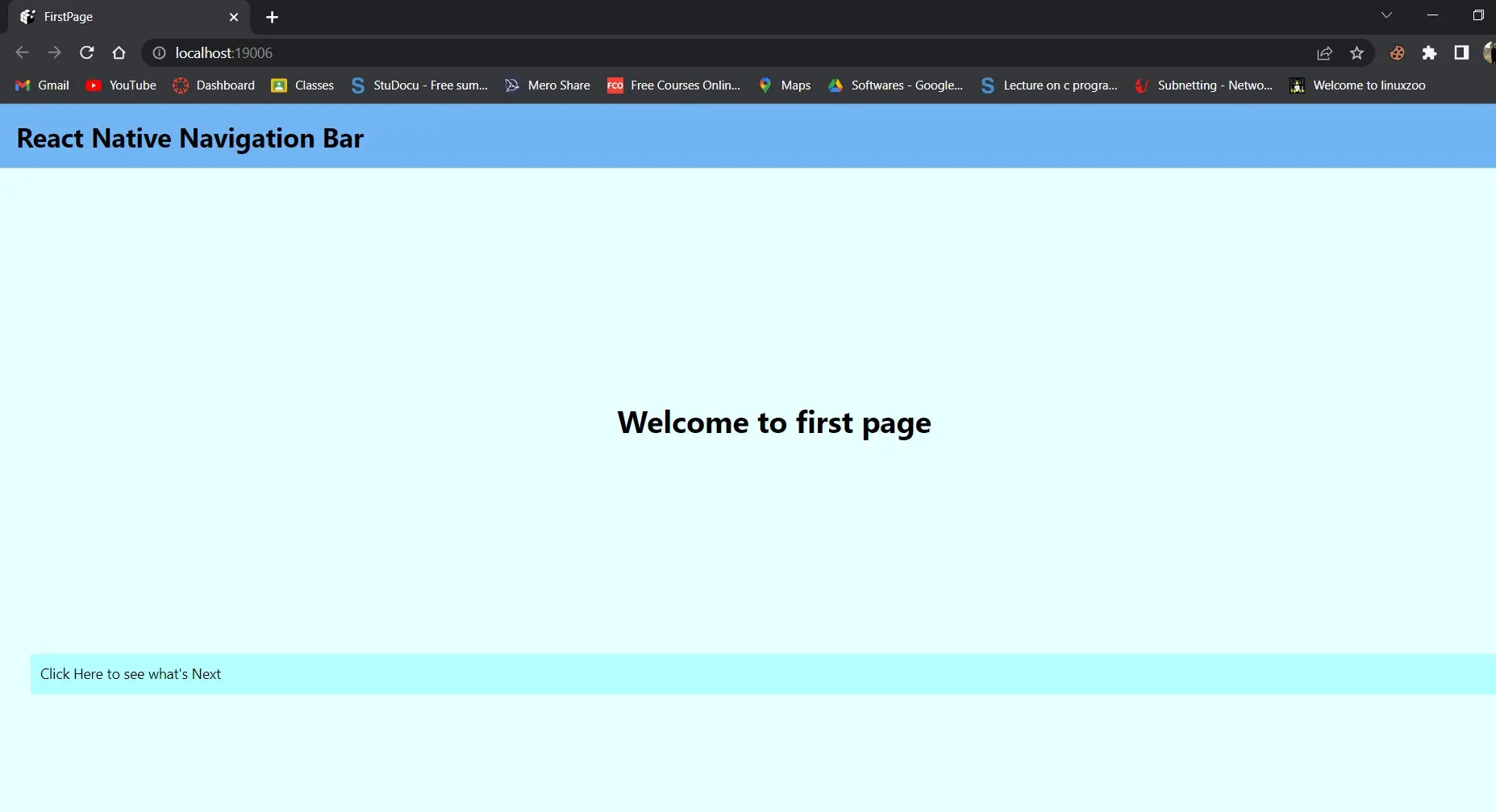
Producción:
Accederá a la segunda página después de hacer clic en el botón de la primera página.
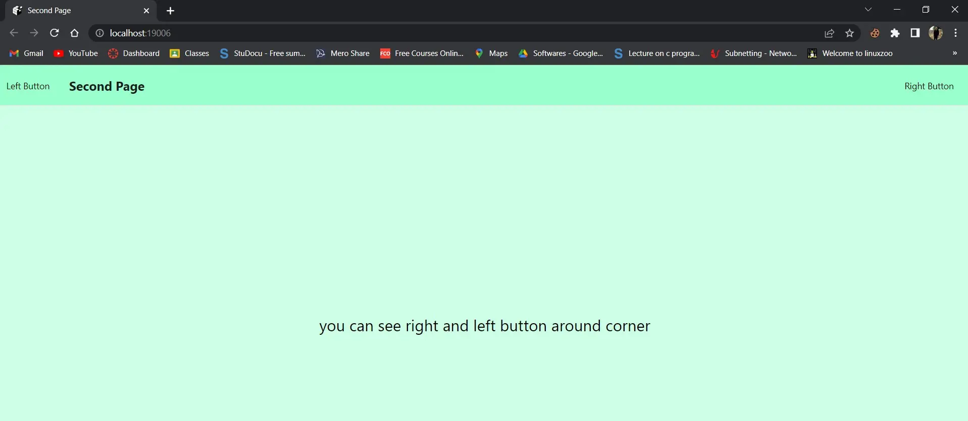
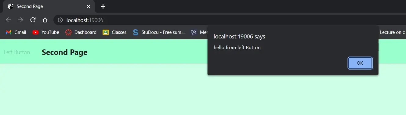
Verá dos botones en esta captura de pantalla: Izquierda y Derecha.
Botón izquierdo:
Botón derecho:
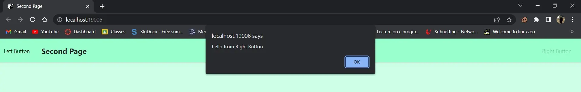
Después de seleccionar el menú de la izquierda, aparecerá el mensaje hola desde el botón izquierdo. Después de hacer clic en él, recibirá una alerta que dice hola desde el botón derecho.
Así que se trataba de hacer un encabezado o barra de navegación receptivo y personalizado.

Shiv is a self-driven and passionate Machine learning Learner who is innovative in application design, development, testing, and deployment and provides program requirements into sustainable advanced technical solutions through JavaScript, Python, and other programs for continuous improvement of AI technologies.
LinkedIn