HOWTO · React Native
기본 탐색 모음 반응
이 기사는 React Native 애플리케이션에서 탐색 막대를 사용하여 페이지 사이를 탐색하는 방법을 이해하는 데 도움이 됩니다.
이 페이지의 내용
이 섹션에서는 헤더 탐색에 집중할 것입니다. 머리글과 상호 작용하는 가장 좋은 방법이기 때문에 머리글에 단추를 추가할 것입니다.
React Native에서 내비게이션 바 사용
먼저 제목에 버튼을 추가한 다음 코드를 하나씩 살펴보겠습니다. 먼저 FirstPage.js와 SecondPage.js라는 두 개의 JavaScript 파일을 만들어야 합니다.
예제 코드(FirstPage.js):
import React from 'react';
import {SafeAreaView, StyleSheet, Text, TouchableOpacity, View,} from 'react-native';

const FirstPage = ({navigation}) => {
  React.useLayoutEffect(() => {
    navigation.setOptions({
      headerTitle: (props) => (
        <Text
          {...props}
          style={{ color: 'black', fontWeight: 'bold', fontSize: 26 }}
        >
          React Native Navigation Bar
        </Text>
      ),
      headerStyle: {
        backgroundColor: "#71b5f5",
      },
    });
  }, [navigation]);

  return (
    <SafeAreaView style={{ flex: 1, backgroundColor: "#e6ffff" }}>
      <View style={styles.container}>
        <Text style={styles.header}>Welcome to first page</Text>
        <TouchableOpacity
          onPress={() => navigation.navigate('SecondPage')}
          style={styles.button_Style}
        >
          <Text style={styles.text_Style}>Click Here to see what's Next</Text>
        </TouchableOpacity>
      </View>
    </SafeAreaView>
  );
};

export default FirstPage;

const styles = StyleSheet.create({
  container: {
    flex: 1,
    padding: 30,
  },
  button_Style: {
    height: 40,
    padding: 10,
    backgroundColor: "#b3ffff",
    borderRadius: 2,
    marginTop: 12,
  },
  header: {
    fontSize: 30,
    textAlign: "center",
    fontWeight: "bold",
    marginVertical: 200,
  },
  text_Style: {
    color: "black",
  },
});
이 코드 섹션에서는 React Native Navigation Bar라는 헤더를 선언하고 스타일을 지정했습니다.
우리는 버튼을 만들었고 onPress 소품이 버튼을 클릭하면 발생하는 일을 결정한다는 것을 알고 있습니다. 그래서 사용자가 버튼을 터치하면 두 번째 페이지로 이동한다고 말했습니다.
원하는 곳 어디든 자유롭게 갈 수 있습니다. 적절한 구문과 구조를 사용하는 것을 잊지 마십시오.
예제 코드(SecondPage.js):
import React from 'react';
import {SafeAreaView, StyleSheet, Text, TouchableOpacity, View,} from 'react-native';

const SecondPage = ({navigation}) => {
  React.useLayoutEffect(() => {
    navigation.setOptions({
      title: 'Second Page',
      headerStyle: {
        backgroundColor: '#99ffcc',
      },
      headerTitleStyle: {
        fontWeight: 'bold',
        fontSize: 20,
        padding: 15,
      },
      headerLeft: () => (
        <TouchableOpacity
          onPress={() => alert('hello from left Button')}
          style={{ marginLeft: 10 }}
        >
          <Text style={{ color: 'black' }}>Left Button</Text>
        </TouchableOpacity>
      ),
      headerRight: () => (
        <TouchableOpacity
          onPress={() => alert('hello from Right Button ')}
          style={{ marginRight: 25 }}
        >
          <Text style={{ color: 'black' }}>Right Button</Text>
        </TouchableOpacity>
      ),
    });
  }, [navigation]);

  return (
    <SafeAreaView style={{ flex: 1, backgroundColor: '#ccffe6' }}>
      <View style={styles.container}>
        <Text style={styles.header}>
          you can see right and left button around corner
        </Text>
      </View>
    </SafeAreaView>
  );
};

export default SecondPage;

const styles = StyleSheet.create({
  container: {
    padding: 20,
    flex: 1,
    justifyContent: "center",
    alignItems: "center",
  },
  header: {
    fontSize: 25,
    marginVertical: 25,
    textAlign: "center",
  },
  text_Style: {
    color: "#fff",
    textAlign: "center",
  },
});
위의 설명은 기본 헤더에 대한 몇 가지 생각을 제공했을 것입니다.
이 파일에는 오른쪽 및 왼쪽 제목이 있습니다. 아래에서 논의할 것입니다.
headerLeft: () => (
<TouchableOpacity
  onPress={() => alert('hello from left Button')}
  style={{
  marginLeft: 10 }}
>
  <Text style={{
  color: 'black' }}>Left Button</Text>
</TouchableOpacity>
      ),
이것은 왼쪽의 제목입니다. 버튼으로 지정했으며 누르면 경고가 발생합니다.
따라서 headerLeft의 왼쪽 머리글에 추가하려는 항목을 입력하십시오.
headerRight: () => (
    <TouchableOpacity
      onPress={() => alert('hello from Right Button ')}
      style={{
  marginRight: 25 }}
    >
      <Text style={{
  color: 'black' }}>Right Button</Text>
    </TouchableOpacity>
      ),
오른쪽 제목도 같은 취급을 받았습니다. 왼쪽 헤더가 어떻게 작동하는지 이해하면 코드가 비슷하기 때문에 오른쪽 제목이 어떻게 작동하는지 쉽게 파악할 수 있습니다.
유일한 차이점은 가용성과 표시 이름입니다.
예제 코드(App.js):
import 'react-native-gesture-handler';

import {NavigationContainer} from '@react-navigation/native';
import {createStackNavigator} from '@react-navigation/stack';
import React from 'react';

import FirstPage from './pages/FirstPage';
import SecondPage from './pages/SecondPage';

const Stack = createStackNavigator();

const App = () => {
  return (
      <NavigationContainer><Stack.Navigator initialRouteName = 'FirstPage'>
      <Stack.Screen name = 'FirstPage' component =
       {
         FirstPage
       } />
        <Stack.Screen name="SecondPage" component={SecondPage} />
      </Stack.Navigator>
    </NavigationContainer>);
};
export default App;
첫 페이지와 두 번째 페이지가 어떻게 작동하는지 이미 살펴보았습니다.
스택 탐색은 App.js 코드에서 사용됩니다. 스택 내비게이터 설명서를 읽었다면 이 코드를 쉽게 이해할 수 있습니다. 그렇지 않으면 스택 탐색 설명서를 읽어 보십시오.
여기에서는 두 개의 스택 화면이 정의되며 첫 번째 페이지와 두 번째 페이지에서 구성 요소를 가져와서 출력에 렌더링합니다.
출력:
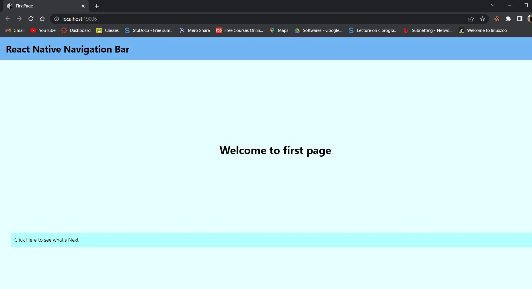
첫 번째 페이지에서 버튼을 클릭하면 두 번째 페이지로 이동합니다.
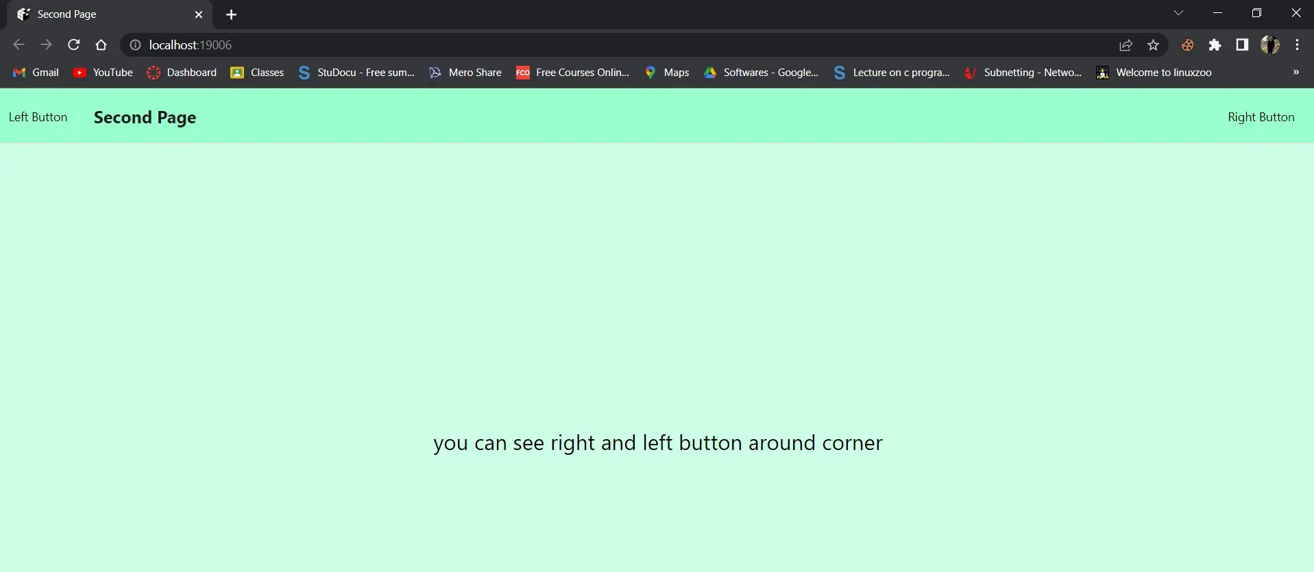
이 스크린샷에는 왼쪽과 오른쪽이라는 두 개의 버튼이 표시됩니다.
왼쪽 버튼:
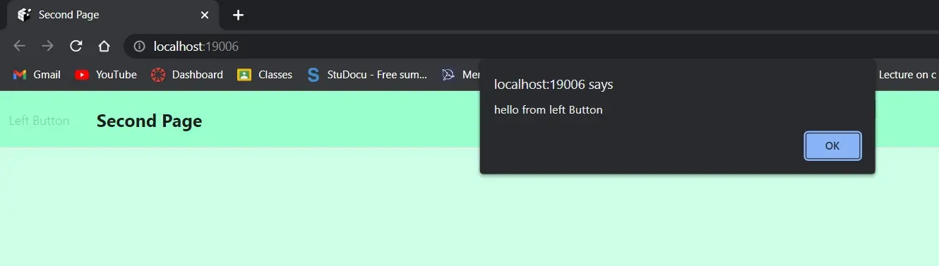
오른쪽 버튼:

왼쪽 메뉴를 선택하면 hello from the left button 메시지가 표시됩니다. 클릭하면 오른쪽 버튼에서 안녕하세요라는 알림이 표시됩니다.
그래서 이것은 반응적이고 개인화 된 헤더 또는 내비게이션 바를 만드는 것에 관한 것입니다.