R ggplot2 プロットで軸の制限を設定する方法
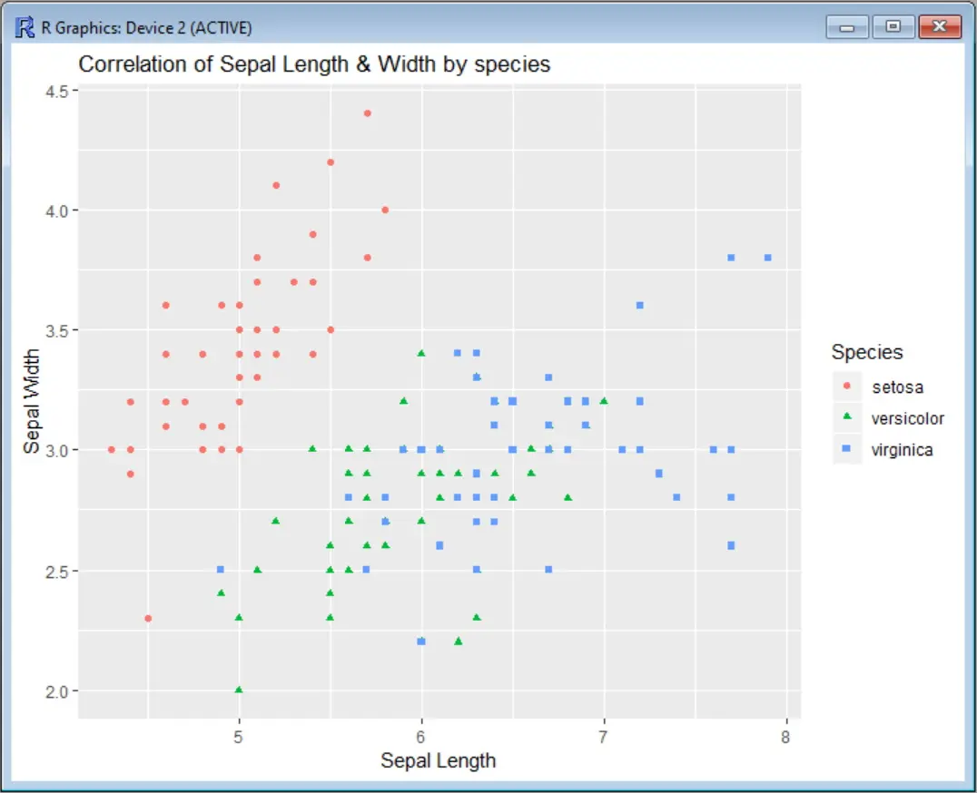
まず、軸に制限をかけずに散布図を見てみましょう。この例では、アイリスのデータセットを用いて、セパル幅の値とセパル幅を相関させ、種を色で分類しています。関数 ggplot を呼び出す前に、ggplot2 パッケージをインストールし、対応するライブラリを読み込む必要があります。
install.packages("ggplot2")
library(ggplot2)
scatter <- ggplot(data=iris, aes(x = Sepal.Length, y = Sepal.Width))
scatter + geom_point(aes(color=Species, shape=Species)) +
 ylab("Sepal Width") + xlab("Sepal Length") +
 ggtitle("Correlation of Sepal Length & Width by species")
出力:
ここで、x 軸 (セパルの長さ) を制限して、x=5 から x=7 の間の領域のみを表示するようにしたいとします。そのためには、scale_x_continuous を使用するか、coord_cartesian を使用するかの 2つのオプションがあります。
scale_x_continuous は指定された軸の指定範囲外にあるデータ点をすべて削除し、coord_cartesian は可視領域の調整のみを行います。ほとんどの場合、どちらのオプションを使っても同じ結果が得られます。しかし、たまたまデータに何かをフィットさせた場合、フィットした値が変わってしまう可能性があります。
ggplot2 の scale_x_continuous で x 軸の限界を設定する
scale_x_continuous を利用するには、以下のように x 軸の下限と上限を指定したベクトルを指定する必要があります。
scatter <- ggplot(data=iris, aes(x = Sepal.Length, y = Sepal.Width))
scatter + geom_point(aes(color=Species, shape=Species)) +
 ylab("Sepal Width") + xlab("Sepal Length") +
 ggtitle("Correlation of Sepal Length & Width by species") +
 scale_x_continuous(limits = c(5, 7))
出力:
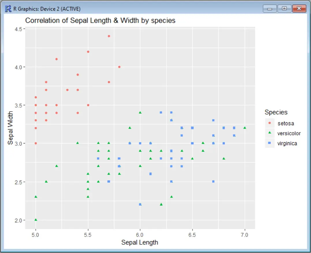
また、グラフから何点のデータが削除されたかを示す警告メッセージが表示されます。
Warning message:
Removed 34 rows containing missing values (geom_point).
y 軸を制限したい場合は、この例と同じように scale_y_continuous を追加します。
scatter-<--ggplot(data=iris,-aes(x-=-Sepal.Length,-y-=-Sepal.Width))
scatter + geom_point(aes(color=Species, shape=Species)) +
ylab("Sepal Width") + xlab("Sepal Length") +
ggtitle("Correlation of Sepal Length & Width by species") +
scale_x_continuous(limits = c(5, 7)) +
scale_y_continuous(limits = c(2.5, 4))
出力は両方の軸の限界を表示します。
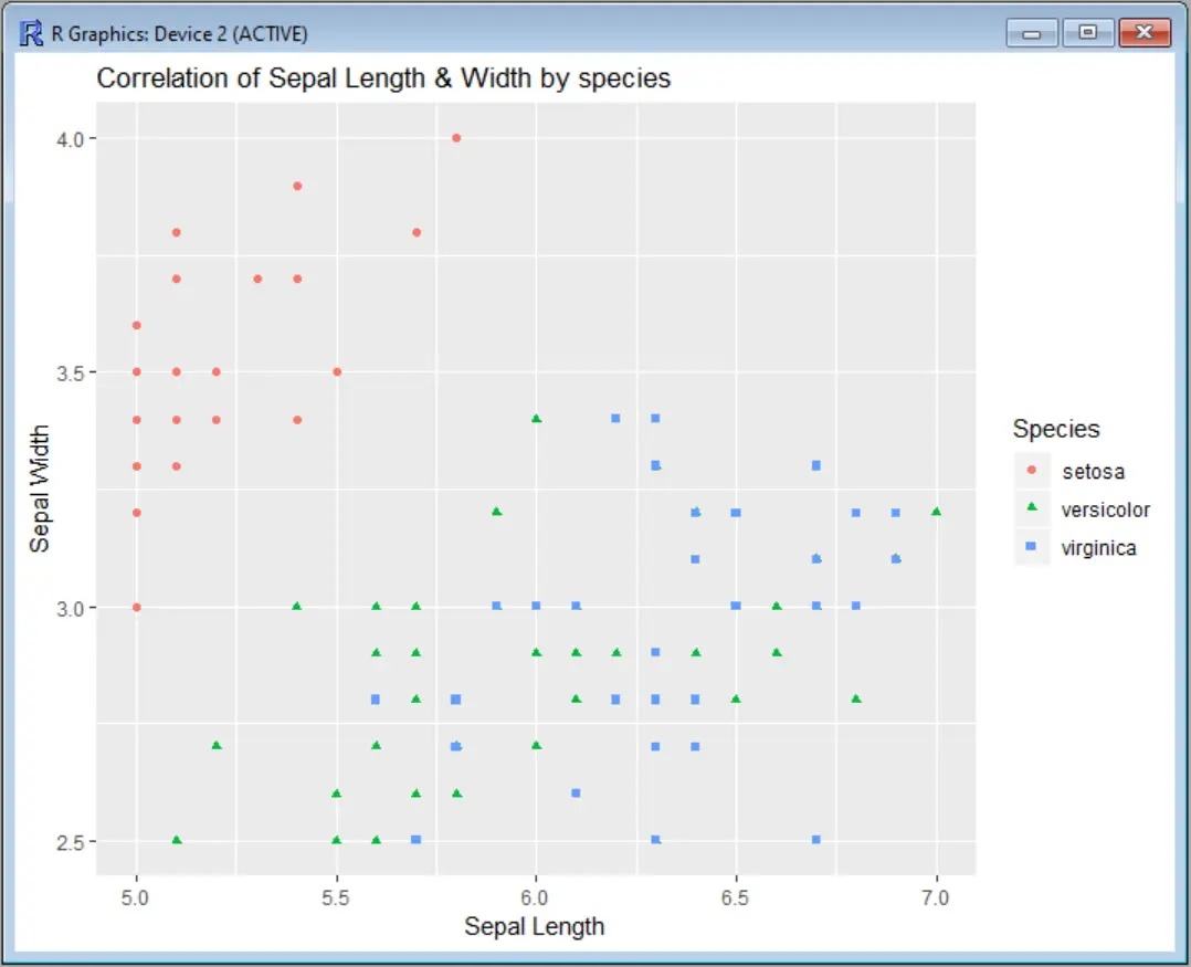
また、scale_x_continuous や scale_y_continuous の代わりに xlim や ylim という短縮関数を使用すると、コマンドを少し短くすることができます。
scatter <- ggplot(data=iris, aes(x = Sepal.Length, y = Sepal.Width))
scatter + geom_point(aes(color=Species, shape=Species)) +
  ylab("Sepal Width") + xlab("Sepal Length") +
  ggtitle("Correlation of Sepal Length & Width by species") +
  xlim(5, 7) + ylim(2.5, 4)
coord_cartesian を用いて ggplot2 の両軸を制限する
もし scale_x_continuous や scale_y_continuous の代わりに coord_cartesian を使いたい場合は以下のようになります。
scatter <- ggplot(data=iris, aes(x = Sepal.Length, y = Sepal.Width))
scatter + geom_point(aes(color=Species, shape=Species)) +
 ylab("Sepal Width") + xlab("Sepal Length") +
 ggtitle("Correlation of Sepal Length & Width by species") +
 coord_cartesian(xlim = c(5, 7), ylim = c(2.5, 4))
また、プロットの出力も同じになります。
RStudio ggplot2 のチートシート には、このコマンドのすべてのオプションの使用法が視覚的にわかりやすく説明されています。