How to Create a ClusterMap in Seaborn
-
Create a Clustermap Using the
clustermap()Method in Seaborn -
Add
row_colorsandcol_colorsOptions in the Seaborn Clustermap
In this demonstration, we will learn what a cluster map is and how we can create and use it for multiple options.
Create a Clustermap Using the clustermap() Method in Seaborn
The seaborn cluster map is a matrix plot where you can visualize your matrix entities through a heat map, but we will also get a clustering of your rows and columns.
Let’s import some required libraries.
Code:
import seaborn as sb
import matplotlib.pyplot as plot
import numpy as np
import pandas as pd
Now, we will create some data about four hypothetical students. We will have their names, study hours, scores on a test, and street addresses.
Code:
TOY_DATA_DICT = {
    "Name": ["Andrew", "Victor", "John", "Sarah"],
    "study_hours": [11, 25, 22, 14],
    "Score": [11, 30, 28, 19],
    "Street_Address": [20, 30, 21, 12],
}
So, this toy data is in a dictionary, but we will convert this to a Pandas data frame and set the index as the student’s name.
Code:
TOY_DATA = pd.DataFrame(TOY_DATA_DICT)
TOY_DATA.set_index("Name", inplace=True)

TOY_DATA
So, we have four hypothetical students and three different columns of data. As we can note here, we have purposely designed this data set so that our study_hours and Score are pretty similar for each student.
Output:
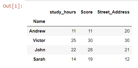
Let’s make a cluster map for this data frame using the clustermap() method. We only need to pass the entire data frame called TOY_DATA.
We use one more keyword argument, annot, and set it to True. This argument will allow us to see the actual numbers printed out on the heat map portion of the cluster map.
Code:
import seaborn as sb
import matplotlib.pyplot as plot
import numpy as np
import pandas as pd
TOY_DATA_DICT = {
"Name": ["Andrew", "Victor", "John", "Sarah"],
"study_hours": [11, 25, 22, 14],
"Score": [11, 30, 28, 19],
"Street_Address": [20, 30, 21, 12],
}
TOY_DATA = pd.DataFrame(TOY_DATA_DICT)
TOY_DATA.set_index("Name", inplace=True)
TOY_DATA
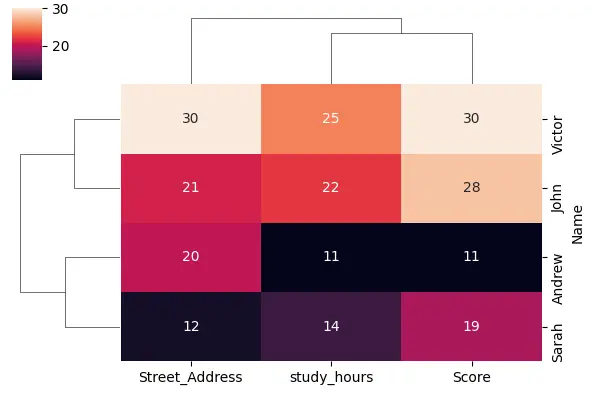
sb.clustermap(TOY_DATA, figsize=(6, 4), annot=True)
plot.show()
We have lower values getting darker colors and higher values getting lighter colors, and we can also notice that we have lines to the left and the top of this heat map. Those lines are called dendrograms, which is how seaborn has clustered our data.
We can see that our study_hours and score have been clustered together, showing us the distance from the study hours to the score. And since their distance is the smallest, they will be clustered together first in the dendrogram, and then we add street_address, which is less similar to these other two columns.
We can say that this dendrogram gives us a sense of how far away each of these different columns is from each other, and the same thing is happening in the rows. You will also notice that Seaborn has reordered our rows and our columns.
Output:
Let’s see the cluster map on an advanced data set. We are loading some data from the Seaborn library, and these data are about penguins.
Code:
PENGUINS = sb.load_dataset("penguins").dropna()
PENGUINS.head()
Output:
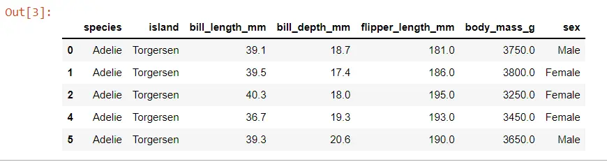
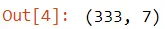
We have about 300 different penguins in this data set, and we can see the shape of the data using the shape attribute.
Code:
print(PENGUINS.shape)
Output:
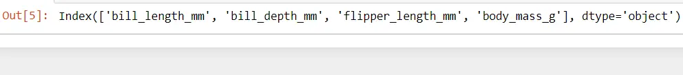
Let’s build a cluster map for these data. The data that we pass to one of these cluster maps should be numeric, so we must filter it down to only the numerical columns of this data frame.
Let’s make an advanced cluster map.
import seaborn as sb
import matplotlib.pyplot as plot
import numpy as np
import pandas as pd


PENGUINS = sb.load_dataset("penguins").dropna()
PENGUINS.head()
print(PENGUINS.shape)

NUMERICAL_COLS = PENGUINS.columns[2:6]
print(NUMERICAL_COLS)

sb.clustermap(PENGUINS[NUMERICAL_COLS], figsize=(6, 6))
plot.show()
When we run this code, we will immediately see that we have three columns with very dark values and only one column with very light values. That is because we have different scales for these different columns.
Output:
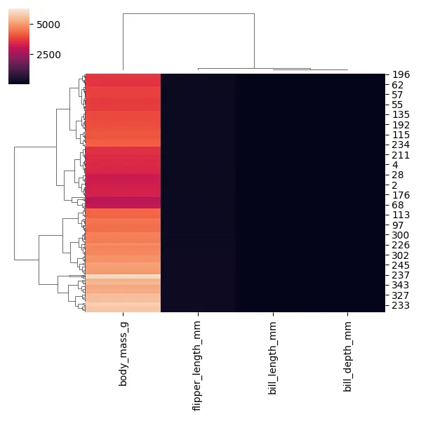
Three columns have smaller values, and one column, body_mass_g, has very large values. But, this can make for a kind of unhelpful heat map, so we need to scale our data.
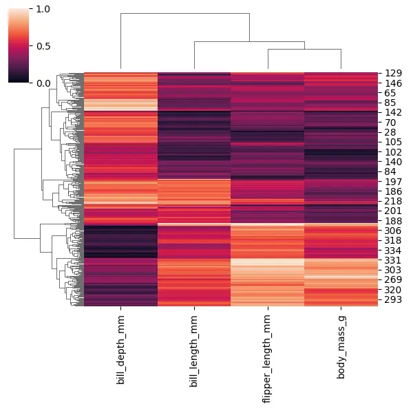
There are a few ways to scale our data within the cluster map, but one easy way is to use this argument called standard_scale. The value for this argument will either be 0 if we want to scale each row or 1 if we’re going to scale each column.
Code:
import seaborn as sb
import matplotlib.pyplot as plot
import numpy as np
import pandas as pd
PENGUINS = sb.load_dataset("penguins").dropna()
PENGUINS.head()
print(PENGUINS.shape)
NUMERICAL_COLS = PENGUINS.columns[2:6]
print(NUMERICAL_COLS)
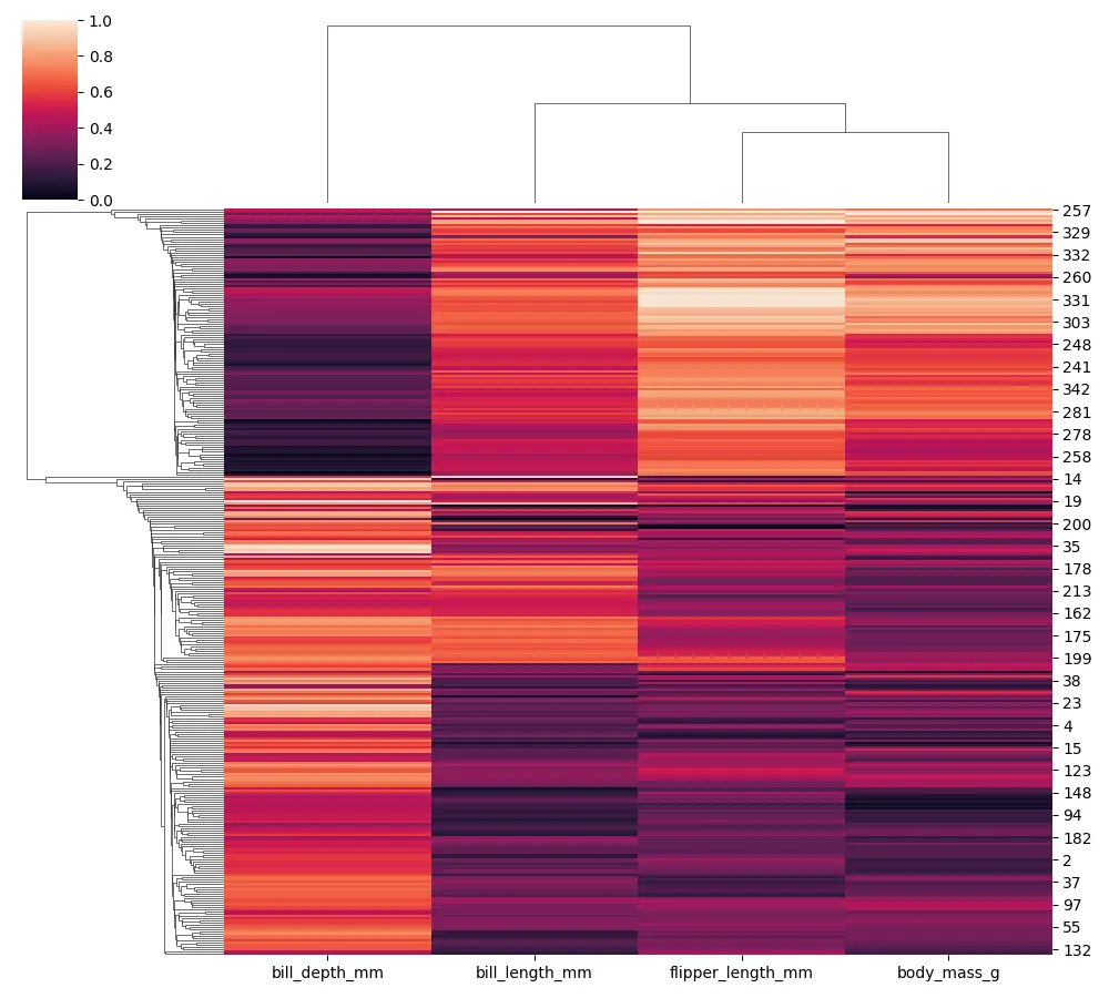
sb.clustermap(PENGUINS[NUMERICAL_COLS], figsize=(6, 6), standard_scale=1)
plot.show()
Now, all of the values are displaying between 0 and 1. It helps us put each of those columns on the same scale to compare them more easily.
We can also see that all the different penguins have been clustered, which could help us figure out which penguins are most similar to each other.
Output:
In the seaborn cluster map, we can change both the linkage and the matrix used to judge the distances, so let’s try to change the linkage using the method argument. We can pass the string as a value called single, which is a minimum linkage.
Code:
import seaborn as sb
import matplotlib.pyplot as plot
import numpy as np
import pandas as pd


PENGUINS = sb.load_dataset("penguins").dropna()
PENGUINS.head()
print(PENGUINS.shape)

NUMERICAL_COLS = PENGUINS.columns[2:6]
print(NUMERICAL_COLS)

sb.clustermap(
    PENGUINS[NUMERICAL_COLS], figsize=(10, 9), standard_scale=1, method="single"
)
plot.show()
You will notice that our dendrogram starts to get slightly different when we use a single linkage.
Output:
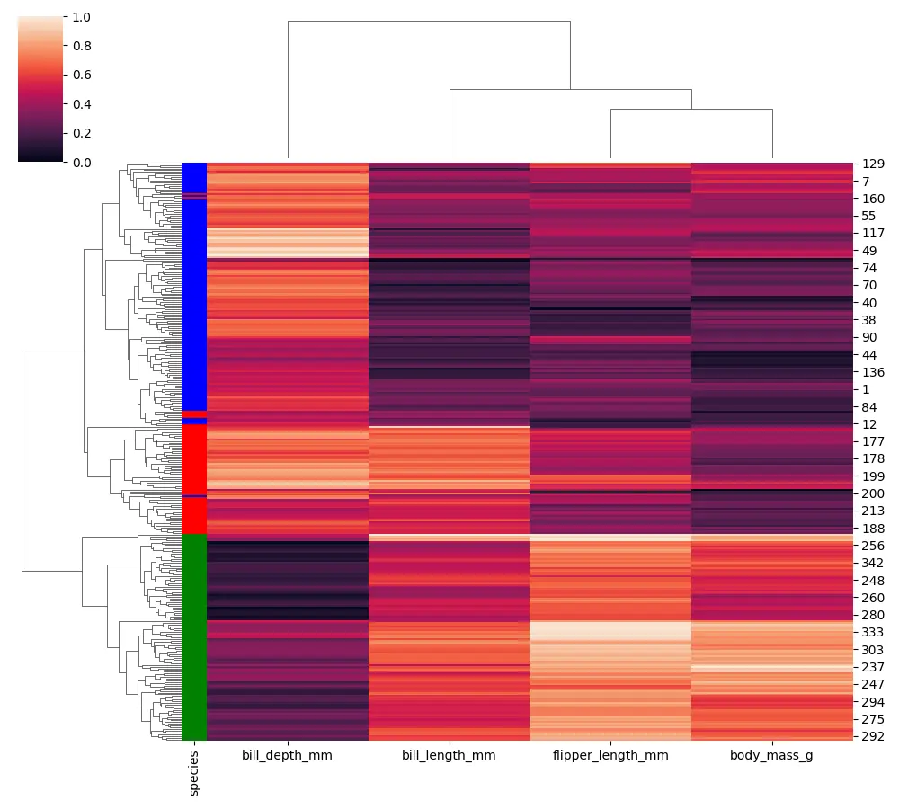
Add row_colors and col_colors Options in the Seaborn Clustermap
There are a few additional options that we can use when building our cluster map. The additional options with the seaborn cluster map are called row_colors or col_colors.
Now, we assign each color and pull this data from our penguin species column (the categorical column).
Code:
import seaborn as sb
import matplotlib.pyplot as plot
import numpy as np
import pandas as pd


PENGUINS = sb.load_dataset("penguins").dropna()
PENGUINS.head()

NUMERICAL_COLS = PENGUINS.columns[2:6]

SPECIES_COLORS = PENGUINS.species.map(
    {"Adelie": "blue", "Chinstrap": "red", "Gentoo": "green"}
)

sb.clustermap(
    PENGUINS[NUMERICAL_COLS],
    figsize=(10, 9),
    standard_scale=1,
    row_colors=SPECIES_COLORS,
)
plot.show()
We can see a flag for every row with the different types of penguin species.
Output:
Seaborn is leveraging scipy or fast cluster in the backend, so if you want to see more about these available linkage options, you can check out the scipy documentation.

Hello! I am Salman Bin Mehmood(Baum), a software developer and I help organizations, address complex problems. My expertise lies within back-end, data science and machine learning. I am a lifelong learner, currently working on metaverse, and enrolled in a course building an AI application with python. I love solving problems and developing bug-free software for people. I write content related to python and hot Technologies.
LinkedIn