How to Use React Portal Functional Component

A first-class method of rendering children into a DOM node that is outside the parent component’s DOM hierarchy is provided by portals.
In this article, we’ll learn how to use the portal functional components of ReactJS.
React Portal Functional Component in ReactJS
In essence, we mount our App element above our root element. Using a div element with the id root as the primary DOM element has practically become standard practice.
Every React component in our application can be found under the root element, which is located inside a sentence if you look at the browser’s DOM tree. Nevertheless, React Portals allow us to leave this DOM tree and render a component onto a DOM node that is not underneath this root element.
Doing this violates a parent-child hierarchy and requires that a component be presented as a new element.
Syntax:
ReactDOM.createPortal(child, container)
- The first argument is a
child, which can be anything renderable, such as an element, string, or fragment (child). - The
containeris a DOM element and is the second argument.
The child components’ need to visually exit the parent container. Demonstrated below is one of the Portal’s most frequent use cases.
- Dialog boxes with modals
- Hovercards
- Floating menus
- Tooltips
- Loaders
When using React Portals, be mindful of the following. Unless you get to know somebody, these tendencies are not immediately apparent.
- Regardless of where the
Portal nodeis located in the DOM, event bubbling will function as intended by propagating events to the React tree predecessors. - React still controls the lifecycle of child elements when rendering them through Portals.
- The React component tree is unaffected by
portal, which only alters the HTML DOM structure. - When using portals, you must specify an
HTML DOM elementas the mount point for the portal component.
Let’s use the following example to understand the mentioned idea.
Code:
const PortalModal = ({message, isModalOpen, onClose}) => {
  if (!isModalOpen) return null;
  return ReactDOM.createPortal(
     <div className='modal'>
      <p>{message}</p>
      <button onClick={onClose}>X</button>
     </div>
    ,document.body);
  }
function Component() {
  const [modalOpen, setModalOpen] = useState(false)
  return (
    <div>
      <button onClick={() => setModalOpen(true)}>Open Modal</button>
      <PortalModal
  message = 'Hello DelftStack Readers!'
       isModalOpen={modalOpen}
       onClose={
    () => setModalOpen(false)}
      />
    </div>
  )
}
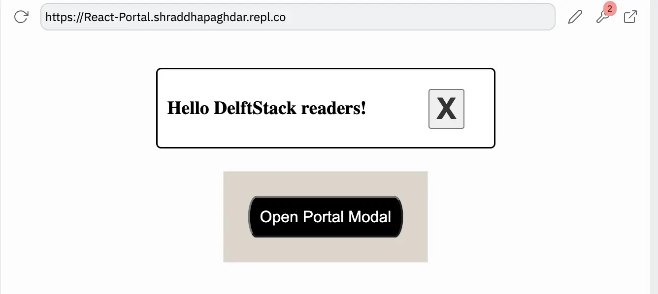
We have made the portal for the modal in the example above. The modal will open and appear outside the root element as soon as the user clicks the button.
The dimensions of this modal would not be inherited or changed by the parent components because it is rendered outside of the root hierarchy.
Output:

Shraddha is a JavaScript nerd that utilises it for everything from experimenting to assisting individuals and businesses with day-to-day operations and business growth. She is a writer, chef, and computer programmer. As a senior MEAN/MERN stack developer and project manager with more than 4 years of experience in this sector, she now handles multiple projects. She has been producing technical writing for at least a year and a half. She enjoys coming up with fresh, innovative ideas.
LinkedIn