How to Plot a Python Dictionary in Order of Key Values

In this tutorial, we’ll explore various ways to plot a dictionary in Python using the pyplot module from the widely used Matplotlib library. Visualizing data from dictionaries can be a crucial aspect of data analysis and interpretation.
We’ll aim to represent the contents of the dictionary as a set of key-value pairs, with keys mapped to the x-axis and their respective values mapped to the y-axis.
Plot a Python Dictionary Using the pyplot Module of Matplotlib Library
Let’s start with a simple example. We’ll begin by converting the dictionary into a list of key-value pairs and then sorting it using the sorted function.
This sorting ensures that our graph is plotted in an ordered manner. Next, we extract the x and y values from the sorted list using the zip function.
Finally, we use these values as arguments for the plt.plot function to create the graph.
import matplotlib.pylab as plt

my_dict = {"Khan": 4, "Ali": 2, "Luna": 6, "Mark": 11, "Pooja": 8, "Sara": 1}

myList = sorted(my_dict.items())
x, y = zip(*myList)

plt.plot(x, y)
plt.show()
Output:
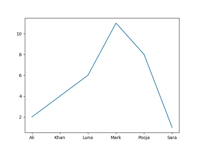
First, we imported the pylab module from the matplotlib library and gave it an alias of plt. Then, we defined a dictionary named my_dict, which contains names (as keys) and corresponding numeric values (as values) associated with each name.
The dictionary items (key-value pairs) are converted into a list of tuples and sorted in lexicographic order based on the keys. Sorting the dictionary items ensures that the data is plotted in a consistent order.
Here, the zip(*myList) operation extracted the keys (names) and values (numeric values) from the sorted list of dictionary items. It separated the tuples into two lists: x contains the keys (names), and y contains the corresponding values.
Using the plt.plot function, we created a line plot. The x values are plotted on the x-axis, and the y values are plotted on the y-axis.
This type of plot is suitable for showing trends or relationships between data points.
Customizing the Plot
Let’s enhance the plot by adding labels and a title. This will provide more context and make the graph easier to interpret.
import matplotlib.pylab as plt

my_dict = {"Khan": 4, "Ali": 2, "Luna": 6, "Mark": 11, "Pooja": 8, "Sara": 1}

myList = sorted(my_dict.items())
x, y = zip(*myList)

plt.plot(x, y)
plt.xlabel("Key")
plt.ylabel("Value")
plt.title("My Dictionary")
plt.show()
Output:
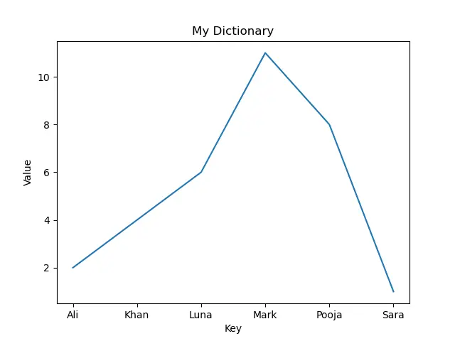
Here, we create a dictionary named my_dict with string keys representing names and integer values associated with each name.
Then, we convert the dictionary items to a list and sort it. This is important for maintaining a consistent order while plotting the data.
The zip(*myList) operation extracts the keys and values from the sorted list of dictionary items and assigns them to x and y, respectively. x will contain the keys (names in this case), and y will contain the corresponding values.
We also use plt.plot to create a line plot. It uses the keys (names) from x as the x-axis values and the corresponding values from y as the y-axis values.
The lines below add labels to the x-axis (Key), y-axis (Value), and a title (My Dictionary) to the plot, providing context and making it easier to interpret.
plt.xlabel("Key")
plt.ylabel("Value")
plt.title("My Dictionary")
Finally, we display the plot on the screen using plt.show().
Bar Chart Representation
Another useful way to visualize a dictionary is by using a bar chart. This can be achieved using the bar function in pyplot.
import matplotlib.pylab as plt

my_dict = {"Khan": 4, "Ali": 2, "Luna": 6, "Mark": 11, "Pooja": 8, "Sara": 1}

keys = my_dict.keys()
values = my_dict.values()

plt.bar(keys, values)
plt.xlabel("Key")
plt.ylabel("Value")
plt.title("My Dictionary - Bar Chart")
plt.show()
Here, we defined the same dictionary named my_dict. Then, we extracted the keys (names) from the dictionary and stored them in the keys variable, and we also extracted the values associated with each key and stored them in the values variable.
Using the plt.bar function, we created a bar chart. The keys (names) are used for the x-axis, and the values (numeric values) are used for the corresponding heights of the bars on the y-axis.
We also added labels to the x-axis (Key) and y-axis (Value) to provide context to the chart. Additionally, a title is set for the graph, which is My Dictionary - Bar Chart.
Finally, the plt.show() function displays the bar chart.
Conclusion
By exploring these examples, we’ve demonstrated versatile ways to visualize a dictionary’s data using the pyplot module in Matplotlib. These techniques can be applied to gain insights from your data in a clear and organized manner.
Feel free to experiment further with additional customizations and styles to suit your specific requirements.