
HOWTO · Pandas
How to Create a Pie Chart Using Pandas DataFrame
In this tutorial, we will introduce how the python pandas library is used to create a pie chart using a dataframe. The pie chart uses the Pandas plot() function to draw a chart. The attribute used in the plot() function is kind.
A pie chart represents the data in a circular graph, often used in research, industry, and business.
The pie segments represent the relative strength of the data and serve as its graphical representation. A pie chart requires a list of categories and numerical variables.
The total value of the pie is always 100 percent.
This article will introduce how the Python Pandas library creates a pie chart using a dataframe.
Create a Simple Pie Chart Using Pandas DataFrame
We must first import a Pandas library before creating a dataframe and saving it in the variable data_frame. This dataframe contains two columns: one for each student’s name and another for the number of votes cast by each student.
import pandas as pd
Now, the data_frame variable stores the data of two columns.
data_frame = pd.DataFrame(
    {
        "Name": [
            "John",
            "John",
            "John",
            "Jhon",
            "John",
            "Arapa",
            "Arapa",
            "Arapa",
            "Arapa",
            "Arapa",
            "Harry",
            "Harry",
            "Harry",
            "Harry",
            "Harry",
        ],
        "each_class_vote": [22, 12, 10, 18, 20, 17, 16, 13, 12, 14, 22, 19, 11, 19, 18],
    }
)
data_frame
Output:
     Name    No_of_vote
0    John    22
1    John    12
2    John    10
3    Jhon    18
4    John    20
5    Arapa   17
6    Arapa   16
7    Arapa   13
8    Arapa   12
9    Arapa   14
10   Harry   22
11   Harry   19
12   Harry   11
13   Harry   19
14   Harry   18
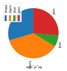
We will plot the pie chart of the above data_frame using the plot() function with the attribute kind.
data_frame.groupby(["Name"]).sum().plot(kind="pie", y="No_of_vote")
Output:
Create Pie Chart with Percentage Using Pandas DataFrame
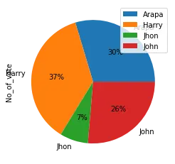
To add another attribute, use autopct with its value. This attribute adds a percentage to the pie chart graph.
data_frame.groupby(["Name"]).sum().plot(kind="pie", y="No_of_vote", autopct="%1.0f%%")
Create Pie Chart with Colors Using Pandas DataFrame
To add an attribute color in the pie chart, we set the list of colors.
Syntax:
plot(kind='pie', colors)
Make a variable colors and assign a list of colors with the color name.
colors = ["pink", "silver", "steelblue", "blue"]
data_frame.groupby(["Name"]).sum().plot(
    kind="pie", y="No_of_vote", autopct="%1.0f%%", colors=colors
)
Output:
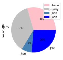
The above output shows that the color list sets the 4 colors according to a student’s name.
Create Pie Chart with Explosion Effect Using Pandas DataFrame
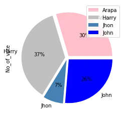
The process of exploding a pie chart is splitting it into parts. For this, we use the explode attribute and assign it to an appropriate value.
plot(kind='pie', explode)
Create a variable called explode and assign the ratio to it.
explode = (0.05, 0.05, 0.05, 0.05)
data_frame.groupby(["Name"]).sum().plot(
    kind="pie", y="No_of_vote", autopct="%1.0f%%", colors=colors, explode=explode
)
Output:
Create Pie Chart with Shadow Effect Using Pandas DataFrame
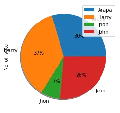
Use the shadow attribute with value True to add a shadow effect in the pie chart. This adds an extra dimension to the pie chart.
plot(kind='pie', shadow=True)
data_frame.groupby(["Name"]).sum().plot(
    kind="pie", y="No_of_vote", autopct="%1.0f%%", shadow=True
)
Output:
Create Pie Chart with Start Angle Using Pandas DataFrame
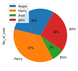
If we want to rotate the pie chart to a different angle, use this attribute with its appropriate value.
Syntax:
plot(kind='pie', startangle)
Rotate the chart at 90 degree
data_frame.groupby(["Name"]).sum().plot(
    kind="pie", y="votes_of_each_class", autopct="%1.0f%%", startangle=60
)
Conclusion
In the above article, first, we create the dataframe with 2 columns then plot a pie chart using the plot() function of the Pandas module. After that, we have applied different attributes and effects to the pie chart.