Pandas Correlation Matrix
-
Generate Correlation Matrix Using the
DataFrame.corr()Method -
Visualize the Pandas Correlation Matrix Using the
Matplotlib.pyplot.matshow()Method -
Visualize the Pandas Correlation Matrix Using the
seaborn.heatmap()Method -
Visualize the Correlation Matrix Using the
DataFrame.styleProperty

This tutorial will explain how we can generate a correlation matrix using the DataFrame.corr() method and visualize the correlation matrix using the pyplot.matshow() method in Matplotlib.
import pandas as pd

employees_df = pd.DataFrame(
    {
        "Name": ["Jonathan", "Will", "Michael", "Liva", "Sia", "Alice"],
        "Age": [20, 22, 29, 20, 20, 21],
        "Weight(KG)": [65, 75, 80, 60, 63, 70],
        "Height(meters)": [1.6, 1.7, 1.85, 1.69, 1.8, 1.75],
        "Salary($)": [3200, 3500, 4000, 2090, 2500, 3600],
    }
)

print(employees_df, "\n")
Output:
       Name  Age  Weight(KG)  Height(meters)  Salary($)
0  Jonathan   20          65            1.60       3200
1      Will   22          75            1.70       3500
2   Michael   29          80            1.85       4000
3      Liva   20          60            1.69       2090
4       Sia   20          63            1.80       2500
5     Alice   21          70            1.75       3600
We will use the DataFrame employees_df to explain how we can generate and visualize a correlation matrix.
Generate Correlation Matrix Using the DataFrame.corr() Method
import pandas as pd

employees_df = pd.DataFrame(
    {
        "Name": ["Jonathan", "Will", "Michael", "Liva", "Sia", "Alice"],
        "Age": [20, 22, 29, 20, 20, 21],
        "Weight(KG)": [65, 75, 80, 60, 63, 70],
        "Height(meters)": [1.6, 1.7, 1.85, 1.69, 1.8, 1.75],
        "Salary($)": [3200, 3500, 4000, 2090, 2500, 3600],
    }
)

print("The DataFrame of Employees is:")
print(employees_df, "\n")

corr_df = employees_df.corr()
print("The correlation DataFrame is:")
print(corr_df, "\n")
Output:
The DataFrame of Employees is:
       Name  Age  Weight(KG)  Height(meters)  Salary($)
0  Jonathan   20          65            1.60       3200
1      Will   22          75            1.70       3500
2   Michael   29          80            1.85       4000
3      Liva   20          60            1.69       2090
4       Sia   20          63            1.80       2500
5     Alice   21          70            1.75       3600

The correlation DataFrame is:
                     Age  Weight(KG)  Height(meters)  Salary($)
Age             1.000000    0.848959        0.655252   0.695206
Weight(KG)      0.848959    1.000000        0.480998   0.914861
Height(meters)  0.655252    0.480998        1.000000   0.285423
Salary($)       0.695206    0.914861        0.285423   1.000000
It generates a DataFrame with correlation values among each column with every other column in the DataFrame.
The correlation values will only be calculated between the columns with numeric values. By default, the corr() method uses the Pearson method to calculate the correlation coefficient. We can also use other methods like Kendall and spearman to calculate the correlation coefficient by specifying the value of the method parameter in the corr method.
Visualize the Pandas Correlation Matrix Using the Matplotlib.pyplot.matshow() Method
import pandas as pd
import matplotlib.pyplot as plt

employees_df = pd.DataFrame(
    {
        "Name": ["Jonathan", "Will", "Michael", "Liva", "Sia", "Alice"],
        "Age": [20, 22, 29, 20, 20, 21],
        "Weight(KG)": [65, 75, 80, 60, 63, 70],
        "Height(meters)": [1.6, 1.7, 1.85, 1.69, 1.8, 1.75],
        "Salary($)": [3200, 3500, 4000, 2090, 2500, 3600],
    }
)

corr_df = employees_df.corr(method="pearson")

plt.matshow(corr_df)
plt.show()
Output:
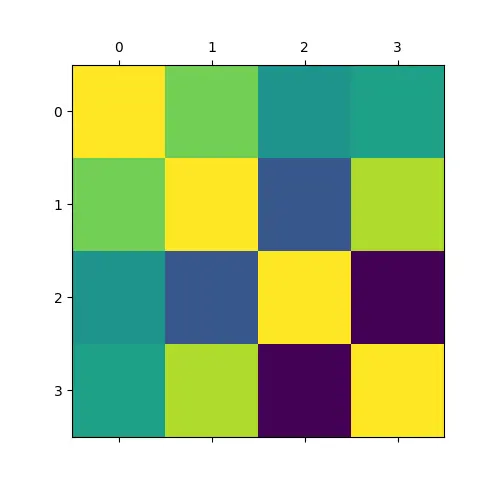
It plots the correlation matrix generated from the employees_df DataFrame using the matshow() function in the Matplotlib.pyplot package.
Visualize the Pandas Correlation Matrix Using the seaborn.heatmap() Method
import pandas as pd
import seaborn as sns
import matplotlib.pyplot as plt

employees_df = pd.DataFrame(
    {
        "Name": ["Jonathan", "Will", "Michael", "Liva", "Sia", "Alice"],
        "Age": [20, 22, 29, 20, 20, 21],
        "Weight(KG)": [65, 75, 80, 60, 63, 70],
        "Height(meters)": [1.6, 1.7, 1.85, 1.69, 1.8, 1.75],
        "Salary($)": [3200, 3500, 4000, 2090, 2500, 3600],
    }
)

corr_df = employees_df.corr(method="pearson")

plt.figure(figsize=(8, 6))
sns.heatmap(corr_df, annot=True)
plt.show()
Output:
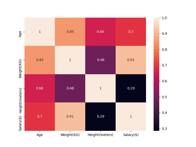
It plots the correlation matrix generated from the employees_df DataFrame using the heatmap() function in the seaborn package.
Visualize the Correlation Matrix Using the DataFrame.style Property
import pandas as pd

employees_df = pd.DataFrame(
    {
        "Name": ["Jonathan", "Will", "Michael", "Liva", "Sia", "Alice"],
        "Age": [20, 22, 29, 20, 20, 21],
        "Weight(KG)": [65, 75, 80, 60, 63, 70],
        "Height(meters)": [1.6, 1.7, 1.85, 1.69, 1.8, 1.75],
        "Salary($)": [3200, 3500, 4000, 2090, 2500, 3600],
    }
)

corr_df = employees_df.corr(method="pearson")

corr_df.style.background_gradient(cmap="coolwarm")
Output:
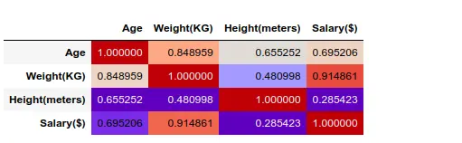
The style property of the corr_df DataFrame object returns a Styler object. We can visualize the DataFrame object using the background_gradient for Styler object.
This method can only generate figures in the IPython notebook.

Suraj Joshi is a backend software engineer at Matrice.ai.
LinkedIn