How to Plot Table in Plotly

This tutorial will discuss creating a table using the Table() function of Plotly’s graph object.
Create a Table Using Plotly
We can use the Table() function of Plotly’s graph object to create a table. To create a basic table, we have to use the header and cells argument of the Table() function to create a header and cells of the table.
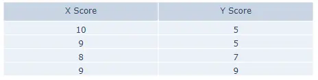
Let’s create a simple table using Plotly. See the code below.
import plotly.graph_objects as go

data = [
    go.Table(
        header=dict(values=["X Score", "Y Score"]),
        cells=dict(values=[[10, 9, 8, 9], [5, 5, 7, 9]]),
    )
]

fig = go.Figure(data)
fig.show()
Output:
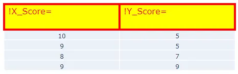
The Figure() function is used to plot the table. Let’s change some properties of the header. We can set the text alignment using the align property, which can be left, right, or auto.
We can fill the header cells with color using the fill property. We can use the font property to set the color and size of the text inside the header cells.
We can set the height of the header cells using the height property and set its value to an integer. Using the line argument, we can set the line properties like the line color and width. We can add prefix and suffix, which will appear before and after the cell value.
Let’s change the properties mentioned above. See the code below.
import plotly.graph_objects as go

data = [
    go.Table(
        header=dict(
            values=["X_Score", "Y_Score"],
            align="left",
            fill=dict(color="yellow"),
            font=dict(color="red", size=16),
            height=50,
            line=dict(color="red", width=4),
            prefix="!",
            suffix="=",
        ),
        cells=dict(values=[[10, 9, 8, 9], [5, 5, 7, 9]]),
    )
]

fig = go.Figure(data)
fig.show()
Output:
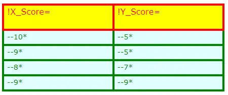
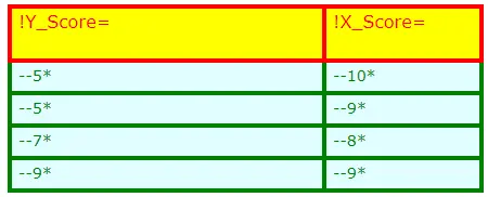
Let’s change some properties of the cells. The properties mentioned above can also be changed for the cells.
Let’s change the properties mentioned above for cells. See the code below.
import plotly.graph_objects as go

data = [
    go.Table(
        header=dict(
            values=["X_Score", "Y_Score"],
            align="left",
            fill=dict(color="yellow"),
            font=dict(color="red", size=16),
            height=50,
            line=dict(color="red", width=4),
            prefix="!",
            suffix="=",
        ),
        cells=dict(
            values=[[10, 9, 8, 9], [5, 5, 7, 9]],
            align="left",
            fill=dict(color="lightcyan"),
            font=dict(color="green", size=14),
            height=30,
            line=dict(color="green", width=4),
            prefix="--",
            suffix="*",
        ),
    )
]

fig = go.Figure(data)
fig.show()
Output:
We can use the domain argument inside the Table() function to set the table domains like the cells’ width using the x property for the x-axis domain and y for the y-axis.
Let’s set the cells’ horizontal size in the table above. See the code below.
import plotly.graph_objects as go

data = [
    go.Table(
        header=dict(
            values=["X_Score", "Y_Score"],
            align="left",
            fill=dict(color="yellow"),
            font=dict(color="red", size=16),
            height=50,
            line=dict(color="red", width=4),
            prefix="!",
            suffix="=",
        ),
        cells=dict(
            values=[[10, 9, 8, 9], [5, 5, 7, 9]],
            align="left",
            fill=dict(color="lightcyan"),
            font=dict(color="green", size=14),
            height=30,
            line=dict(color="green", width=4),
            prefix="--",
            suffix="*",
        ),
        domain=dict(x=[0, 0.5]),
    )
]

fig = go.Figure(data)
fig.show()
Output:
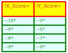
We can also set the column order using the columnorder argument and the column width using the columnwidth argument.
Let’s show the first column in the second and second column in the first, and let’s change the column width and set the first column’s width half. See the code below.
import plotly.graph_objects as go

data = [
    go.Table(
        columnorder=[2, 1],
        columnwidth=[1, 2],
        header=dict(
            values=["X_Score", "Y_Score"],
            align="left",
            fill=dict(color="yellow"),
            font=dict(color="red", size=16),
            height=50,
            line=dict(color="red", width=4),
            prefix="!",
            suffix="=",
        ),
        cells=dict(
            values=[[10, 9, 8, 9], [5, 5, 7, 9]],
            align="left",
            fill=dict(color="lightcyan"),
            font=dict(color="green", size=14),
            height=30,
            line=dict(color="green", width=4),
            prefix="--",
            suffix="*",
        ),
    )
]

fig = go.Figure(data)
fig.show()
Output:
We can use the values stored inside a data frame to create a table. Check this link for more details about creating a table in Plotly.
