How to Plot Choropleth Map in Plotly
This tutorial will discuss creating a choropleth map using the choropleth() function of Plotly in Python.
Use the choropleth() Function of Plotly to Create a Choropleth Map in Python
A choropleth map is a map that represents data as colored polygons. It is used to plot a map of a country and states with different colors.
We can use the choropleth() function of plotly.express to create a choropleth map. To create a plot, we must pass a data frame with the geometric information and a list of features that we want to show on the map inside the choropleth() function.
For example, we can use the built-in data of world map to draw a simple map like the map of the world and highlight the Texas state of USA. See the code below.
import plotly.express as px

fig = px.choropleth(locationmode="USA-states", locations=["TX"])
fig.show()
Output:
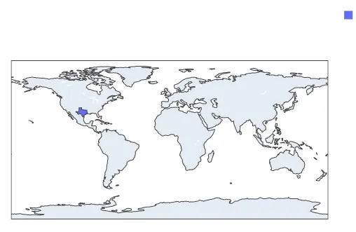
Texas is highlighted with blue in the plot above, but we cannot see it. Instead of showing the whole map, we can show a portion like the USA using the scope argument.
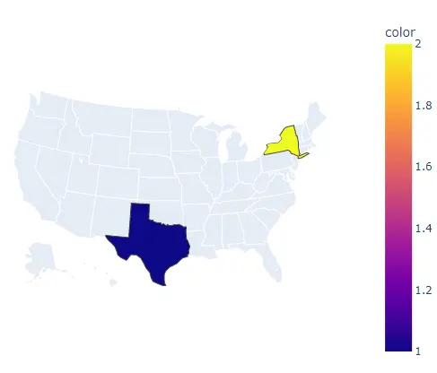
The scope argument can be set to the world, usa, europe, asia, africa, and north and south america. For example, let’s show only the USA map, highlight two states and give them different colors using the color argument.
See the code below.
import plotly.express as px

fig = px.choropleth(
    locationmode="USA-states", locations=["TX", "NY"], scope="usa", color=[1, 2]
)
fig.show()
Output:
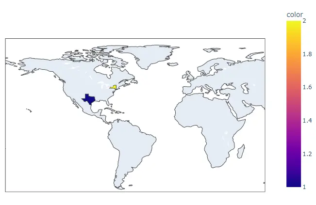
We can also set the center of the map using the latitude and longitude of the center point. To set the map’s center point, we must pass the latitude and longitude inside the center argument.
For example, let’s set the map’s center point to Texas. See the code below.
import plotly.express as px

fig = px.choropleth(
    locationmode="USA-states",
    locations=["TX", "NY"],
    color=[1, 2],
    center=dict(lat=32, lon=-109.9),
)
fig.show()
Output:
To convert the histogram into a group of subplots containing a single bin in each subplot, we can use the facet_row for rows and facet_col for columns and set its value to a list of integers or strings used to set the name of the subplot.
We can also change the spacing between each subplot using the facet_row_spacing and facet_col_spacing arguments and set its value to a floating-point number from 0 to 1. We can give a title to the histogram using the title argument.
We can set the width and height of the plot using the width and height arguments. We can set the fitbounds property to locations to show locations only on the map.
We can also hide the base map using the basemap_visible argument and set it false.
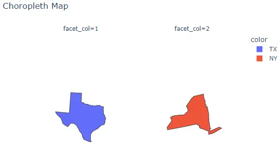
For example, let’s change the properties mentioned above. See the code below.
import plotly.express as px

fig = px.choropleth(
    locationmode="USA-states",
    locations=["TX", "NY"],
    color=["TX", "NY"],
    scope="usa",
    facet_col=[1, 2],
    title="Choropleth Map",
    fitbounds="locations",
    basemap_visible=False,
)
fig.show()
Output:
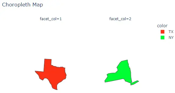
We can change the default color sequence using the color_discrete_sequence argument. We can set the color sequence to Plotly’s supported color sequence like Dark24 or Light24.
For example, let’s change the color sequence of the above plot. See the code below.
import plotly.express as px

fig = px.choropleth(
    locationmode="USA-states",
    locations=["TX", "NY"],
    color=["TX", "NY"],
    scope="usa",
    facet_col=[1, 2],
    title="Choropleth Map",
    fitbounds="locations",
    basemap_visible=False,
    color_discrete_sequence=px.colors.qualitative.Light24,
)
fig.show()
Output:
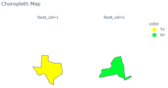
Instead of using a color sequence, we can also give any color to each location using the color_discrete_map argument. This argument is used to override the default colors.
If we only change a few locations, the rest will be assigned from the color sequence. For example, let’s change the first location colors to yellow.
See the code below.
import plotly.express as px

fig = px.choropleth(
    locationmode="USA-states",
    locations=["TX", "NY"],
    color=["TX", "NY"],
    scope="usa",
    facet_col=[1, 2],
    title="Choropleth Map",
    fitbounds="locations",
    basemap_visible=False,
    color_discrete_sequence=px.colors.qualitative.Light24,
    color_discrete_map={"TX": "yellow"},
)
fig.show()
Output:
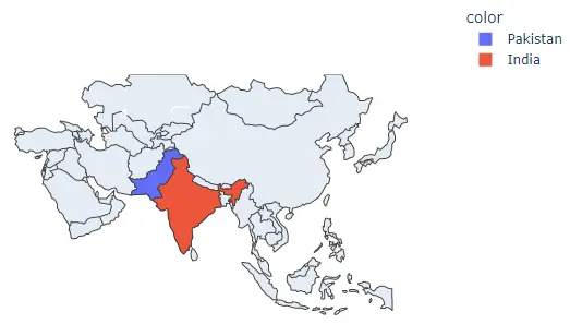
Instead of using states as locations, we can also use different country names by setting the locationmode argument to country names and passing the country name inside the locations argument to highlight it in the plot.
For example, let’s highlight two countries from Asia. See the code below.
import plotly.express as px

fig = px.choropleth(
    locationmode="country names",
    locations=["Pakistan", "India"],
    color=["Pakistan", "India"],
    scope="asia",
)
fig.show()
Output:
We can also use a data frame to create a choropleth map.
For example, let’s read a pre-stored data of life expectancy of the year 2007 in different countries of the world and using the name if countries we can create the choropleth map and using life expectancy numbers, we can give each country a different color.
See the code below.
import plotly.express as px

df = px.data.gapminder().query("year==2007")
fig = px.choropleth(df, locations="iso_alpha", color="lifeExp", hover_name="country")
fig.show()
Output:

The hover_name argument shows the country name when we hover over a country.
